The purpose of data visualization is to present complex data in a way that is clear to understand and engages audiences. Visualizations make it easy to convey an overall message, highlight key insights, and can be very persuasive in terms of guiding an audience toward a conclusion.
In this article, we will consider how to present complex information effectively with data visualization in a simple five-step guide, we will also discuss its benefits and provide a few use case examples.
Data visualization represents data and information in a graphical way that is easy to comprehend. Visualizations can include charts, maps, graphs, infographics, and other elements that help to simplify data. This makes it easy to identify patterns and trends, spot inconsistencies and outliers, and help an audience conclude the data that is being presented.
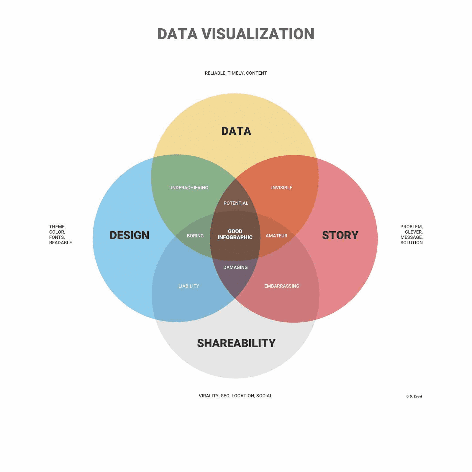
Image from infogram
Data visualizations are also very effective when it comes to presenting complex and potentially confusing data to non-technical personnel within a company. This can assist key decision-makers when it comes to signing off new projects or allocating more of the budget to a certain department, for example.
As humans, our eyes are immediately drawn to patterns, colors, and shapes and we can instantly differentiate between certain elements. Branding and logos of big businesses are prime examples of this, with almost everyone around the world able to identify a big yellow ‘M’ or the outline of that famous apple.
Data visualizations are based on these human perceptions, grabbing the audience’s interest and keeping people focused on the message. Used effectively, data visualization can be an amazing storytelling tool, leading the audience on a journey in an engaging and persuasive way.
As previously discussed, data visualization is very effective at turning complex and confusing data into something more digestible and easy to understand, especially if it is being presented to non-technical people or an audience that is not familiar with the subject.
Visualizations also make it possible to analyze big data, data that is so large, complex, and
fast-paced that it is impossible to process using traditional means. This presents new opportunities to businesses, allowing for new insights and trends to be discovered, and providing a competitive edge.
Other key uses of data visualization include visualizing relationships and patterns between two elements, sharing key information quickly, and exploring new business opportunities in an interactive way.
To fully understand data visualization we cannot just focus on the advantages, we also need to look at its limitations to determine when and where it can be used.
One disadvantage that is more user error than a fault of the technology is the possibility of making inaccurate assumptions when there are a large number of different data points. Inexperienced users may also choose a poor or incorrect design, visualizing the data in a way that confuses the audience or implements too much bias.
Another issue that needs to be avoided is automatically believing any correlation can be linked to a cause. Of course, in many cases, correlation does represent a valuable insight or trend, but not always, coincidences do happen.
Finally, it can be sometimes easy to become embroiled in the fancy graphics and interactive charts, losing sight of the key message and the overall goal of the visualization. Like any type of reporting and presentation technique, the focus is crucial to deliver the key messaging effectively.
Now we understand what data visualization is, its benefits, and what to avoid when designing and delivering a report, let’s consider how it can be applied with a few common use cases.
- Data visualization can provide advanced marketing analytics to help drive decision making, discover new trends and niches, while also improving current campaigns. Data could include website traffic and page performance, helping to fine-tune web content to create more conversions.
- Risk management can also rely on data visualization to quickly highlight any issues within business operations or cybersecurity, for example. By analyzing historical data and presenting it in an engaging way, risks can be easily identified and mitigated before they cause any disruption.
- In sales, CRM tools enable businesses to present data in a visually engaging manner, simplifying comprehension for both internal teams and customers. Moreover, there are specialized CRM tools tailored for very specific industries. For instance, roofing contractors can leverage roofing CRM software instead of generic options. This bespoke approach ensures that data visualization becomes accessible and applicable to a wide range of businesses.
Using data visualization effectively can be relatively straightforward if best practices are adhered to and the purpose of the data analysis and who it is being presented to is clear.
Here are five steps on how to present complex data effectively with data visualization.
1. Determine Who The Audience Is
The first step when creating a data visualization is to fully determine who the audience is, their knowledge level, and their technical expertise. If you know the individuals well then you may also have an understanding of their general attention span and their interest in the subject.
For a data visualization to be effective you must fully understand the expectations and goals of the audience and deliver the data in a format and design that suits their needs.
2. Remove Unnecessary Complexity
When designing a data visualization, simplicity is critical, removing any unnecessary elements that could distract or confuse the audience. The overall message should be abundantly clear, without any clutter. To achieve this, implement an eye-catching and consistent color scheme, clear and suitably-sized fonts, and utilize white space, grids, and margins to organize the page layout. Large titles, legends, and labels can also help to explain the content more clearly.
3. Use Relevant Charts
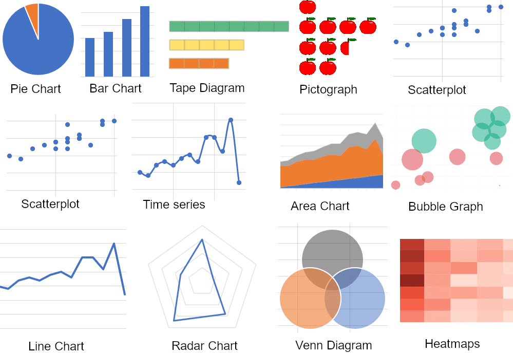
Image from polymersearch
Relevancy is crucial for efficient data visualizations, therefore, it is advised to use the correct charts and graphs to display any data. For example, a line chart is the recommended way to display trends, and scatter charts show relationships and correlations, while a pie or donut chart can show percentages.
4. Create a Story
Data visualization should be more than just cold, hard numbers, it should have a clear story that keeps the audience engaged and gradually reaches a conclusion. Make sure you include any relevant background information before delving into the figures and highlight the key points to ensure they’re understood.
5. Test Your Data Visualization
The last step is to test the data visualization so it can be optimized before presenting it to an audience. Make sure the key points are apparent, the data is accurate, and that charts and graphs are easy to follow. Having the visualization cross-checked by a colleague is one of the best ways to find any errors, typos, or inconsistencies, plus they can also give honest feedback on whether the design and content are engaging.
Data visualization has become essential in terms of presenting big data and discovering new insights and trends, especially in the sales and marketing sectors. By presenting data in this way, audiences are engaged, and complex information can be displayed in a way that is easy to digest.
This can result in a better understanding of big data and analytics across an organization, resulting in improved decision-making and boosting operations.
Nahla Davies is a software developer and tech writer. Before devoting her work full time to technical writing, she managed — among other intriguing things — to serve as a lead programmer at an Inc. 5,000 experiential branding organization whose clients include Samsung, Time Warner, Netflix, and Sony.
- SEO Powered Content & PR Distribution. Get Amplified Today.
- PlatoData.Network Vertical Generative Ai. Empower Yourself. Access Here.
- PlatoAiStream. Web3 Intelligence. Knowledge Amplified. Access Here.
- PlatoESG. Carbon, CleanTech, Energy, Environment, Solar, Waste Management. Access Here.
- PlatoHealth. Biotech and Clinical Trials Intelligence. Access Here.
- Source: https://www.kdnuggets.com/data-visualization-presenting-complex-information-effectively?utm_source=rss&utm_medium=rss&utm_campaign=data-visualization-presenting-complex-information-effectively

