
Image from DALLE 3
5 Key Takeaways:
- The basic structure of a data visualization chart
- Using Python Altair to build a data visualization chart
- Using GitHub Copilot to speed up chart generation
- Using ChatGPT to generate relevant content for your chart
- Using DALL-E to add engaging images to your chart
Are you tired of spending hours creating boring data visualization charts? Use the power of generative AI to improve your data visualization. In this article, we will explore how you can use generative AI to enrich your chart. We’ll use cutting-edge tools like Python Altair, GitHub Copilot, ChatGPT, and DALL-E to implement our chart with the support of generative AI.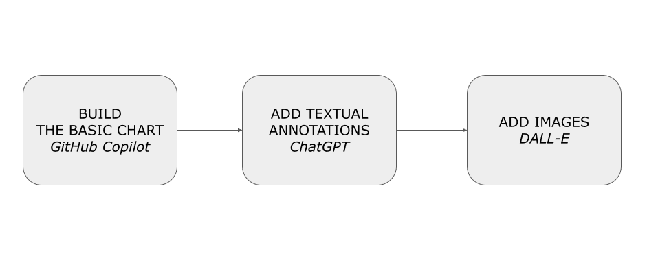
First, let’s implement the basic chart using GitHub Copilot. Next, we add textual annotations (such as the title) using ChatGPT. Finally, we will add images to the chart using DALL-E. As a programming language, we will use Python and the Python Altair visualization library.
We will cover:
- Defining the use case
- Building a basic chart: using GitHub Copilot
- Adding annotations: ChatGPT
- Adding images: DALL-E.
As a use case, we will draw a chart representing the Research and development expenditure by performance sectors using the dataset released by Eurostat under an Open Data license. To make the process more accessible, we’ll use a simplified version of the dataset, already converted in CSV. The following table shows an extract of the dataset:
| unit | sectperf | geo | 2010 | 2011 | 2012 | 2013 | 2014 | 2015 | 2016 | 2017 | 2018 | 2019 | 2020 | 2021 |
| PC_GDP | BES | AT | 1.87 | 1.84 | 2.05 | 2.09 | 2.2 | 2.18 | 2.19 | 2.14 | 2.16 | 2.2 | 2.23 | 2.22 |
| PC_GDP | BES | BA | 0.16 | 0.19 | 0.05 | 0.07 | 0.08 | |||||||
| PC_GDP | BES | BE | 1.38 | 1.49 | 1.59 | 1.62 | 1.66 | 1.7 | 1.73 | 1.87 | 2.05 | 2.33 | 2.48 | 2.42 p |
| PC_GDP | BES | BG | 0.28 | 0.28 | 0.36 | 0.39 | 0.52 | 0.7 | 0.56 | 0.52 | 0.54 | 0.56 | 0.57 | 0.51 |
The dataset contains the following columns:
- unit – the value for this column is always set to Percentage of gross domestic product (PC_GDP)
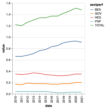
- sectperf – performance sectors. Possible values include: business enterprise (BES); government (GOV); higher education (HES); private non-profit (PNP), and TOTAL
- geo – European countries
- 2010-2021 – the expenditure value for the specified year.
As a specific case, let’s focus on BES in Italy and draw a chart using Python Altair, a data visualization library.
GitHub Copilot is a generative AI tool you can use as an assistant while writing your code. In GitHub Copilot, you describe the sequence of actions that your software must run, and GitHub Copilot transforms it into runnable code in your preferred programming language. The ability to use GitHub Copilot consists of learning how to describe the sequence of actions.
Installing Copilot
Before using GitHub Copilot, you must first set up a free trial or subscription for your personal GitHub account. If you are a teacher or a student, you can set up a free subscription plan at the following link: https://education.github.com/discount_requests/pack_application.
Once you have activated a subscription plan, you can configure Copilot as an extension of Visual Studio Code (VSC), a free, open-source code editor designed for developers to write and debug code.
Follow the steps described below to configure VSC with Copilot:
- Download VSC from its official website: https://visualstudio.microsoft.com/it/downloads/
- Open Visual Studio and navigate to the Extensions tab
- Download and install the GitHub Copilot extension, and select Connect to your account from the dashboard.
- Enter your GitHub credentials.
- Once logged in, the extension will detect existing repositories and provide options for configuring new projects.
Using Copilot as a Code Assistant
Using Copilot, let’s generate the basic chart for our visualization. To build the chart, we perform two steps:
- Load and preprocess data – load the dataset as a Pandas DataFrame, drop unnecessary columns, select only rows related to Italy, and use the Pandas melt() to convert columns related to 2010-2021 into rows.
- Build the chart as a line chart.
Let’s start with the first step, load and preprocess data. Write the following instructions for Copilot:
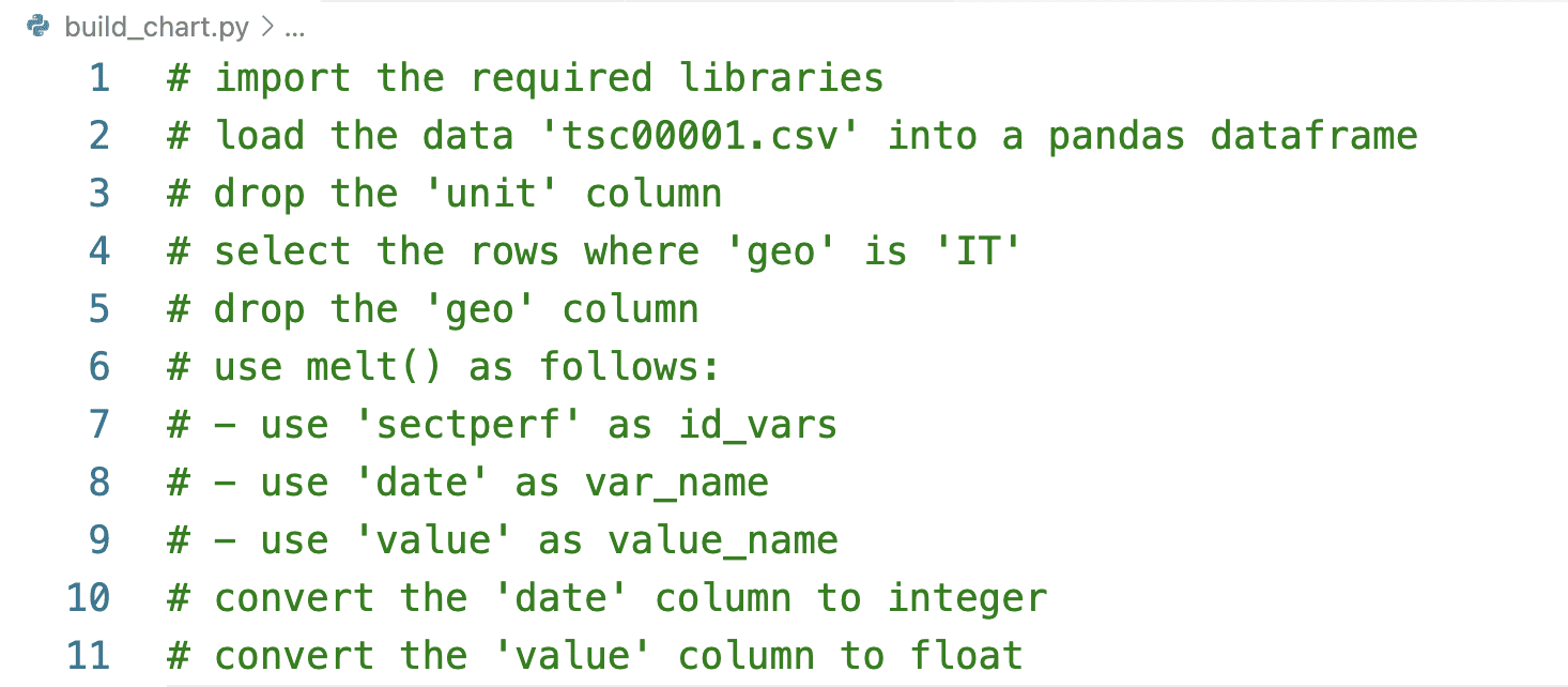
Press the ENTER button on your keyboard, and Copilot starts generating the code corresponding to the written instructions. The following code snippet shows a possible output produced by Copilot:
import pandas as pd
import altair as alt

df = pd.read_csv('tsc00001.csv')
df = df.drop(columns=['unit'])
df = df[df['geo'] == 'IT']
df = df.drop(columns=['geo'])
df = pd.melt(df, id_vars=['sectperf'], var_name='date', value_name='value')
df['date'] = df['date'].astype(int)
df['value'] = df['value'].astype(float)
Remember that Copilot is a generative model, so the output produced in your case can be different from the previous one.
Now, let’s proceed with the instructions to build the chart. Write the following instructions for Copilot:
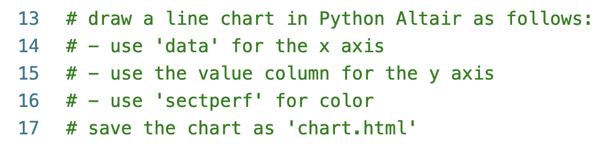
Copilot will produce a Python code similar to the code snippet shown below:
chart = alt.Chart(df).mark_line().encode(
    x='date:O',
    y='value',
    color='sectperf'
)

chart.save('chart.html')
Save the script, and run it from the command line. As an output, the script produces an HTML file named chart.html. Open it using your preferred browser. The following figure shows the produced chart:
Now that you have built the basic chart, you can improve it manually or using Copilot. For example, you can ask Copilot to generate the code to increase the stroke width for BES. Add a comma after the color line, and start writing the instructions as shown below:
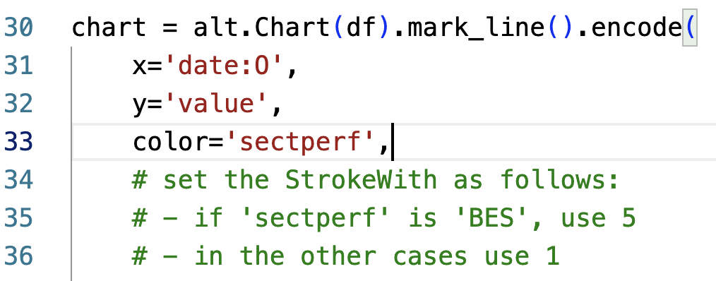
Press ENTER and wait for Copilot to write the code for you. The following code snippet shows a possible output generated by Copilot:
strokeWidth=alt.condition(
        alt.datum.sectperf == 'BES',
        alt.value(5),
        alt.value(1)
    )
The following figure shows the improved chart:

You can further improve the chart by asking Copilot to rotate X labels, set the title, and so on. You can learn more details on how to improve your chart in [1]. The following figure shows the decluttered version of the chart. You can find the complete code at this link.

Once the basic chart is ready, we can proceed with the next step, using ChatGPT to set the chart title.
Adding annotations: ChatGPT
ChatGPT is an advanced language model developed by OpenAI. It is designed to engage in human-like conversations and provide intelligent responses. We can use ChatGPT to generate text for our chart, including the title and the annotations.
To use ChatGPT, navigate to https://chat.openai.com/, log in to your account, or create a new one, and start writing your prompts in the input text box like a live chat. Whenever you want to start a new topic, create a new chat session by clicking on the top left button New Chat.
The Web interface also provides a paid account that gives some additional features, such as the possibility to use advanced models, and a suite of additional functionalities, such as priority support, expanded customization options, and exclusive access to beta features and updates. .
To interact with ChatGPT, write an input text (prompt) that defines the instructions to be performed. Different ways exist to structure a prompt for ChatGPT. In this article, we consider a prompt composed of three main consecutive texts:
- Telling ChatGPT to act in a specific [role] – for example “You are an examiner looking at high school students’ English papers.”
- Telling ChapGPT to tailor its outputs to an intended [audience] – for example “Explain your gradings in a way that can be understood by high schoolers.”
- Define the [task] – for example “Grade this text and explain your reasoning.”
In our example, we can formulate the prompt as follows:
Act as a data analyst wanting to communicate to decision makers. Generate 5 titles for the following topic: A chart showing performance sectors from 2010 to 2021. Performance sectors include business enterprise (BES); government (GOV); higher education (HES); and private non-profit (PNP). You want to focus on BES, which has the highest values over time.
ChatGPT generates five titles, as shown in the following figure:
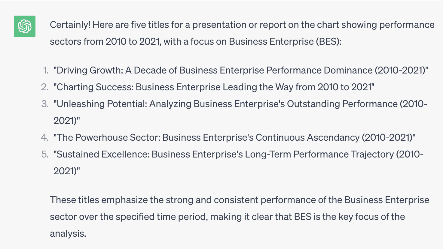
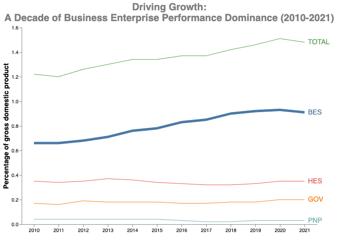
If you run the same prompt again, ChatGPT will generate another five titles. For example, we can choose the first title, Driving Growth: A Decade of Business Enterprise Performance Dominance (2010-2021), and set it as the title of our chart:
chart = alt.Chart(df).mark_line().encode(
   …
).properties(
    width=600,
    height=400,
    title=['Driving Growth:',
        'A Decade of Business Enterprise Performance Dominance (2010-2021)']
)
The following figure shows the resulting chart:
The chart is almost ready. To improve our chart readability and engage our audience emotionally, we can add an image.
Adding images: DALL-E
DALL-E is a generative AI model created by OpenAI. It combines the power of GPT-3 with image generation capabilities, allowing it to create realistic images from textual descriptions. To use DALL-E, you must set up an account on the Open AI website and buy some credits.
Different ways exist to structure a prompt for DALL-E. In this article, we consider a prompt composed of:
- [Subject]
- [Style].
In our case, we can generate a generic image with the following topic: a black and white icon representing research and development expenditure.
The following figure shows a possible output generated by DALL-E:

Let’s choose the third image and add it to the chart, as shown in the following code snippet:
df_red = pd.DataFrame({'url': ['red.png']})

red = alt.Chart(df_red).mark_image(
    align='center',
    baseline='top',
    width=300,
    height=300
).encode(
    url='url'
)

chart = (red | chart + text)
To view the image in the chart, you must run it in a web server. Run the following Python command from the directory containing the HTML file to run a simple web server: python3 -m http.server, and then point to localhost:8000/chart.html. You should see a chart similar to the following:

You can customize your chart as you prefer. For example, you can generate an icon for each performance sector.
Congratulations! You have just learned to use generative AI tools to empower your data visualization charts!
- First, write your basic chart using GitHub Copilot.
- Next, use ChatGPT to generate textual descriptions for your chart, such as the title and the annotations.
- Finally, use DALL-E to generate images to include in your chart to improve readability and engage the audience.
You can download the full code described in this example from this GitHub repository. In addition, you can find more details on how to use generative AI in data storytelling in [1].
References
[1] A. Lo Duca.Data Storytelling with Generative AI using Python and Altair. Manning Publications.
[2] A. Lo Duca. Using Python Altair for Data Storytelling. Educative Inc.
Angelica Lo Duca (Medium) (@alod83) is a researcher at the Institute of Informatics and Telematics of the National Research Council (IIT-CNR) in Pisa, Italy. She is a professor of “Data Journalism” for the Master degree course in Digital Humanities at the University of Pisa. Her research interests include Data Science, Data Analysis, Text Analysis, Open Data, Web Applications, Data Engineering, and Data Journalism, applied to society, tourism, and cultural heritage. She is the author of the book Comet for Data Science, published by Packt Ltd., of the upcoming book Data Storytelling in Python Altair and Generative AI, published by Manning, and co-author of the upcoming book Learning and Operating Presto, by O’Reilly Media. Angelica is also an enthusiastic tech writer.
- SEO Powered Content & PR Distribution. Get Amplified Today.
- PlatoData.Network Vertical Generative Ai. Empower Yourself. Access Here.
- PlatoAiStream. Web3 Intelligence. Knowledge Amplified. Access Here.
- PlatoESG. Carbon, CleanTech, Energy, Environment, Solar, Waste Management. Access Here.
- PlatoHealth. Biotech and Clinical Trials Intelligence. Access Here.
- Source: https://www.kdnuggets.com/how-generative-ai-can-help-you-improve-your-data-visualization-charts?utm_source=rss&utm_medium=rss&utm_campaign=how-generative-ai-can-help-you-improve-your-data-visualization-charts

