Overview
Many CSS properties accept numbers as values. Sometimes those are whole numbers. Sometimes they’re decimals and fractions. Other times, they’re percentages. Whatever they are, the unit that follows a number determines the number’s computed length. And by “length” we mean any sort of distance that can be described as a number, such as the physical dimensions of an element, a measure of time, geometric angles… all kinds of things!
At the time of this writing, the CSS Values and Units Module Level 4 specification defines a bunch of different CSS units — and many of those are relatively new (this pun will make sense later).
Quick Reference
Absolute units
| Unit | Name |
|---|---|
cm |
Centimeters |
mm |
Millimeters |
Q |
Quarter-millimeters |
in |
Inches |
pc |
Picas |
pt |
Points |
px |
Pixels |
Font units
| Unit | Relative to… |
|---|---|
| em | The font size of the element, or its nearest parent container |
| ex | The x-height of the element’s font |
| cap | The cap height (the nominal height of capital letters) of the element’s font |
| ch | The width of the 0 character of the font in use |
| ic | The average width of a full glyph of the font in use, as represented by the “水” (U+6C34) glyph |
| rem | The font-size value that’s set on the root (html) element |
| lh | The line-height value that’s set on the element |
| rlh | The line-height that’s set on the root (html) element |
| vw | 1% of viewport’s width |
| vh | 1% of viewport’s height |
| vi | 1% of viewport’s size in the root element’s inline axis |
| vb | 1% of viewport’s size in the root element’s block axis |
| vmin | Equal to 1% of the vw or vh, whichever is smaller |
| vmax | Equal to 1% of the vw or vh, whichever is larger |
Viewport units
vw |
1% of viewport’s width |
vh |
1% of viewport’s height |
vi |
1% of viewport’s size in the root element’s inline axis |
vb |
1% of viewport’s size in the root element’s block axis |
vmin |
1% of the vw or vh, whichever is smaller |
vmqx |
1% of the vw or vh, whichever is larger |
Container units
| Unit | Relative to |
|---|---|
cqw |
1% of a query container’s width |
cqh |
1% of a query container’s height |
cqi |
1% of a query container’s inline size |
cqb |
1% of a query container’s block size |
cqmin |
The smaller value of cqi or cqb |
cqmax |
The larger value of cqi or cqb |
Angle units
| Unit | Description |
|---|---|
deg |
There are 360 degrees in a full circle. |
grad |
There are 400 gradians in a full circle. |
rad |
There are 2π radians in a full circle. |
turn |
There is 1 turn in a full circle. |
Time units
| Unit | Description |
|---|---|
s |
There are 60 seconds in a minute, but there is no unit for minutes. |
ms |
There are 1,000 milliseconds in a second. |
Fractional units
| Unit | Description |
|---|---|
fr |
One fraction of the free space in a grid container. |
Resolution units
| Unit | Description |
|---|---|
dpi |
Dots per inch |
dpcm |
Dots per centimeter |
dppx, x |
Dots per pixel unit |
Frequency units
| Unit | Description |
|---|---|
Hz |
Represents the number of occurrences per second |
kHz |
One kiloHertz is equal to 1000 Hertz. |
Table of contents
Introduction
You’re going to see a lot numbers in CSS. Here are a few examples?
/* Integers */
1

/* Pixels */
14px

/* em */
1.5em

/* rem */
3rem

/* Percentage */
50%

/* Characters */
650ch

/* Viewport units */
100vw
80vh
50dvh

/* Container units */
100cqi
50cqb
While these all mean different things, they essentially do the same thing: define an element’s dimensions in CSS. We need units in CSS because they determine how to size elements on a page, whether it’s the height of a box, the width of an image, the font-size of a heading, the margin between two elements, how long an animation runs, etc. Without them, the browser would have no way of knowing how to apply numbers to an element.
So, what the heck is px? What’s up with this thing called rem? How are these different than other length units? The unit defines what type of number we’re dealing with, and each one does something different, giving us lots of ways to size things in CSS.
Types of numbers
You may think a number is just a number, and you’re not wrong. Numbers are numbers! But we can distinguish between a few different types of numbers, which is helpful context for discussing the different types of units we attach them to since “number” can mean, well, a number of different things.
- Integers (literally a unit-less number, e.g.
3) - Numbers (same as an integer, only measured in decimals, e.g.
3.2) - Dimensions (either a number or integer with a unit, e.g.
3.2rem) - Ratios (the quotient between two divided numbers, e.g.
3/2) - Percentages (e.g.
3%)
Got that? They’re all numbers but with nuances that make them ever-so-slightly different.
From here, we can think of numbers in CSS as falling into two specific types of units: absolute and relative. Let’s start things off our deep dive on CSS length units by breaking those down.
Absolute units
An absolute unit is like Bill Murray in the movie Groundhog Day: it’s always the same. In other words, whatever the number is, that’s exactly how it computes in the browser regardless of how other elements are sized.
The most common absolute value you’ll see is the pixel value. It’s sort of hard to define, but a pixel is the smallest building block of a graphical display, like a computer screen. And it’s based on the resolution of the screen. So, if you’re on a super high-resolution screen, a pixel will be smaller than it would be on a low-resolution screen, as the resolution can pack more pixels into a smaller amount of space for higher clarity. But look at the example below. All of the boxes are sized with pixels, so you can get a sense of how large 50px is compared to 250px.
Absolute values are nice in that they are predictable. That could, however, change in some situations, particularly when it comes to zooming. If, say, a user zooms into a page using browser settings, then anything defined with an absolute value is going to increase its absolute size accordingly. So, if the font-size of a paragraph is set to 20px, the paragraph is going to be larger as the user zooms closer into the page. And because zooming is often used to make content more readable, using absolute values that retain their sizing could be a good approach for making pages more accessible by allowing users to zoom things up to a spot that more comfortable to read.
But then again, see Josh Collinsworth’s click-baity, but fantastic, post titled “Why you should never use px to set font-size in CSS” for an exhaustive explanation of how pixels behave when used to set the font-size of an element. It’s a great read to better understand the behavior and limitations of pixel units.
And, hey: pixels are only one of many types of absolute lengths that are available in CSS. In fact, we can group them by the types of things they measure:
Length units
Length units are a little funny because they can technically be either an absolute unit or a relative unit. But we’re discussing them in absolute terms at the moment and will revisit them when we get further along to relative length units.
A length is essentially a dimension, which is any integer proceeded by a unit, according to the list of types of numbers we looked at earlier. And when we talk about dimensions, we’re really talking about the physical size of an element.
| Unit | Name |
|---|---|
cm |
Centimeters |
mm |
Millimeters |
Q |
Quarter-millimeters |
in |
Inches |
pc |
Picas |
pt |
Points |
px |
Pixels |
What we’re looking at here are the types of units you might use see on a tape measure (e.g., cm and in) or in print design (e.g. pc and pt). They are what they are and what you see is what you get.
Angle units
Angle units are purely geometric. They’re good for setting shape dimensions — like a circle’s radius, setting the direction of a linear-gradient(), or setting the how much we want to rotate() something.
| Unit | Name | Description | Example |
|---|---|---|---|
deg |
Degrees | A full circle is equal to 360deg. |
rotate(180deg) |
grad |
Gradiens | A full circle is equal to 400grad. |
rotate(200grad) |
rad |
Radiens | A full circle is equal to 2π (i.e., 2 × 3.14), or about 6.2832rad. |
rotate(3.14rad) |
turn |
Turns | A full circle is 1turn, like a bicycle wheel making one full rotation. |
rotate(.5turn) |
Time units
Time units are what you’d expect to find on a clock or watch, but only measure in seconds and milliseconds. Apparently the web cannot be measured in minutes, hours, days, weeks, months, or years. Perhaps we’ll get a new category of “calendar units” at some point, or maybe there’s no good use case for that sort of thing. 🤷♂️
| Unit | Name | Description | Example |
|---|---|---|---|
s |
Seconds | One full minute of time is equal to 60s. |
animation-duration: 2s |
ms |
Milliseconds | One full second of time os equal to 1000ms. |
animation-duration: 2000ms |
Frequency units
You won’t see frequency units used very often and for good reason: they’re not supported by any browser at the time of this writing. But they’re specced to change sound frequency, such as a sound’s pitch. The best I can make of it as it currently stands is that frequencies can be used to manipulate an audio file with a higher or lower pitch measured in hertz and kilohertz.
| Unit | Name | Description | Example |
|---|---|---|---|
Hz |
Hertz | Measures the number of frequencies per second | |
kHz |
Kilohertz | A value of 1Hz is equal to 0.001kHz. |
|
If you’re wondering what constitutes a “low” pitch from a “high” one, the spec explains it like this:
[W]hen representing sound pitches, 200Hz (or 200hz) is a bass sound, and 6kHz (or 6khz) is a treble sound.
Resolution units
Resolution is how many little dots are packed into a screen — such as the screen you’re looking at right now — where more dots per inch of space improves the clarity and quality of the display. The fewer dots there are, the more pixelated and blurry the display.
Why would you need something like this? Well, it’s great for targeting styles to specific screens that support certain resolutions in a media query.
img {
  max-width: 500px;
}

/* Double the resolution and above */
@media (min-resolution >= 2dppx) {
  img {
    max-width: 100%;
  }
}| Unit | Name | Description | Example |
|---|---|---|---|
dpi |
Dots per inch | The number of dots packed into one inch of space. | @media |
dpcm |
Dots per centimeter | The number of dots packed into one centimeter of space. | @media |
dppx (or x) |
Dots per pixel | The number of dots packed into one pixel of space. | @media |
Interestingly, the specification makes mention of an infinite value that is supported by resolution media queries for targeting screens without resolution constraints. It’s not so much of a “catch-all” value for targeting any sort of screen, but for cases when we’re using the media query range syntax to evaluate whether a certain value is greater than, less than, or equal to it:
For output mediums that have no physical constraints on resolution (such as outputting to vector graphics), this feature must match the infinite value. For the purpose of evaluating this media feature in the range context, infinite must be treated as larger than any possible <resolution>. (That is, a query like (resolution > 1000dpi)will be true for an infinite media.)
Relative units
A relative unit is extremely well-named because whatever value we use for a relative unit depends on the size of something else. Say we have an HTML element, a <div>, and we give it an absolute height value (not a relative one) of 200px.
<div class="box">
  I am 200 pixels tall
</div>
.box {
height: 200px;
}That height will never change. The .box element will be 200px tall no matter what. But let’s say we give the element a relative width (not an absolute one) of 50%.
<div class="box">
  I am 200 pixels tall and 50% wide
</div>
.box {
height: 200px;
width: 50%;
}What happens to our box? It takes up 50%, or half, of the available space on the screen.
See that? Go ahead and open that demo in a new window and change the width of the screen. And notice, too, how the height never changes because it’s an absolute length unit in pixels. The width, meanwhile, is fluidly resized as “50% of the available space” changes with the width of the screen.
That’s what we mean when talking about computed values with relative numbers. A relative number acts sort of like a multiplier that calculates the value used to set a length based on what type of unit it is relative to. So, a value of 3rem is going to wind up becoming a different value when it is computed.
Percentages, like 50%, are only one kind of relative unit. We have many, many others. Once again, it’s helpful to break things out into separate groups to understand the differences just as we did earlier with absolute units.
Percentages
We’ve already discussed percentages in pretty good detail. What makes a percentage relative is that it computes to a number value based on the length of another element. So, an element that is given width: 25% in a container that is set to width: 1000px computes to width: 250px.
| Unit | Name | Relative to… |
|---|---|---|
% |
Percent | The size of the element’s parent container. |
Font relative units
The em and rem units we looked at earlier are prime examples of relative units that you will see all over the place. They’re incredibly handy, as we saw, because changing the font-size value of an element’s parent or the <html> element, respectively, causes the element’s own font-size value to update in accordance with the updated value.
In other words, we do not need to directly change an element’s font-size when updating the font-size of other elements — it’s relative and scales with the change.
| Unit | Name | Relative to… |
|---|---|---|
em |
Element | The font-size value of the element’s parent container. |
rem |
Root element | The font-size value of the <html> element. |
ch |
Character | The width of one character of content relative to the parent element’s font. The computed width may update when replacing one font with another, except for monospace fonts that are consistently sized. |
rch |
Root character | The same thing as a ch unit except it is relative to the font of the root element, i.e. <html>. |
lh |
Line height | The line-height value of the element’s parent container. |
rlh |
Root element line height | The line-height value of the <html> element. |
cap |
Capital letter | The height of a capital letter for a particular font relative to the parent element. |
rcap |
Root capital letter | The same measure as cap but relative to the root element, i.e. <html>. |
ic |
International character | The width of a CJK character, or foreign glyph, e.g. from a Chinese font, relative to an element’s parent container. |
ric |
Root international character | The same measure as ic but relative to the root element, i.e. <html>. |
ex |
X-height | The height of the letter x of a particular font, or an equivalent for fonts that do not contain an x character, relative to the parent element. |
rex |
Root x-height | The same measure as ex but relative to the root element, i.e. <html>. |
Some of those terms will make more sense to typography nerds than others. The following diagram highlights the lines that correspond to relative font units.
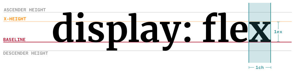
So, at the expense of beating this concept into the ground, if width: 10ch computes to a certain number of pixels when using one font, it’s likely that the computed value will change if the font is swapped out with another one with either larger or smaller characters.
Viewport relative units
| Unit | Name | Relative to… |
|---|---|---|
vh / vw |
Viewport Height / Viewport Width | The height and width of the viewport (i.e., visible part of the screen), respectively. |
vmin / vmax |
Viewport Minimum / Viewport Maximum | The lesser and greater of vh and vw, respectively. |
lvh / lvw |
Large Viewport Height / Large Viewport Width | The height and width of the viewport when the device’s virtual keyboard or browser UI is out of view, leaving a larger amount of available space. |
lvb / lvi |
Large Viewport Block / Large Viewport Inline | These are the logical equivalents of lvh and lvw, indicating the block and inline directions. |
svh / svw |
Small Viewport Height / Small Viewport Width | The height and width of the viewport when the device’s virtual keyboard or browser UI is in view, making the amount of available space smaller. |
svb / svi |
Small Viewport Block / Small Viewport Inline | These are the logical equivalents of svh and svw, indicating the block and inline directions. |
dvh / dvw |
Dynamic Viewport Height / Dynamic Viewport Width | The height and width of the viewport accounting for the available space changing if, say, the device’s virtual keyboard or browser UI is in view. |
dvb / dvi |
Dynamic Viewport Block / Dynamic Viewport Inline | These are the logical equivalents of dvh and dvw, indicating the block and inline directions. |
dvmin / dvmax |
Dynamic Viewport Minimum / Dynamic Viewport Maximum | The lesser and greater of dvh/dvb and dvw/dvi, respectively. |
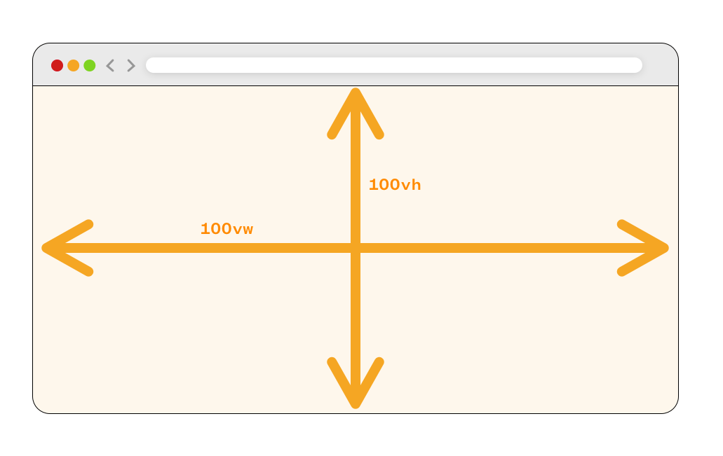
Ah, viewport units! When we say that something should be 100% wide, that means it takes up the full width of the contain it is in. That’s because a percentage unit is always relative to its nearest parent element. But a viewport unit is always relative to the size of the viewport, or browser window. If an element has a viewport height of 100vh and a viewport width of 100vw, then it will be as tall and wide as the full browser window.
This can be a neat way to create something like a hero banner at the top of your website. For example, we can make a banner that is always one half (50vh) the height of the viewport making it prominent no matter how tall someone’s browser is. Change the CSS in the top-left corner of the following demo from height: 50vh to something else, like 75vh to see how the banner’s height responds.
There’s something else that’s very important to know when working with viewport units. You know how mobile phones, like iPhone or an Android device, have virtual keyboards where you type directly on the screen? That keyboard changes the size of the viewport. That means that whenever the keyboard opens, 100vh is no longer the full height of the screen but whatever space is leftover while the keyboard is open, and the layout could get super squished as a result.
That’s why we have the svh, lvh, and dvh units in addition to vh:
svhis equal to the “small” viewport height, which occurs when the keyboard is open.lvhis equal to the “large” viewport height, which is when the keyboard is disabled and out of view.dvhis a happy medium betweensvhandlvhin that it is “dynamic” and updates its value accordingly when the keyboard is displayed or not.dvmin/dvmaxis the greater ore lesser ofdvh, respectively.
It’s a bit of a tightrope walk in some cases and a good reason why container queries and their units (which we’ll get to next) are becoming more popular. Check out Ahmed Shader’s article “New Viewport Units” for a comprehensive explanation about viewport units with detailed examples of the issues you may run into. You may also be interested in Sime Vidas’s “New CSS Viewport Units Do Not Solve The Classic Scrollbar Problem” for a better understanding of how viewport units compute values.
Container relative units
| Unit | Name | Equivalent to… |
|---|---|---|
cqw |
Container query width | 1% of the queried container’s width |
cqh |
Container query height | 1% of the queried container’s height |
cqi |
Container query inline size | 1% of the queried container’s inline size, which is its width in a horizontal writing mode. |
cqb |
Container query block size | 1% of the queried container’s inline size, which is its height in a horizontal writing mode. |
cqmin |
Container query minimum size | The value of cqi or cqb, whichever is smaller. |
cqmax |
Container query maximum size | The value of cqi or cqb, whichever is larger. |
Container units are designed to be used with container queries. Just as we are able to target a specific screen size with a media query, we can target the specific size of a particular element and apply styles using a container query.
We won’t do a big ol’ deep dive into container queries here. The relevant bit is that we have CSS length units that are relative to a container’s size. For example, if we were to define a container:
.parent-container {
  container-type: inline-size;
}
…then we’re watching that element’s inline-size — which is equivalent to width in a horizontal writing mode — and can apply styles to other elements when it reaches certain sizes.
.child-element {
  background: rebeccapurple;
  width: 100%;

  @container parent (width > 30ch) {
    .child-element {
      background: dodgeblue;
      width: 50cqi;
    }
  }
}
Try resizing the following demo. When the parent container is greater than 30ch, the child element will change backgrounds and shrink to one-half the parent container’s width, or 50cqi.
What about unit-less numbers?
Oh yeah, there are times when you’re going to see numbers in CSS that don’t have any unit at all — just a single integer or number without anything appended to it.
aspect-ratio: 2 / 1; /* Ratio */
column-count: 3; /* Specifies a number of columns */
flex-grow: 1; /* Allows the element to stretch in a flex layout */
grid-column-start: 4; /* Places the element on a specific grid line */
order: 2; /* Sets the order of elemnents in a flex or grid layout */
scale: 2; /* The elementis scaled up or down by a factor */
z-index: 100; /* Element is placed in a numbered layer for stacking */
zoom: 0.2;  /* The element zooms in or out by a factor */
This isn’t a comprehensive list of all the CSS properties that accept unit-less numeric values, but it is a solid picture of when you would use them. You’ll see that in most cases a unit-less number is an explicit detail, such as a specific column to position an element, a specific layer in a stacking context, a boolean that enables or disables a feature, or the order of elements. But note that anytime we declare “zero” as a number, we can write it with or without a prepended unit, as zero always evaluates to zero no matter what unit we’re dealing with.
border: 0; /* No border */
box-shadow: 0 0 5px #333; /* No shadow offset */
margin: 0; /* No margin */
padding: 0; /* No padding */
We can create our own custom units!
In some cases, we may want to work with a numeric value, but CSS doesn’t exactly recognize it as one. In these cases, the number is recognized as a “string” value instead, regardless of whether or not it contains alphabetical characters. That’s where we can use @property to create what’s called a “custom property” that evaluates a numeric value in a certain way.
Here’s a good example. There was a time when it was virtually impossible to animate a gradient that changes colors over time because to do so would require (1) a color function that allows us to change a color value’s hue (which we have with hsl()) and (2) being able to interpolate that hue value around the color spectrum, between a range of 0deg and 360deg.
Sounds simple enough, right? Define a variable that starts at 0 and then cycles through 360 degrees at the end of an animation. But this doesn’t work:
/* 👎 */
.element {
  --hue: 0;

  animation: rainbow 10s linear infinite;
  background: linear-gradient(hsl(--hue 50% 50%);
}

@keyframes rainbow {
  from { --huw: 0; }
  to { --hue: 360deg; }
}
That’s because CSS reads the variable as a string instead of a number. We have to register that variable as a custom property so that CSS aptly reads it as a numeric value.
@property --hue {
  syntax: "<number>";
  initial-value: 0;
  inherits: true;
}
There we go! Now that we’ve given CSS a hint that the --hue syntax is that of a <number>, we can animate away!
/* 👍 */
@property --hue {
  syntax: "<number>";
  initial-value: 0;
  inherits: true;
}

.element {
  --hue: 0;

  animation: rainbow 10s linear infinite;
  background: linear-gradient(hsl(--hue 50% 50%);
}

@keyframes rainbow {
  from { --huw: 0; }
  to { --hue: 360deg; }
}
Find a deeper explanation of this same example in “Interpolating Numeric CSS Variables” by Geoff Graham.
When to use one unit over another
This is super tricky because CSS is extremely flexible and there are no definitive or hard-and-fast rules for when to use a specific type of CSS length unit over another. In some cases, you absolutely have to use a specific unit because that’s how a certain CSS feature is specced, like using angle units to set the direction of a linear gradient:
.element {
  background: linear-gradient(
    135deg, red, blue;
  )
}
The same goes for the values we use in certain color functions, like using percentages to set the saturation and lightness levels in the hsl() function:
.element {
  background: hsl(0 100% 10%);
}
Speaking of color functions, we define alpha transparency with either an integer or number:
.element {
  background: hsl(0 100% 10% / 0.5); /* or simply .5 */
}
All that being said, many cases are going to be some degree of “it depends” but there are some instances where it makes sense to use a specific unit in your work.
Generally set font sizes in rem and em units
This way, you can set things up in a way where changing the font-size value of the <html> or a parent element updates the font sizes of their descendants.
html {
  font-size: 18px; /* Inherited by all other elements */
}

.parent {
  font-size: 1rem; /* Updates when the `html` size changes */
}

.child {
  font-size: 1em; /* Updates when the parent size changes */
}
Declare “zero” without units if you’d like
It’s not a big deal or anything, but leaving off the units shortens the code a smidge, and anytime we’re able to write shorter code it’s an opportunity for faster page performance. The impact may be negligible, but we’re able to do it since 0 always computes to 0, no matter what unit we’re working with.
Use container units for responsive design, where possible
Container queries in general are so gosh-darn great for responsive layouts because they look at the size of the container and let us apply styles to its descendants when the container is a certain size.
.parent {
  container: my-container / inline-size; /* Looks at width */
}

.child {
  display: flex;
  flex-direction: column;
  max-width: 100vh; /* 100% of the viewport */
}

/* When the container is greater than 600px wide */
@container my-container (width >= 600px) {
  .child {
    flex-direction: row;
    max-width: 50%; /* 50% of the parent elenent */
  }
}
So, if we going to size the .child element — or any of its children — it’s worth specifying sizes in relation to the container’s size with container units than, say, the viewport’s size with viewport units.
.parent {
  container: my-container / inline-size; /* Looks at width */
}

.child {
  display: flex;
  flex-direction: column;
  max-width: 100cqi; /* 100% of the container */
}

/* When the container is greater than 600px wide */
@container my-container (width >= 600px) {
  .child {
    flex-direction: row;
    max-width: 50cqi; /* 50% of the container */
  }
}
Use percentages when you’re unsure of the context
Yes, use container units for responsive design, but that only does you good if you know you are in the context of a container. It’s possible, though, that you use the same component in different places, and one of those places might not be a registered container.
In that case, go with a percentage value because percentages are relative to whatever parent element you’re in, regardless of whether or not it’s a container. This way, you can declare an element’s size as 100% to take up the full space of whatever parent element contains it.
The only word of caution is to note that we’re only basing the size on the parent. Meanwhile, container units can style any descendant in the container, no matter where it is located.
Viewport units are great for laying out containers
You may be thinking that viewport units are a bad thing since we’ve been advising against them in so many cases, like font sizing, but they are still incredibly useful, particularly when it comes to establishing a full-page layout.
I say “full-page” layout because container queries are the gold standard for sizing elements according to the space they have in their container. But if we’re working with a full page of containers, this is where viewport units can be used to establish a responsive layout at a higher level.
If the elements of individual containers look at their container for sizing information, then the sizing and placement of individual containers themselves probably ought to look at the viewport since it directly influences the amount of space on the page.
Examples
Element (em) and Relative element (rem) units
Let’s talk specifically about these two little buggers. We saw how a percentage unit calculates its size by the size of something else. em and rem units are sort of the same, but they are calculated based on the relative font size of specific elements.
Let’s start with em units and say we have an HTML element, a <div> with a .box class, and we set its font size to 20px. That means any text inside of that element is 20px.
Great, now what if we decide we need additional text in the box, and give it a relative font size of 1.5em?
See how a font size of 1.5em is larger than the 20px text? That’s because the larger text is based on the box’s font size. Behind the scenes, this is what the browser is calculating:
20px * 1.5 = 30pxSo, the relative font size is multiplied by the pixel font size, which winds up being 30px.
And guess what? rem units do the exact same thing. But instead of multiplying itself by the pixel font size of the parent container, it looks at the pixel font size of the actual <html> element. By default, that is 16px.
/* This is the browser's default font size */
html {
  font-size: 16px;
}

.box {
  font-size: 1.5rem; /* 16px * 1.5 = 24px */
}
And if we change the HTML element’s font size to something else?
html {
  font-size: 18px;
}

.box {
  font-size: 1.5rem; /* 18px * 1.5 = 27px */
}
Character unit (ch)
The character unit (ch) is another is another unit relative to font size and, while it isn’t used all that often, it is amazingly great at sizing things based on the amount of content displayed in an element, because one character unit equals the width of one character of content. Here’s how I wrap my own head around it. If we have this in our HTML:
<p>The big brown dog lazily jumped over the fence.</p>…and this CSS:
p {
  width: 10ch;
}
What we get is a paragraph that is 10 characters wide. That means the text will break after the tenth character, including spaces.
But note that the words themselves do not break. If the content is supposed to break after 10 characters, the browser will start the next line after a complete word instead of breaking the word into multiple lines, keeping everything easy to read.
If you’re wondering when you might reach for the ch unit, it’s absolutely boss at establishing line lengths that are more pleasant and legible, especially for long form content like this guide you’re reading.
Line height unit (lh)
The line-height unit (lh) looks at the line-height property value of the element’s containing (i.e., parent) element and uses that value to size things up.
.parent {
  line-height: 1.5;
}

.child {
  height: 3lh; /* 3 * 1.5 = 4.5 */
}
When would you use this? Personally, I find lh useful for setting an exact height on something based on the number of lines needed for the text. You can see this clearly demonstrated in Temani Afif’s “CSS Ribbon” effect that uses lh to establish dimensions for each row of text that makes for consistently-sized lines that adapt to whatever the parent element’s font-size value happens to be,
Related Articles
Absolute vs. Relative Units
Container Units
Viewport Units
Article
on
Dec 21, 2017
“The Notch” and CSS
Article
on
Mar 25, 2020
CSS Viewport Units
Article
on
May 18, 2020
CSS fix for 100vh in mobile WebKit
Article
on
May 23, 2022
Fun with Viewport Units
Article
on
Aug 9, 2021
The Large, Small, and Dynamic Viewports
Article
on
Jun 5, 2015
Viewport vs Percentage Units
Article
on
Nov 15, 2022
Viewport Sized Typography
Article
on
Nov 6, 2019
Some Things You Oughta Know When Working with Viewport Units
Article
on
Jun 24, 2015
Viewport sized typography with minimum and maximum sizes
Article
on
Jan 5, 2018
`font-size` With All Viewport Units
Article
on
Jun 28, 2021
Working around the viewport-based fluid typography bug in Safari
Typography
Article
on
Apr 23, 2020
Accessible Font Sizing, Explained
Article
on
May 19, 2020
Simplified Fluid Typography
Article
on
Apr 13, 2017
There’s more to the CSS rem unit than font sizing
Article
on
Dec 17, 2015
Font Size Idea: px at the Root, rem for Components, em for Text Elements
Article
on
May 5, 2020
`lh` and `rlh` units
Article
on
Nov 15, 2022
Viewport Sized Typography
Article
on
Jan 5, 2018
`font-size` With All Viewport Units
Article
on
Jun 24, 2015
Viewport sized typography with minimum and maximum sizes
Angle Units
Time Units
Article
on
Jan 7, 2017
CSS Animation Tricks: State Jumping, Negative Delays, Animating Origin, and More
Article
on
Jan 9, 2018
Making CSS Animations Feel More Natural
Article
on
Dec 9, 2010
CSS Transition Timing
Article
on
Aug 14, 2019
Staggered CSS Transitions
Article
on
Sep 6, 2022
Hacking CSS Animation State and Playback Time
Article
on
Aug 3, 2015
Debugging CSS Keyframe Animations
Article
on
Sep 19, 2022
Making a Real-Time Clock With a Conic Gradient Face
Resolution Units
- SEO Powered Content & PR Distribution. Get Amplified Today.
- PlatoData.Network Vertical Generative Ai. Empower Yourself. Access Here.
- PlatoAiStream. Web3 Intelligence. Knowledge Amplified. Access Here.
- PlatoESG. Carbon, CleanTech, Energy, Environment, Solar, Waste Management. Access Here.
- PlatoHealth. Biotech and Clinical Trials Intelligence. Access Here.
- Source: https://css-tricks.com/css-length-units/