This article was published as a part of the Data Science Blogathon.
Introduction to Power BI
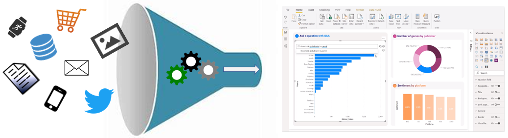
In today’s data-driven age, a large amount of data gets generated daily from various sources such as supply chain and logistics, emails and multi-media, e-commerce websites, healthcare, transaction processing systems, etc. The data generated from the above sources can generate meaningful insights in Power BI by building and publishing reports and dashboards.
Source: https://docs.microsoft.com/en-us/learn/modules/data-analytics-microsoft/1-introduction
Power BI is one of the most popular data visualization, business intelligence, and analytics software product developed by Microsoft. It reports can be easily embedded in web applications or shared as a public link or pdf file. It provides insights from a variety of data sources, such as Dataverse, SQL Server, Azure, Excel, SAP, Snowflake, Teradata database, etc. by telling stories using reports and dashboards from data models.
Source: https://docs.microsoft.com/en-us/power-bi/connect-data/desktop-tutorial-importing-and-analyzing-data-from-a-web-page
You can clean, transform and shape the data from multiple data sources using Power Query Editor so that the Power BI report developed using this data provide better decision-making and streamlined business practices. Its Desktop comes with Power Query Editor, where users can modify and transform the data into the shape they want. You can generate an insightful report with the help of Power BI built-in and custom visuals.
Source: https://docs.microsoft.com/en-us/power-bi/transform-model/desktop-query-overview
Data modeling and data analytics go hand in hand because a quality data model will provide impactful analytics for businesses. Data modeling is the process of analyzing, creating, and defining data model and their relationship to other data models. Data modeling helps people to understand the logical structure of data within a database.
In this guide, I’ll show you how to build and publish a superstore
sales and profit report in Power BI using the US superstore retail transaction data to get valuable insights about sales and profits. Superstore retail transaction data available on Kaggle gives insights into online orders of a superstore in the US.
What is Power BI?
Power BI is one of the most popular data visualization, business intelligence, and analytics software product developed by Microsoft. Power BI provides insights from a variety of data sources, such as Oracle, SAP Databases, SQL Server, Azure, Excel, Impala, Google Big Query, Snowflake, and Teradata databases, etc. by building and publishing reports and dashboards. Power BI consists of the following:
a. Power BI Desktop – a Microsoft Windows desktop application
b. Power BI Service – an online SaaS (Software as a Service) service
c. Power BI Mobile apps – available on any device, with native mobile BI apps for Windows, iOS, and Android.

Source: https://powerbi.microsoft.com/en-us/desktop/
Building Blocks of Power BI
The building blocks of Power BI are:
1. Visualizations: A visualization is a visual representation of data, such as tables, column charts, scatter charts, gradient-colored maps, etc., which can be used to visually represent your data.
2. Datasets: Power BI uses datasets for creating visuals. A dataset can be a single data source or a combination of multiple data sources like Web, Dataverse, CSV, etc. For example, you can create a dataset from three database fields, i.e., one SQL Server table, an Excel table, and online results of a promotional marketing campaign. Power BI has built-in connectors which help users easily connect to services such as MailChimp, Facebook, etc.
Source: https://learn.microsoft.com/en-us/power-bi/consumer/end-user-basic-concepts
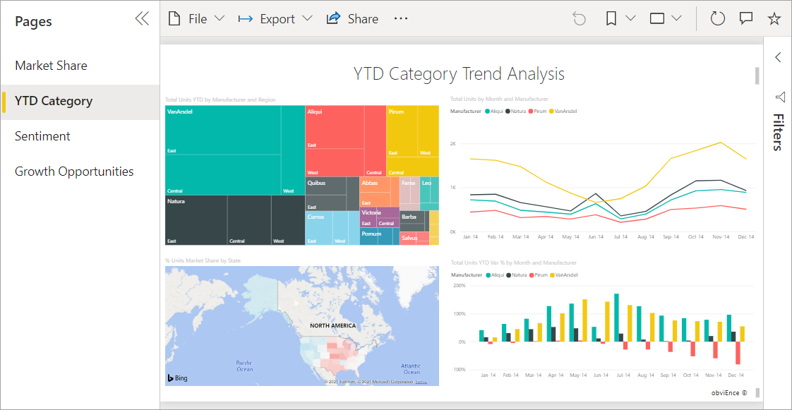
3. Reports: Reports are a collection of visualizations related to each other that appears together on a page. The report can be developed either using Power BI Report Builder, Power BI Service or Power BI Desktop. A report may contain more than a page. For example, the Power BI report was developed to analyze an organization’s quarterly sales.
Source: https://learn.microsoft.com/en-us/power-bi/consumer/end-user-basic-concepts
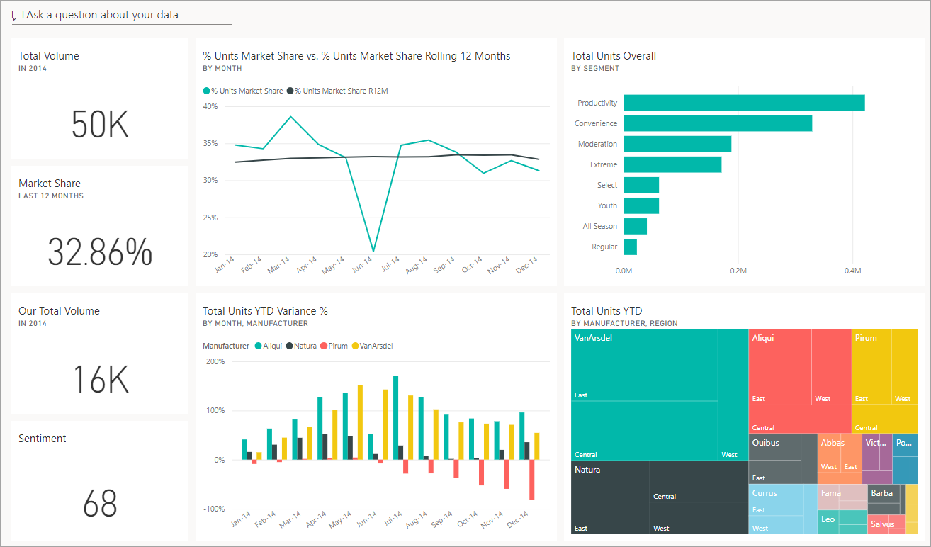
4. Dashboards: Dashboards are single-page presentations having one or more visualizations added to them, which you can share with others. The dashboard provides quick insight into the story user is trying to present. Dashboards can be shared with other users or groups, who can then interact with your dashboards when they’re in the Power BI service or on their mobile devices. For example, the Sales dashboard can have donut charts, KPI scorecards, area charts, bar charts, maps, etc.
Source: https://learn.microsoft.com/en-us/power-bi/consumer/end-user-basic-concepts
5. Tiles: A tile is a rectangular box with visuals like cards, pie charts, etc.
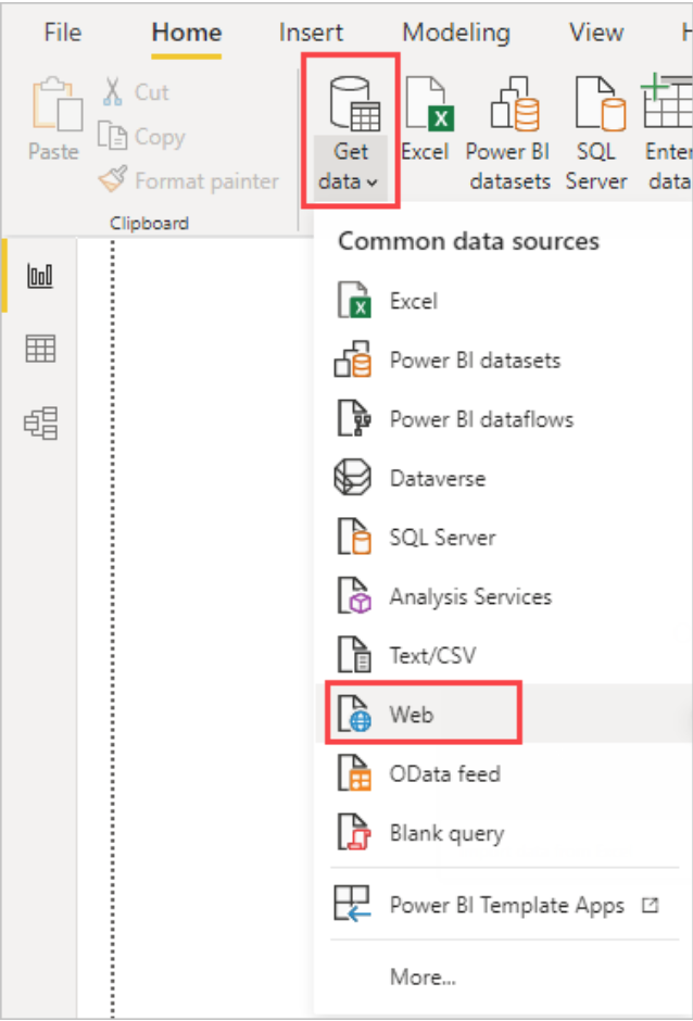
Connect to Data Sources in Power BI
The get data option is used for loading data for visualization and analysis. Developers can either load the data first or perform a data transformation before loading the data. The get data option is used to connect to different data sources and is present in the Home tab on the Power BI desktop. Users can import data from Azure Synapse Analytics SQL, Excel, Text/CSV, Web, Amazon RedShift, Oracle, MySQL, Snowflake, SAP databases, Google BigQuery, MariaDB, SharePoint List, etc., in Power BI.
Source:https://docs.microsoft.com/en-us/power-bi/connect-data/desktop-tutorial-importing-and-analyzing-data-from-a-web-page
Dataset Connectivity Modes in Power BI
Below are the three dataset connectivity modes available in Power BI:
1. Import mode: Import mode imports the data from the data source and stores it in the disk, thus, has fast performance. By default, the data is imported using import mode in Power BI.
The data must be fully loaded in import mode during the querying or data refreshing process.
2. Direct Query Mode: Direct Query mode directly retrieves data from underlying data sources with the help of native queries. This mode doesn’t import data but directly uses the data from the underlying data source. Direct Query mode is used when the data is nearly real-time and large in volume.
3. Composite Mode: Composite mode can combine imported datasets by Import and Direct Query modes or integrate various Direct Query data. It gives the best performance among the different dataset connectivity modes.
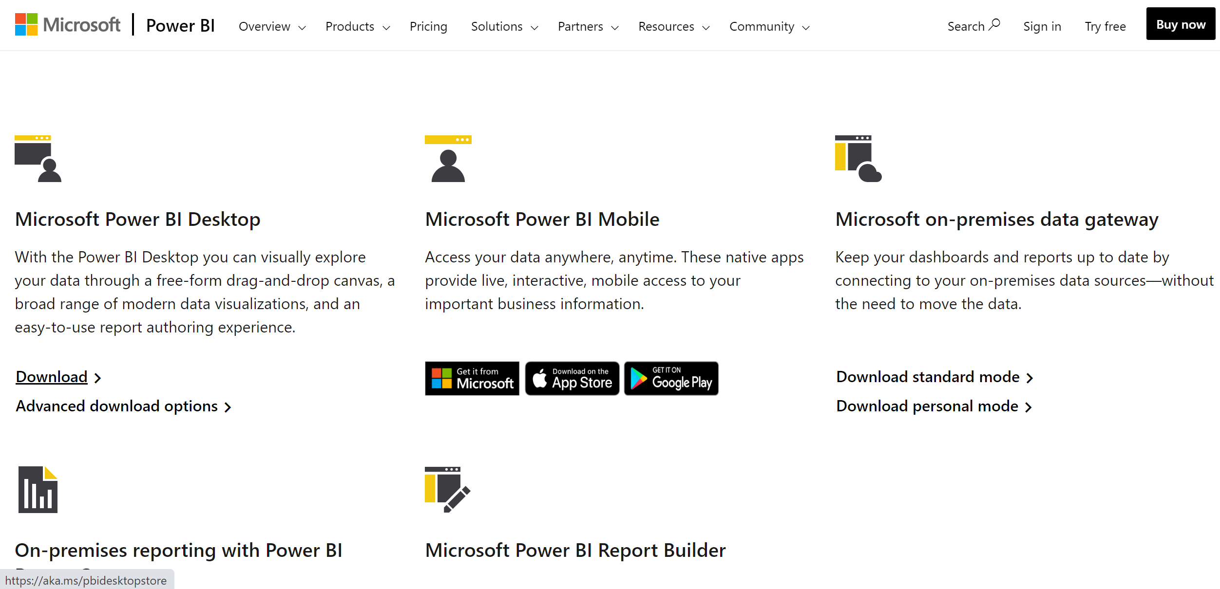
Installing Power BI
To develop the report, install Power BI Desktop. Visit https://powerbi.microsoft.com/en-us/downloads/
Select Download from Microsoft Power BI Desktop.
Source: https://powerbi.microsoft.com/en-us/downloads/
A .exe file will be downloaded. Install the downloaded .exe.
Introduction to the Power BI Interface
Search for Power BI Desktop and open it. We can see the below screen after opening the Power BI Desktop.
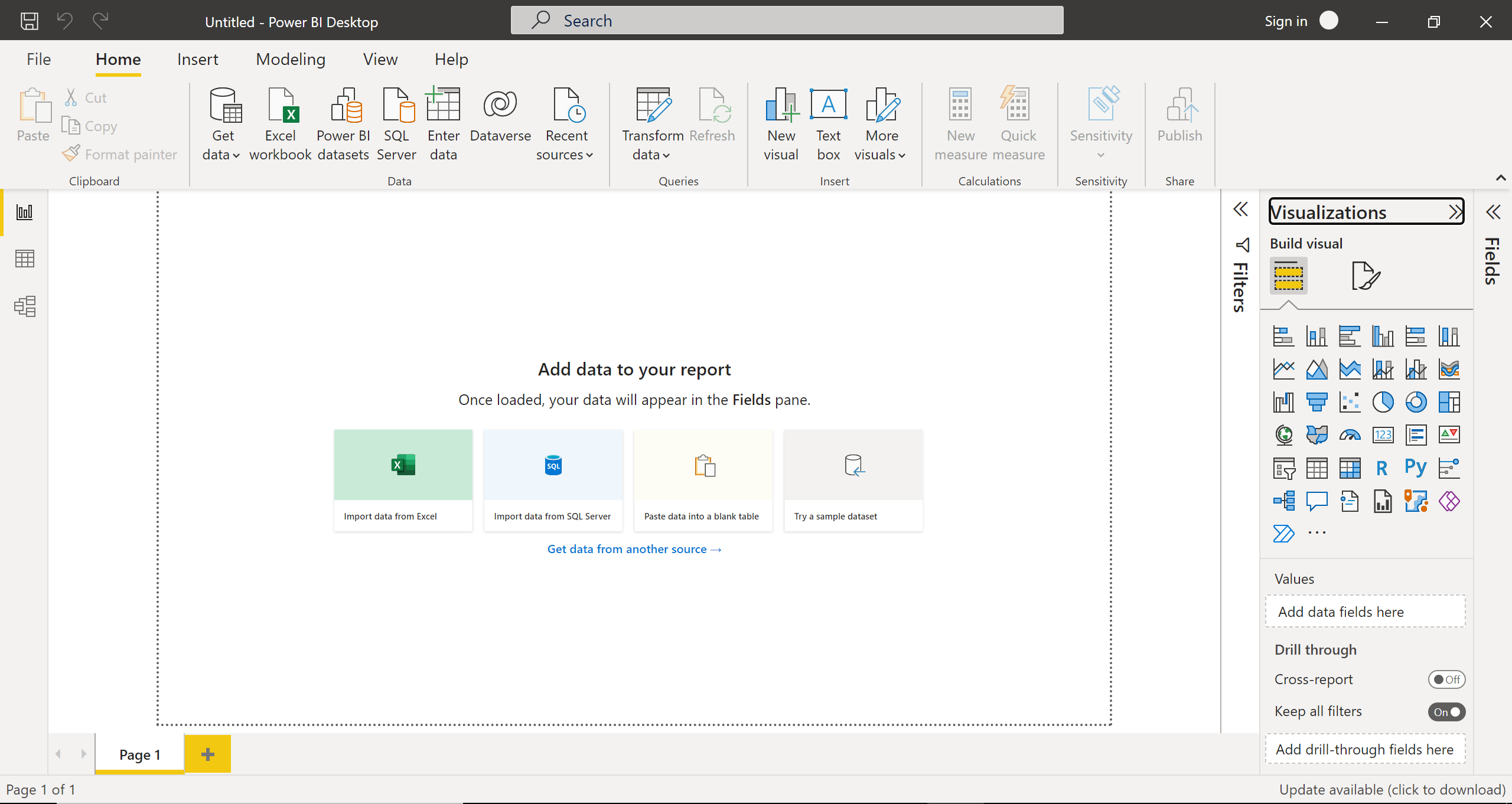
In the Home tab, from the Get data option, we can get data from various data sources such as Excel workbook, Text/CSV, SQL Server, Power BI datasets, Power BI dataflows, Web, OData feed, Analysis Services, Parquet, Sharepoint folder, Azure Blob Storage, Azure Databricks, MariaDB, etc.
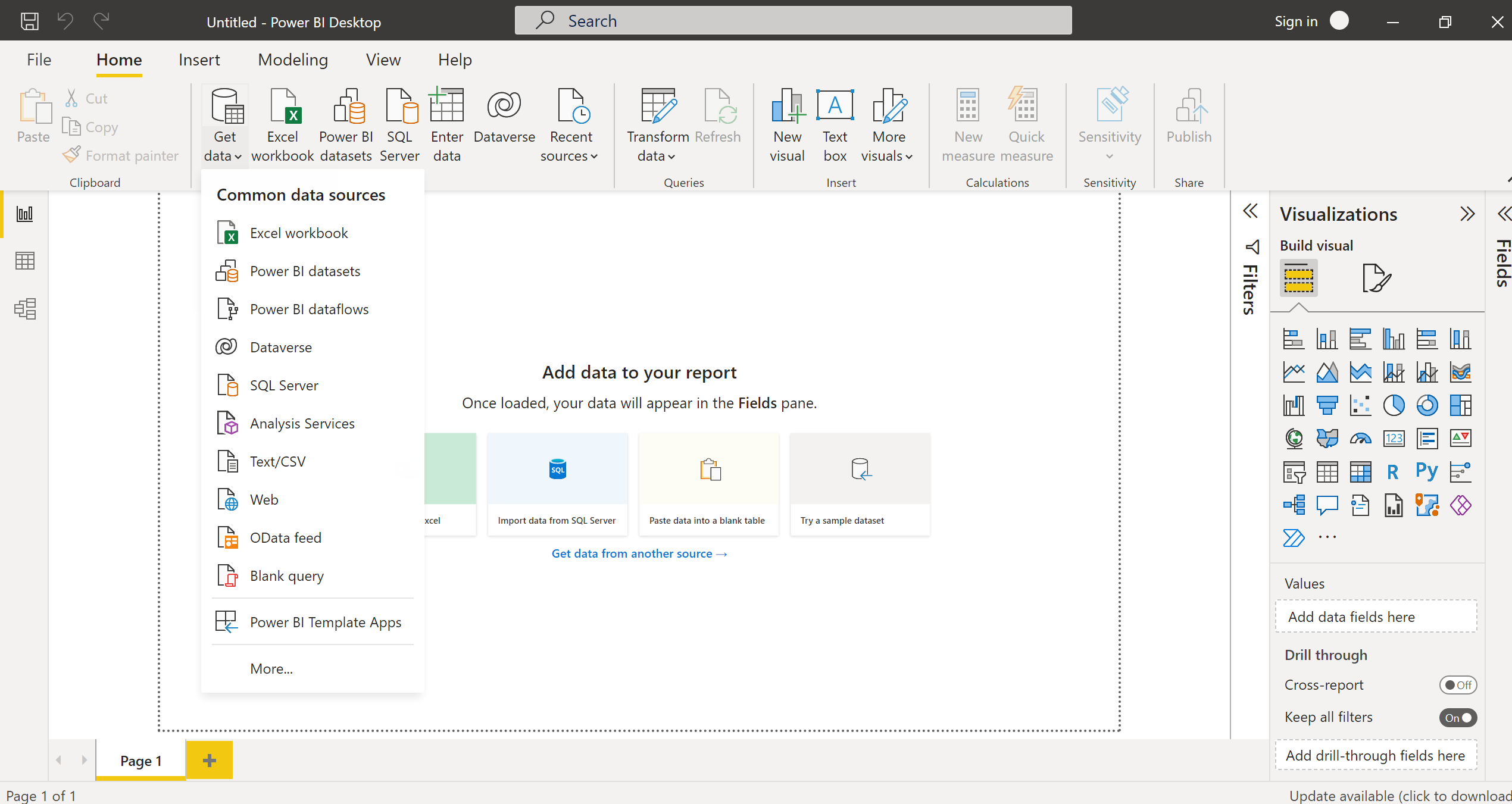
We can see the data sources options from the Recent sources option, which we have connected recently to the Power BI report.
We can add visuals to the report page by clicking the New visual option.
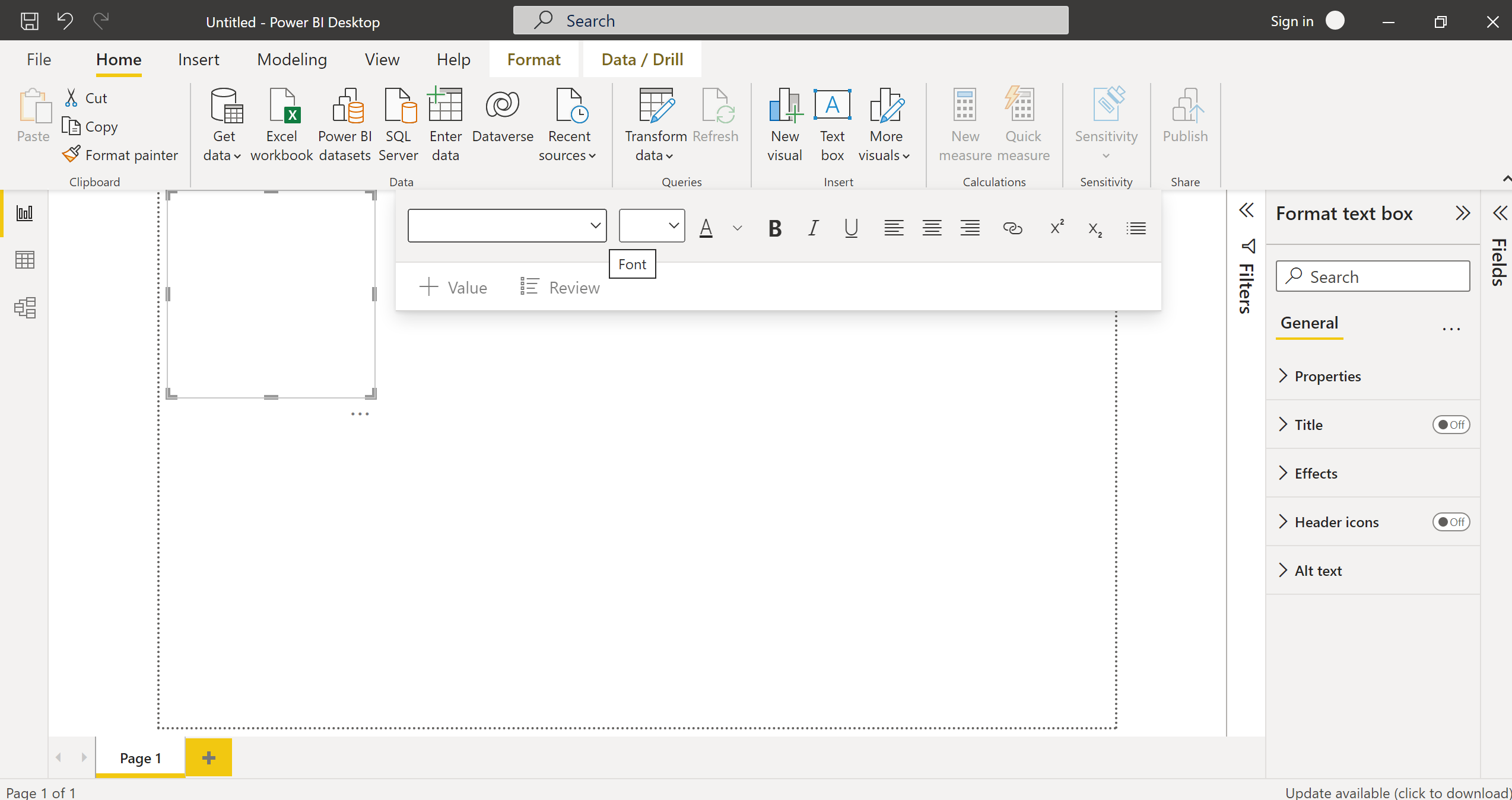
With the Text box option, we can insert a text box in the report page and set the font type and font size for the text visual.
With More visuals options, users can insert the visuals created by them or import the visuals from AppSource.
On the Power BI desktop’s left side are icons for the report view, data view, and model view. By default, when we open the Power BI desktop, the report view is selected.
In the Visualizations panel on the right side of the Power BI desktop, visuals such as stacked area charts, pie charts, matrix, waterfall charts, line, and clustered column charts are available. In the same panel, drill-through options like cross-filters is also present.

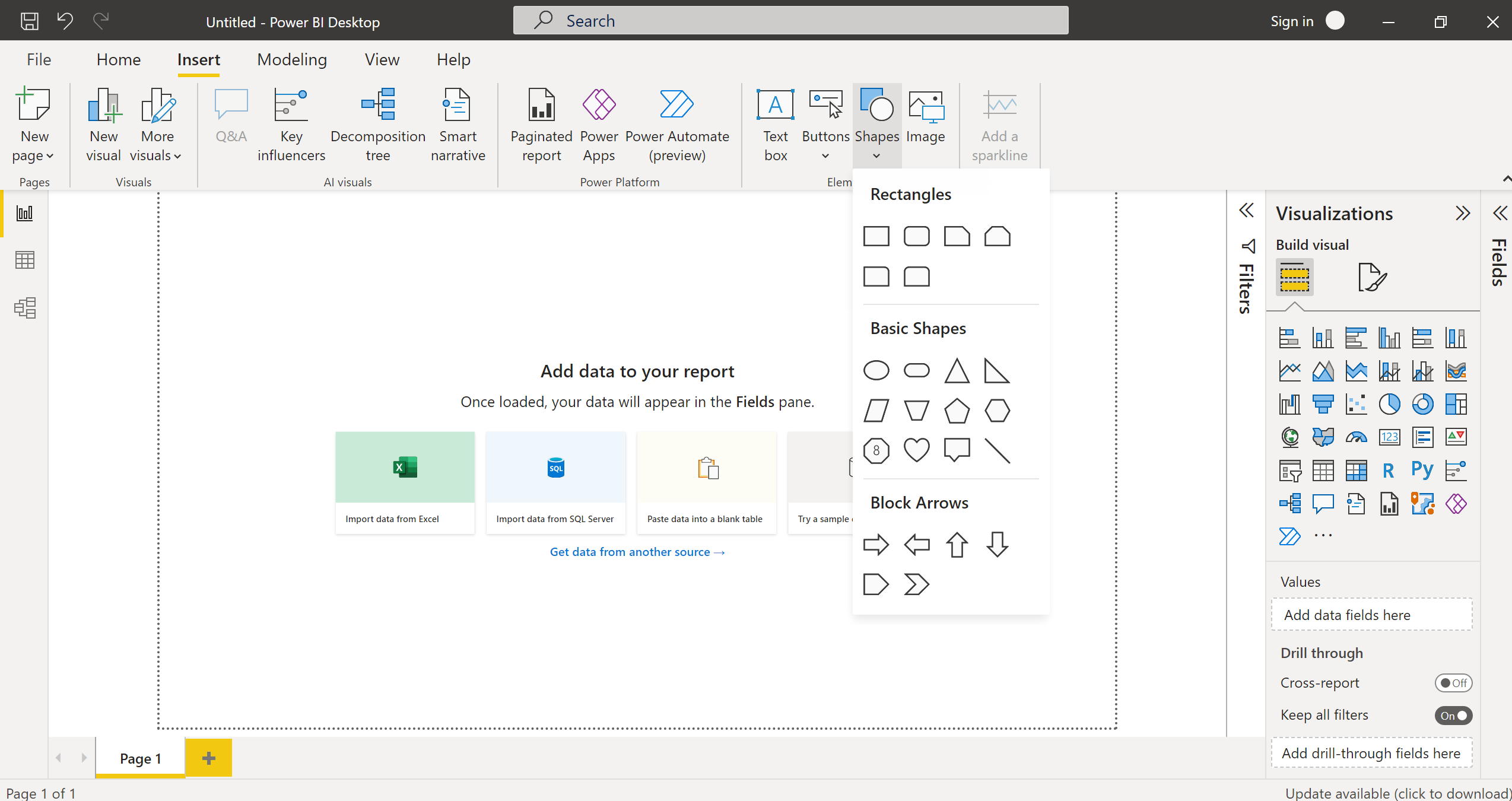
In the Insert tab, from the Text box option, we can insert a text box in the report page and set the font type and font size for the text visual. Using the Shapes option, we can insert shapes like block arrows pointing to different directions and basic shapes such as circles, ovals, lines, pentagons, hexagons, etc.
Using Paginated Report, Power Apps, and Power Automate options, we can create paginated reports, connect power apps and power automate flow and apps in the Power BI Report.
We can insert the image and buttons in Power BI Report using the Image and buttons options.
In the Modeling tab, we have the Managing relationships option to manage the relationships between the tables imported from the various data sources. Using New Measure and New Column options, we can create measure and calculated columns in the Power BI report.

From the View tab, we can choose the theme for the report. Users can also customize the current theme by using Customize current theme option. Using the Page View option, we can make a report Fit to page, Fit to width, or actual size.
Using Filters and bookmarks options, the user can apply filters and bookmarks to the Power BI Report.

Now, we have completed the walkthrough of the interface of Power BI Desktop.
Users can create a report in Power BI and publish it after signing in with their organizational domain email ID.
Understand the Problem Statement
Download the Superstore retail transaction data available on Kaggle to find meaningful insights from online orders of a superstore in the US.
From this data, we will analyze the sales and profits of the US superstores from 2014-2018 based on the discount rates of the products, city or states where people shop the most, customer loyalty and product discount rates, etc.
Open the Downloaded Excel; we can see that downloaded excel has an Orders sheet that has 9995 rows and 21 columns.
Now we have the data, let’s start developing the sales and profit report in Power BI Desktop.
Importing Data in Power BI
The get data option is used for loading data for visualization and analysis.
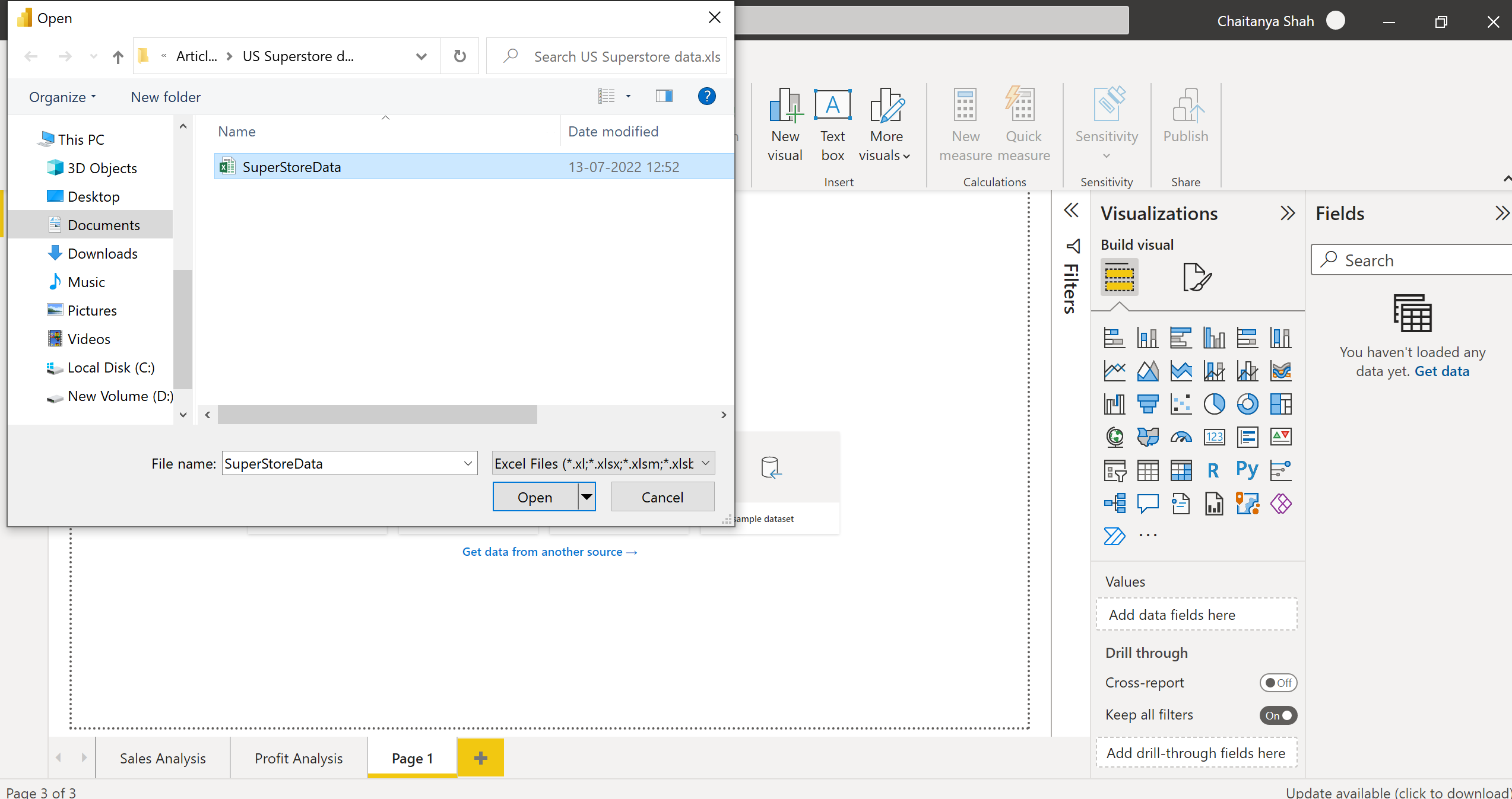
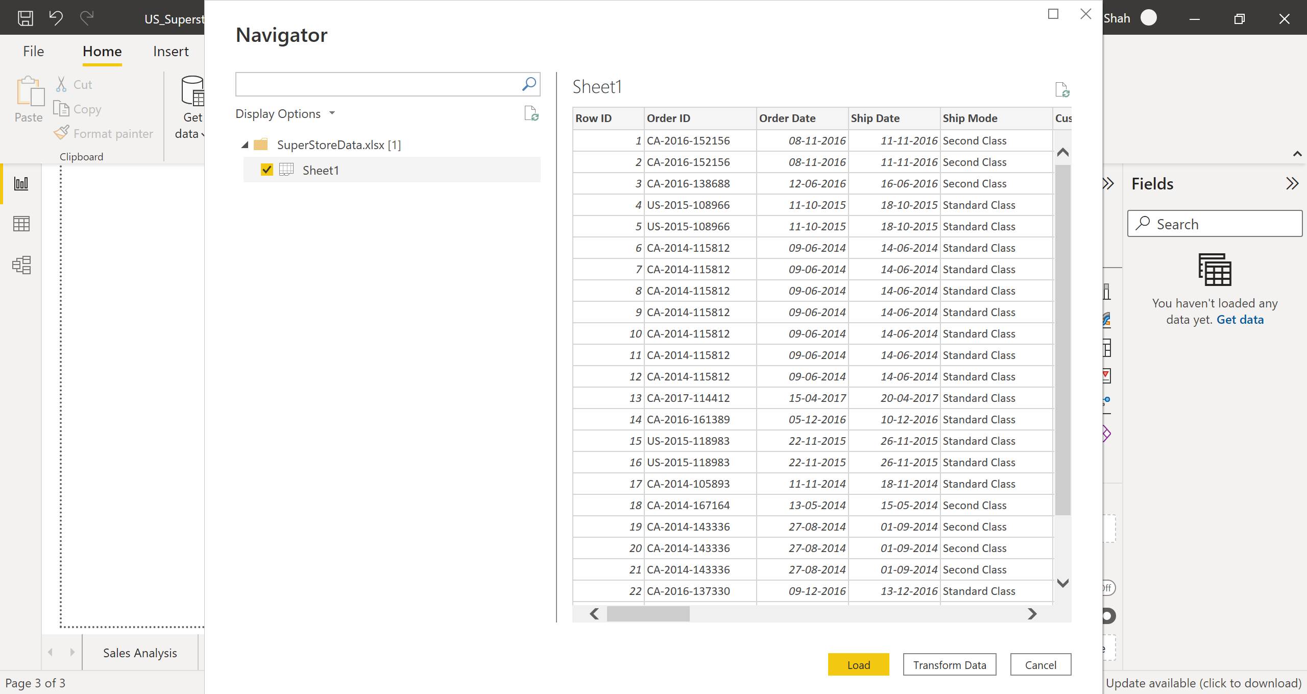
Step 1: Click on Get data in the Home tab, then select Excel workbook, now choose the downloaded excel file and Open it.
Users can import data from Azure Synapse Analytics SQL, Excel, Text/CSV, Web, Amazon RedShift, Oracle, MySQL, Snowflake, SAP databases, Google BigQuery, MariaDB, SharePoint List, etc., in Power BI Desktop based on their requirements.
Step 2: Select Sheet1-> Transform Data.
Perform data transformation to remove unnecessary columns, shape the data, evaluate and change column data types, and clean the data.
Performing Data Transformation
A. Shaping & Cleaning the Data
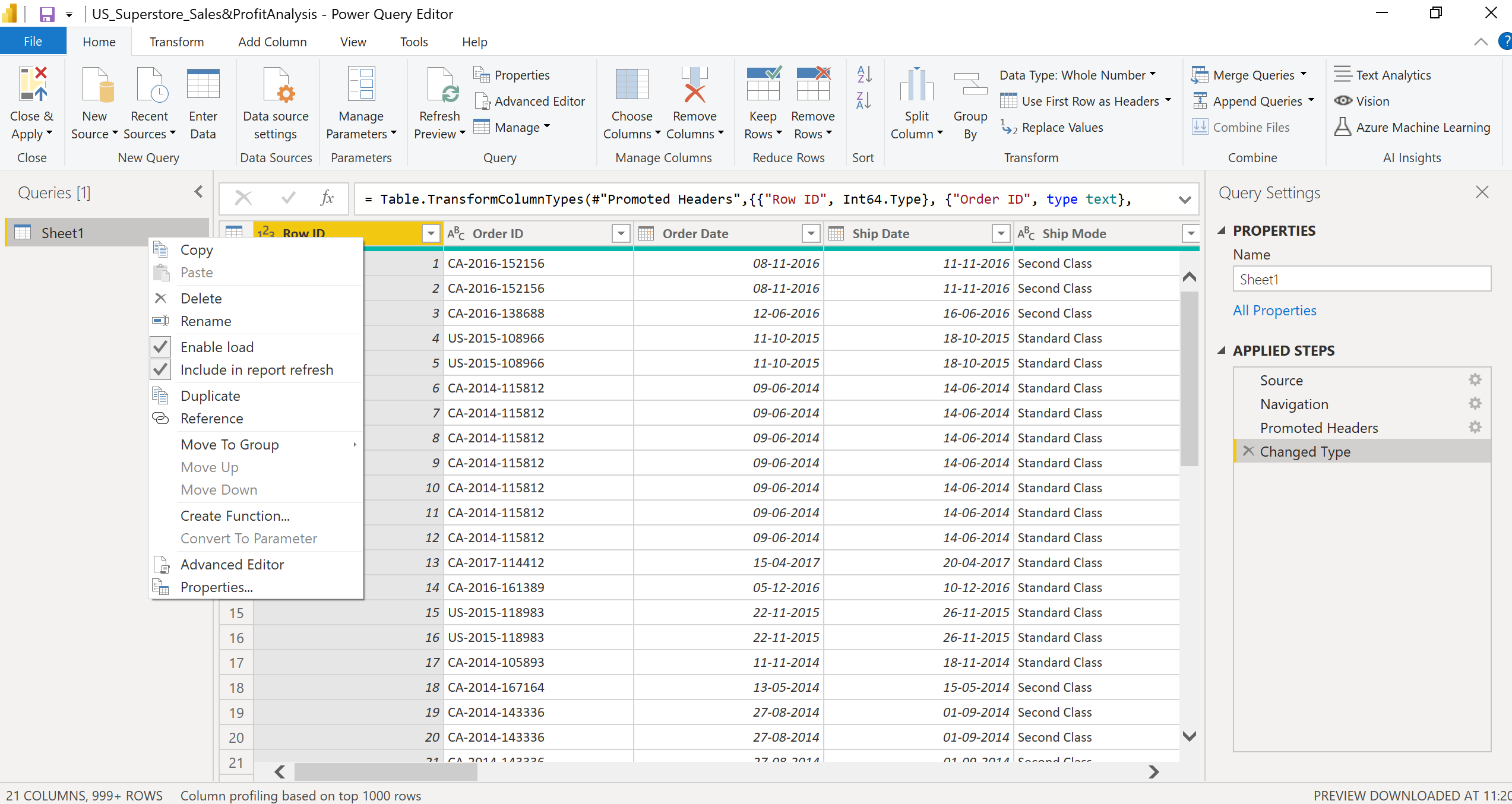
1. Right Click Sheet1 -> Rename. Rename it to Orders.
2. Right Click Order ID-> Remove Empty.
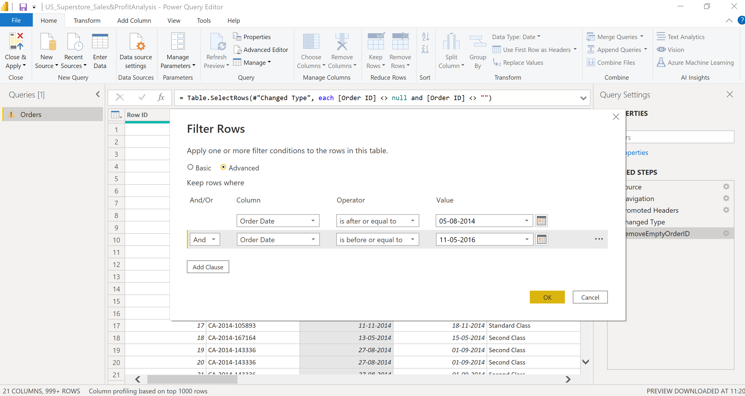
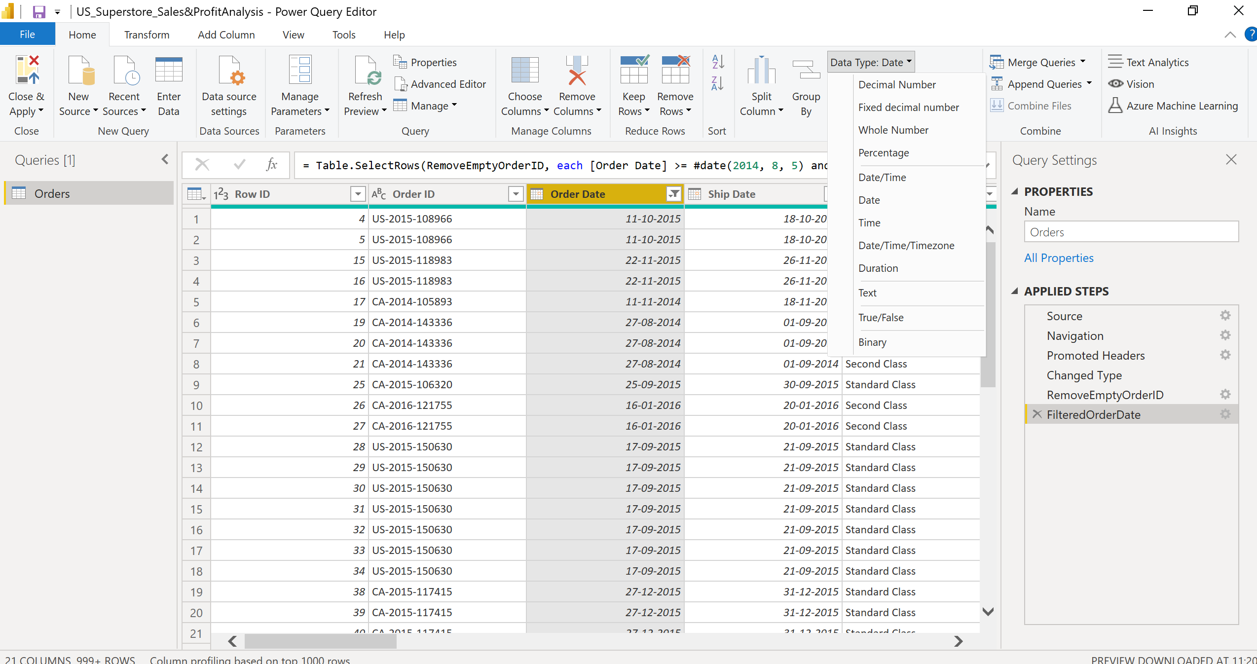
3. Right Click Order Date -> Date filters -> Between -> Filter Rows tab select Advanced radio button -> Select 05-08-2014 in date picker parallel to is after or equal to -> Select 11-05-2016 in date picker parallel to is before or equal to.
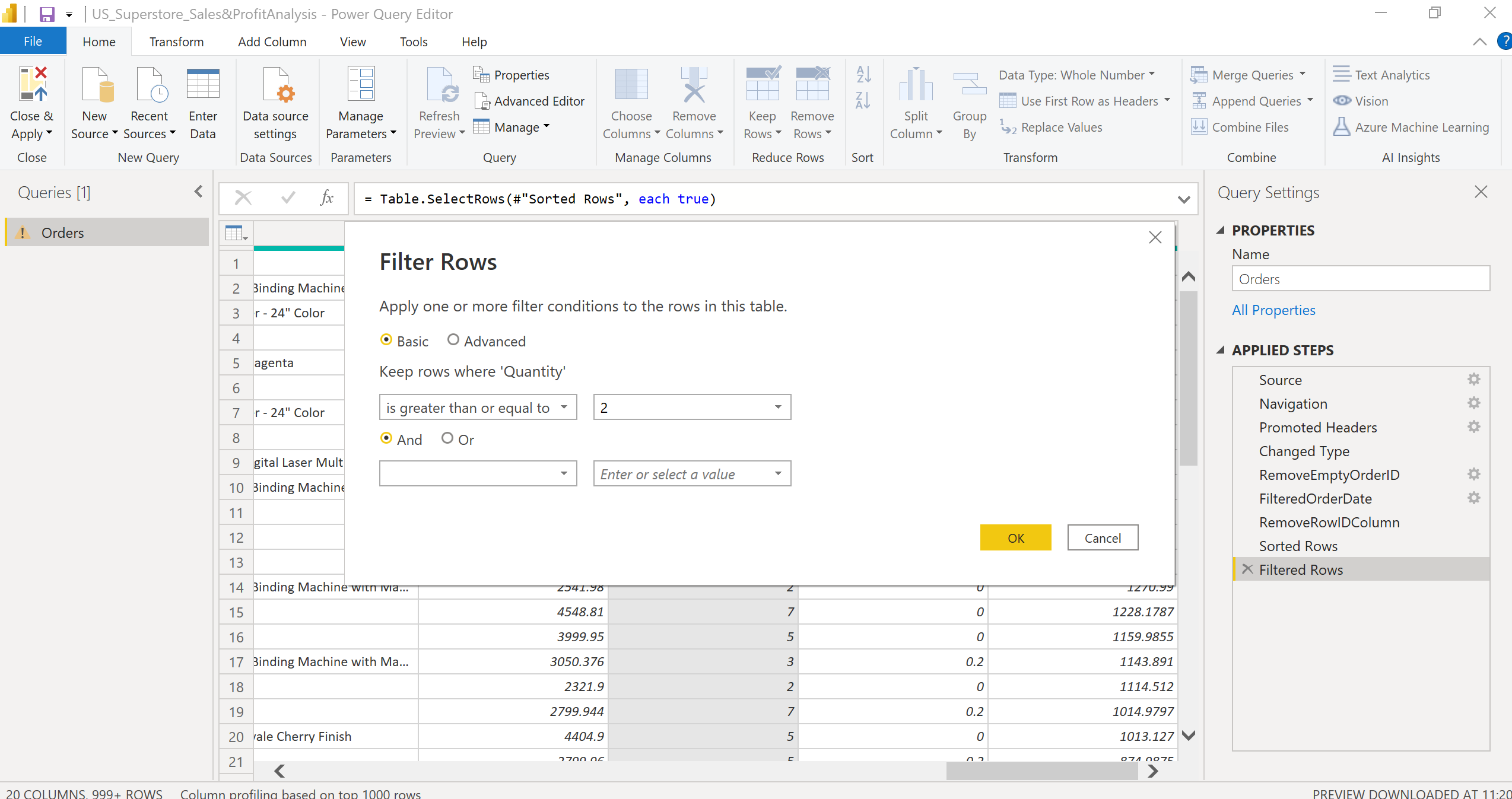
4. Right Click Quantity -> Number filters -> Greater than or equal to -> Filter Rows tab select Basic radio button -> Select 2 in drop-down parallel is greater than or equal to -> OK.
B. Evaluating and changing column data types
Now, click on every column and check if the Data Type is correctly selected or not.
If the Data Type is not correctly selected, change the Data Type from the dropdown. For example, the Data Type of Order Date & Ship Date column must be Date.
C. Dropping, Sorting column data & Renaming the columns
1. Check the columns and figure out which columns you don’t want to use in the report or keep in the data model.
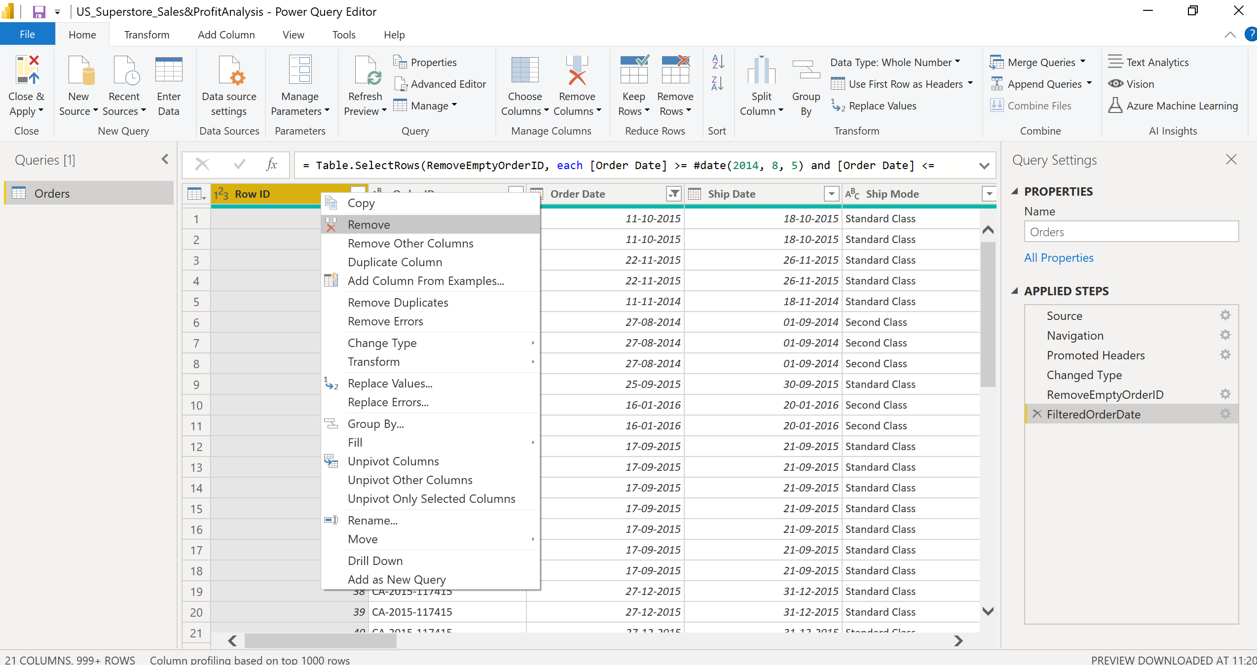
2. In the imported data, the Row ID column is unnecessary; we can drop the Row ID column. Right Click Row ID-> Remove.
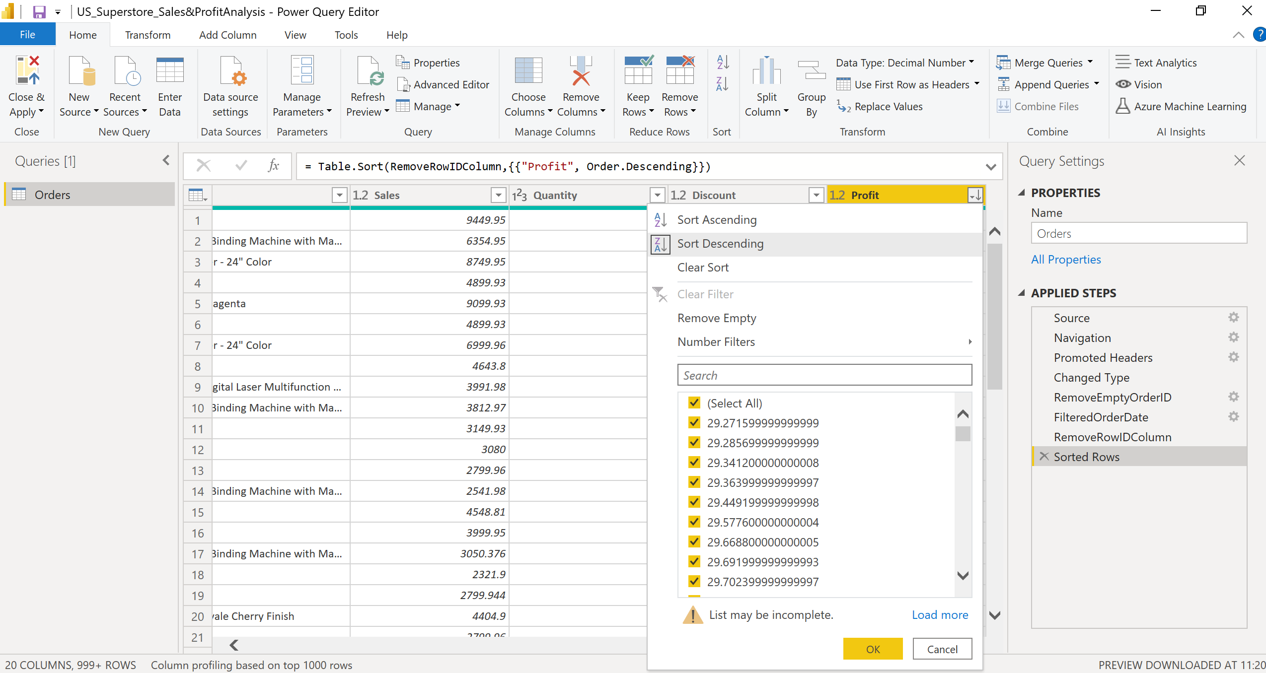
3. Sort Data based on the Descending Order of Profit column. Right Click Profit-> Sort Descending -> OK.
Change the Applied steps name in the right pane as per your understanding to avoid confusion.
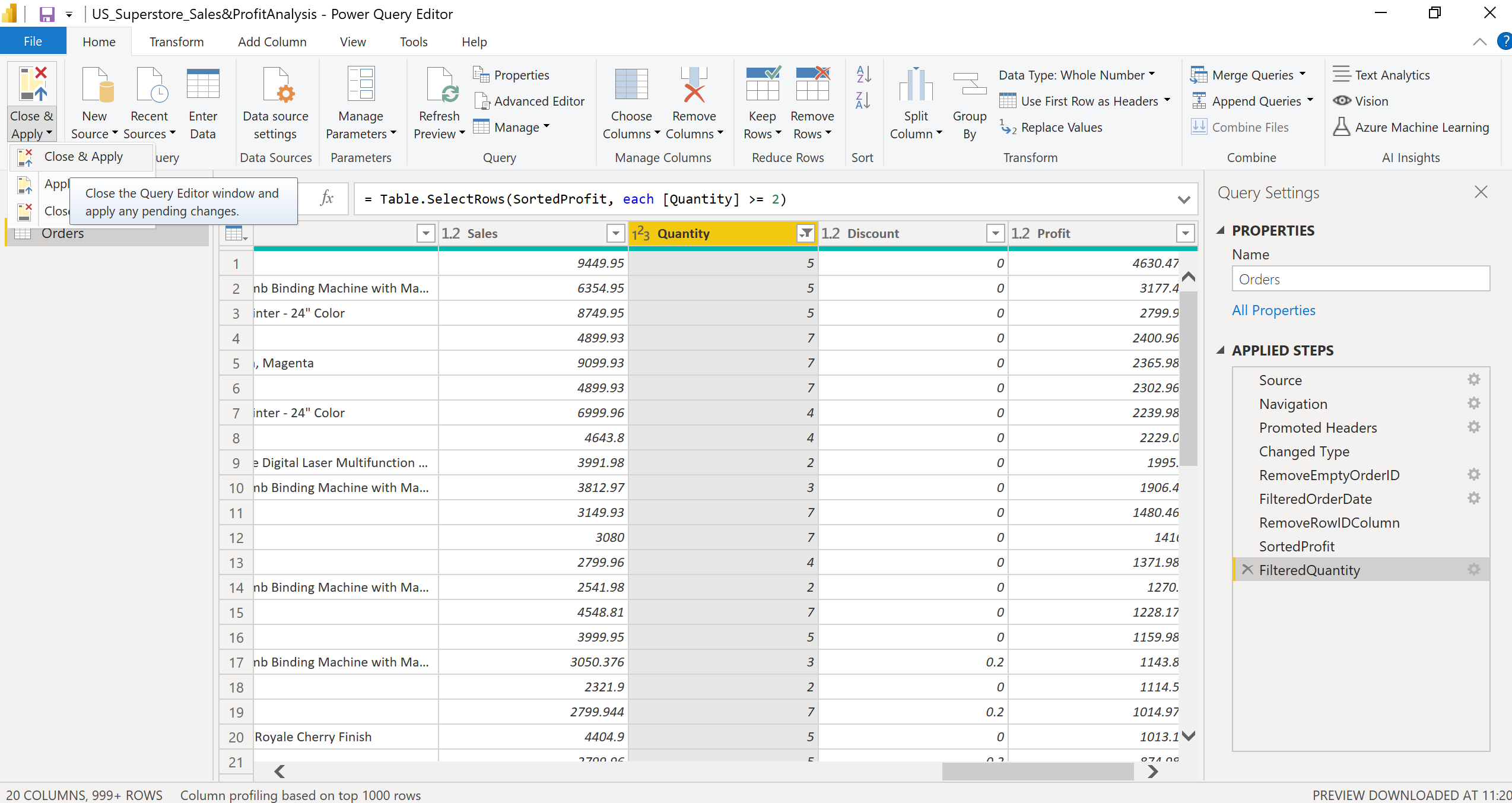
After you have completed all your data transformations, click Close & Apply.
Building the Superstore Sales & Profit Report
After clicking on close & apply, the report view opens.
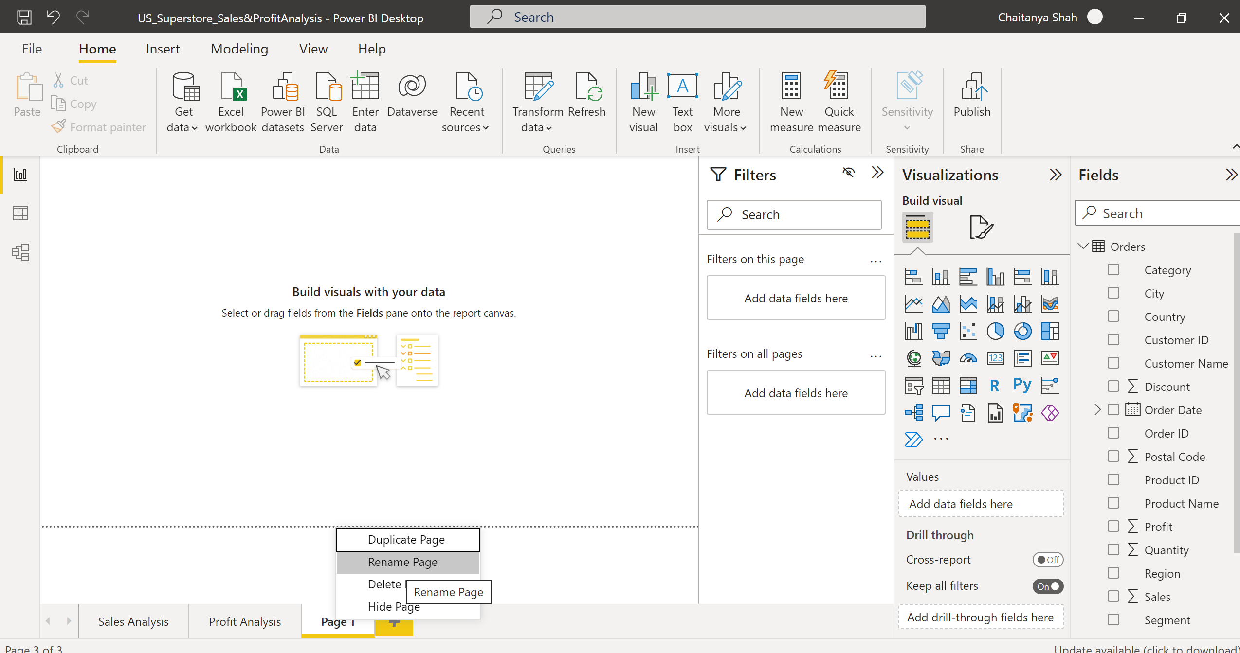
Click Rename to rename the report page in Power BI Desktop.
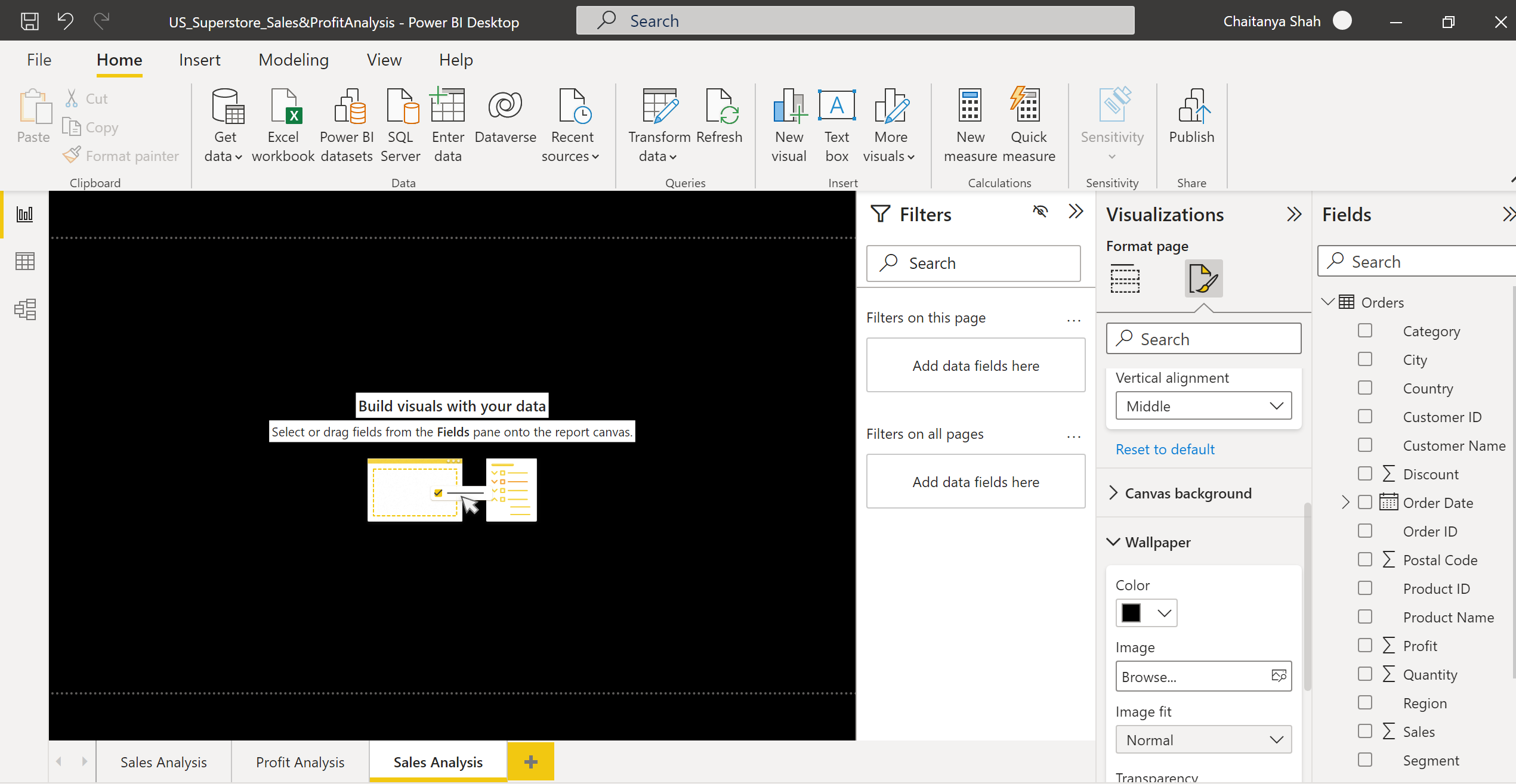
In the Visualizations pane on the right side, from Canvas settings, choose vertical alignment as middle, and from Wallpaper choose the color as black.
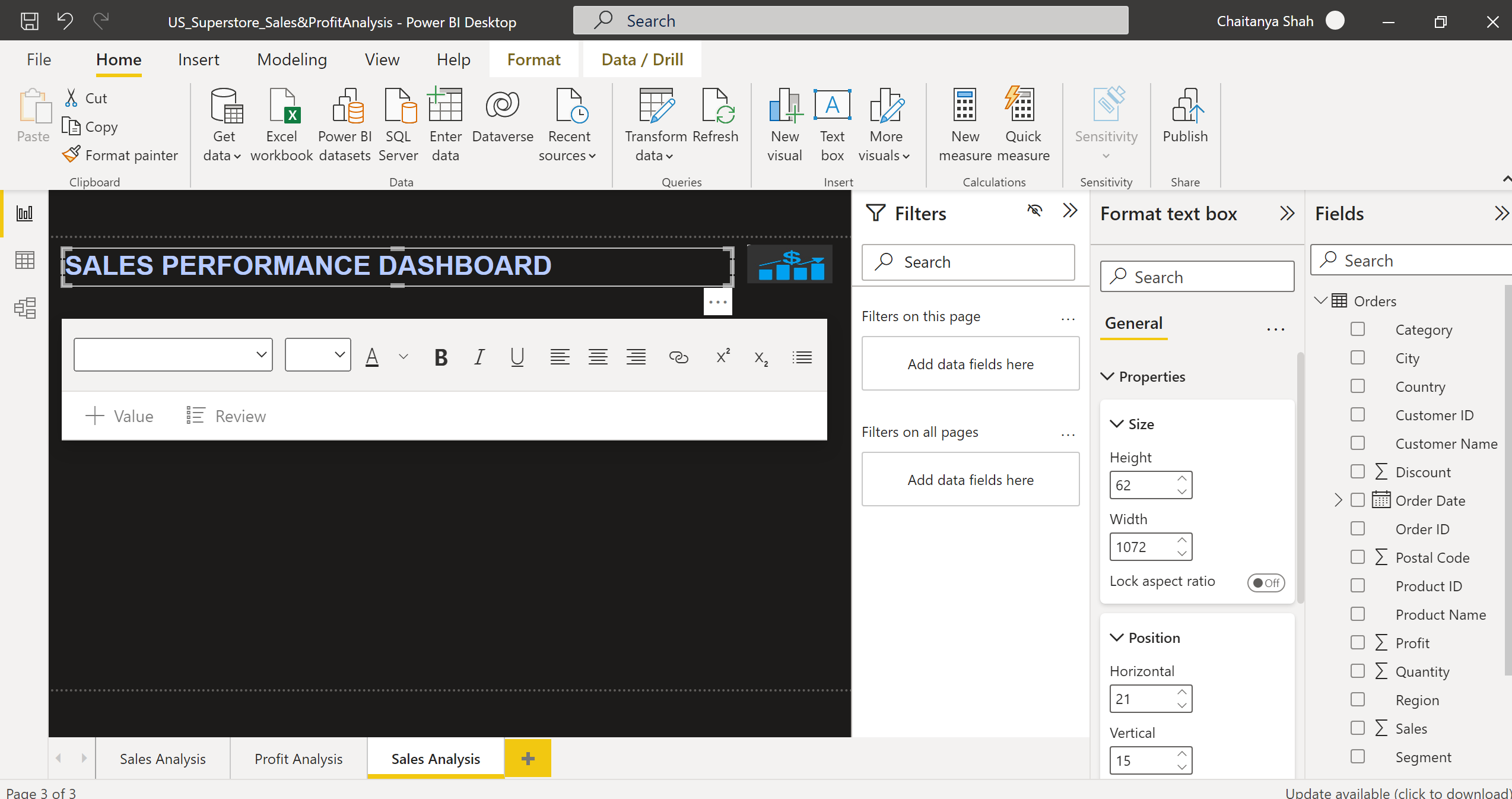
Select the Text box option in the Home tab, insert and write your text inside the text box and set the alignment as left, font type as Arial, and font size as 32 for the text visual. Set the Height, Width, Horizontal & Vertical Position of the text box from the General tab on the right side.
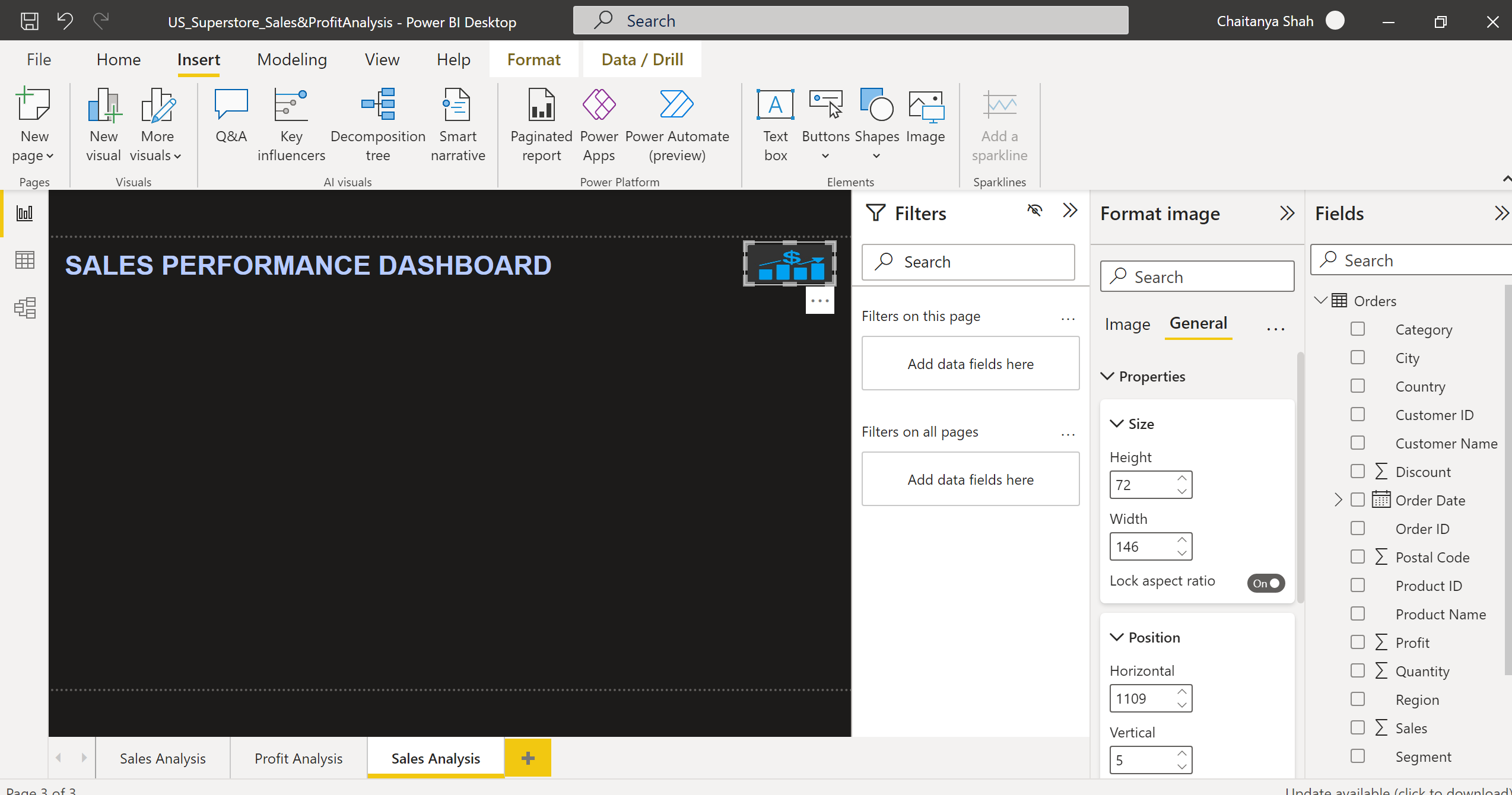
Using Image options from the Insert tab, insert the downloaded image and set the Height, Width, Horizontal & Vertical Position of the image from the General tab.
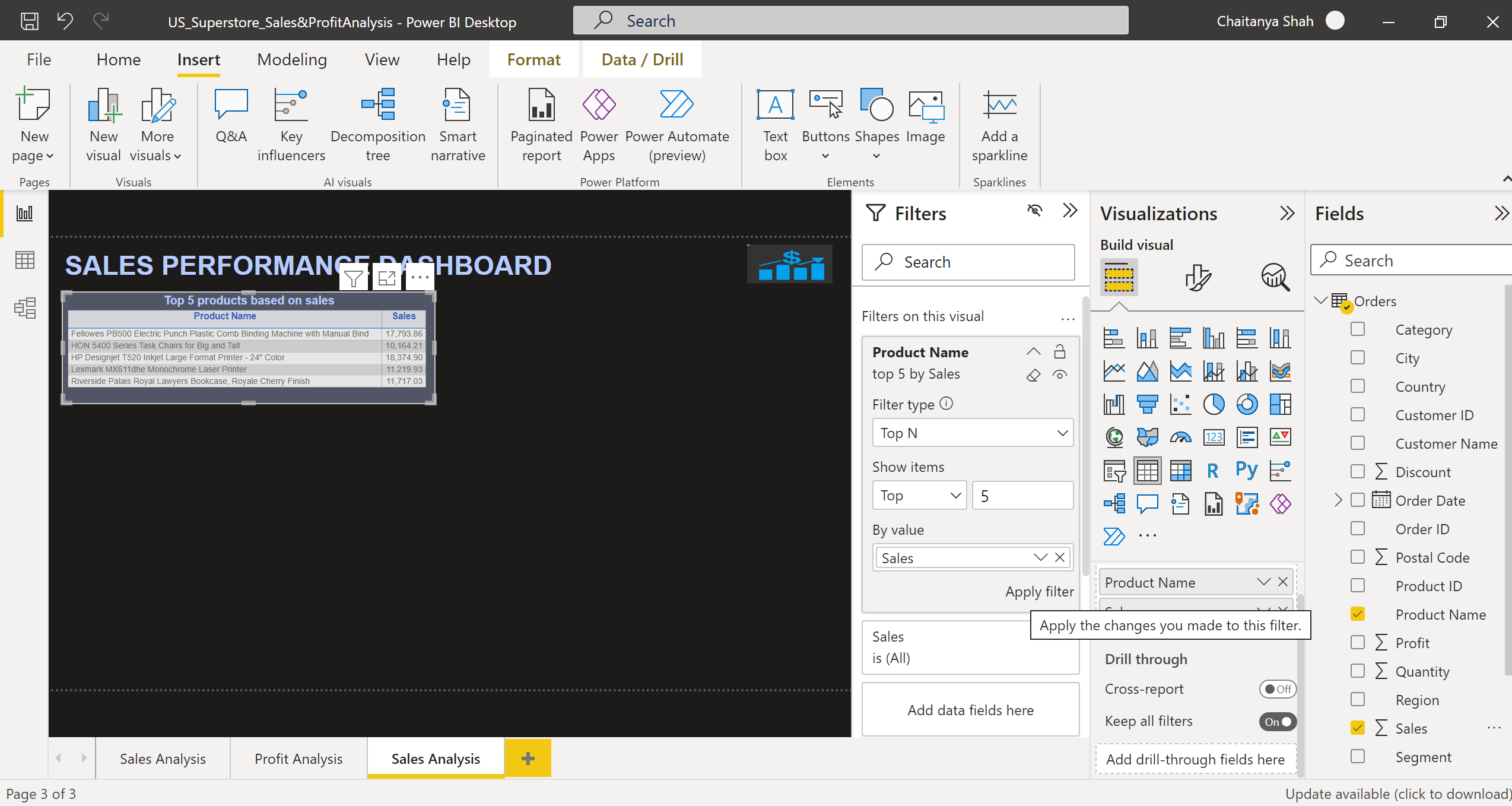
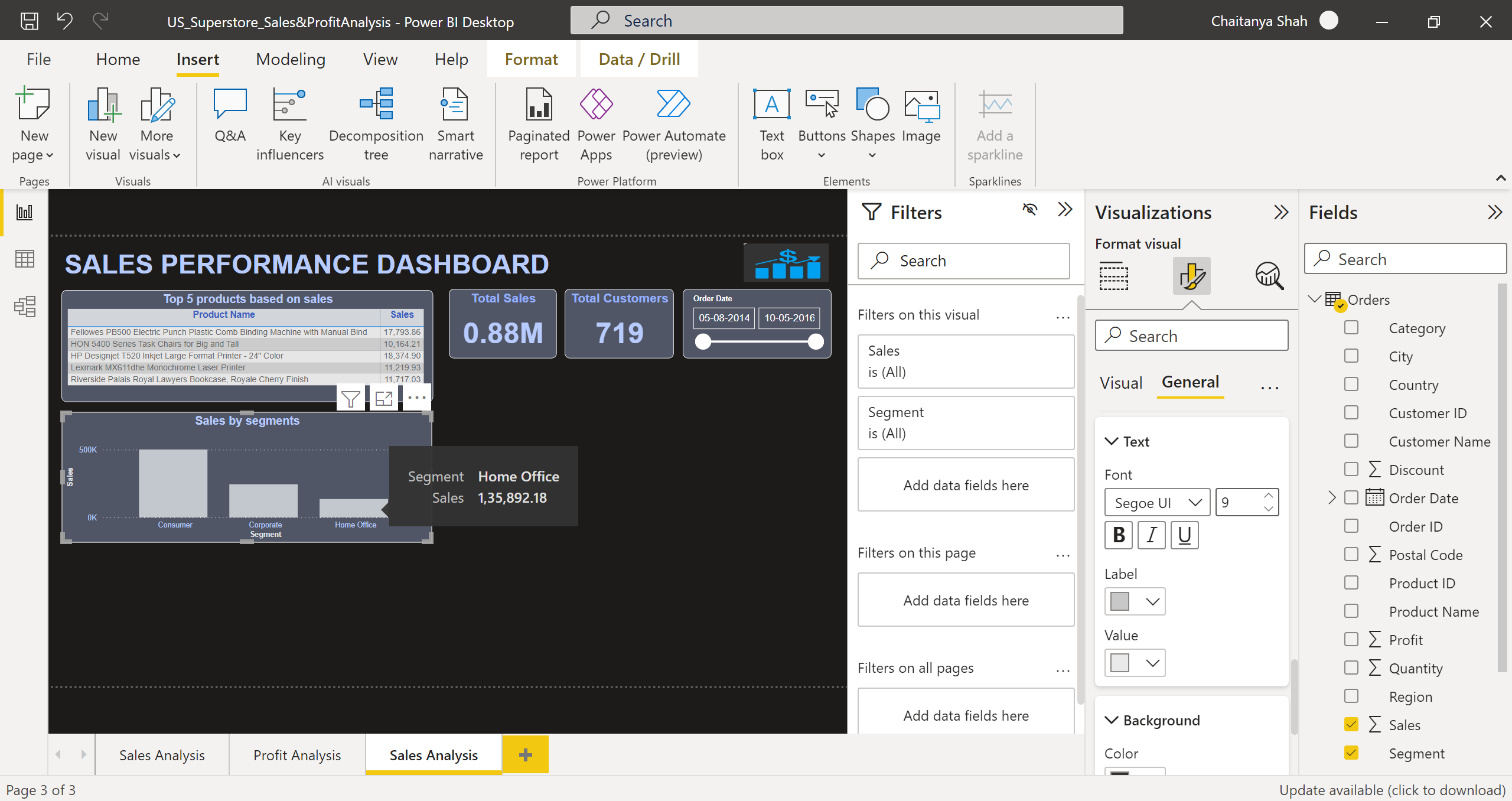
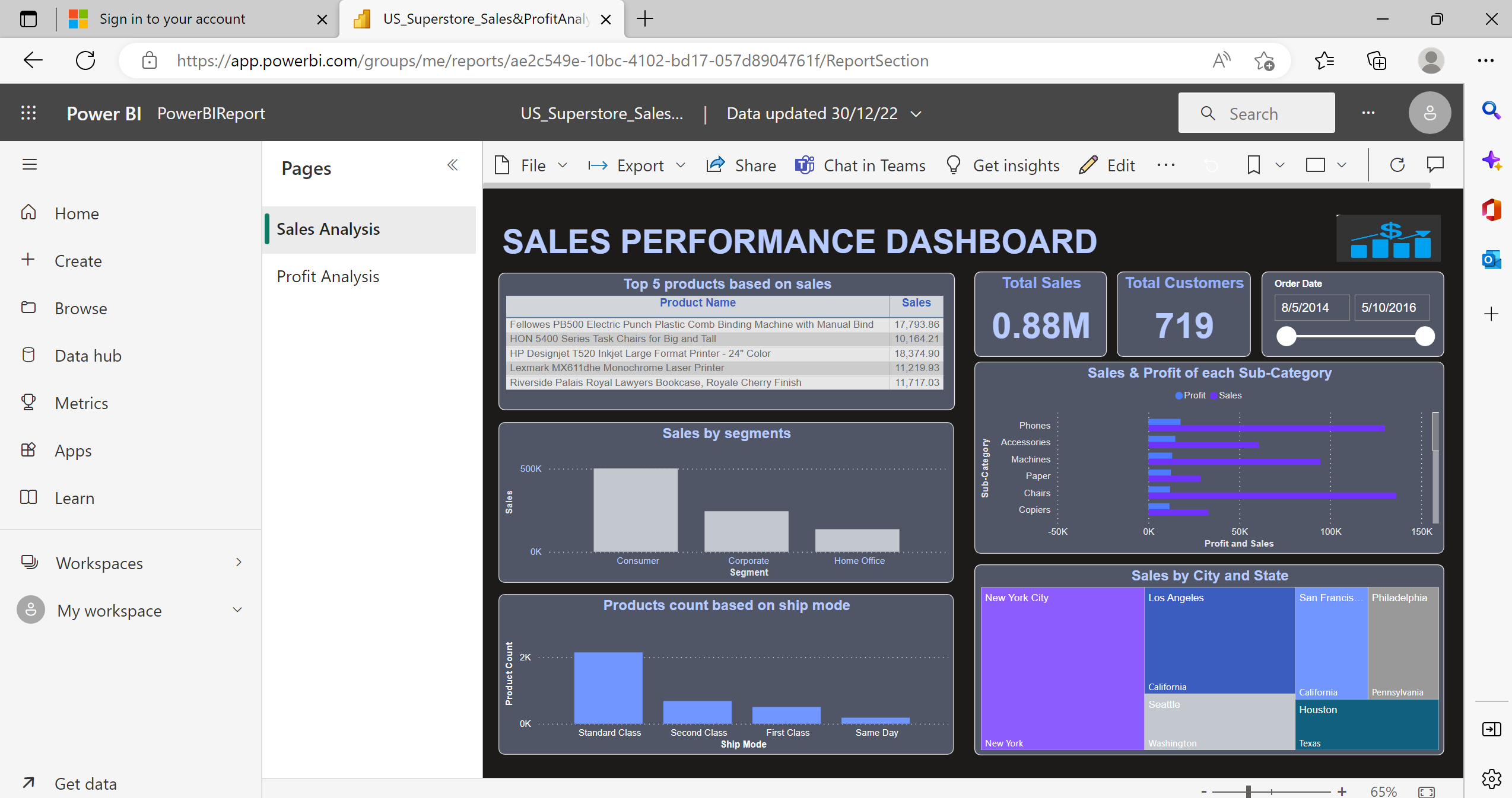
Now, select table visual from the Build visual tab, and drag the Product
Name and Sales column to the Fields tab. In the Filters pane, in the Product Name column select Filter type as Top N, Show items Top 5, By value drag Sales column and click on Apply filter.
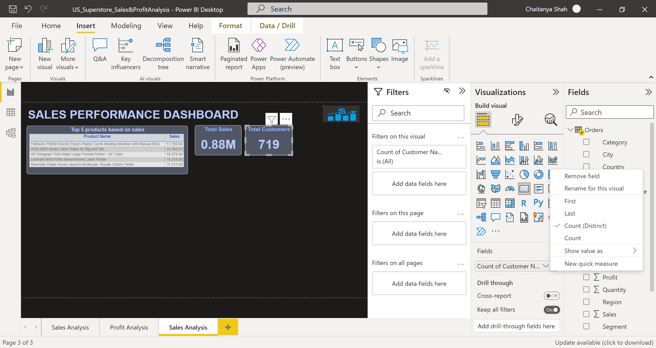
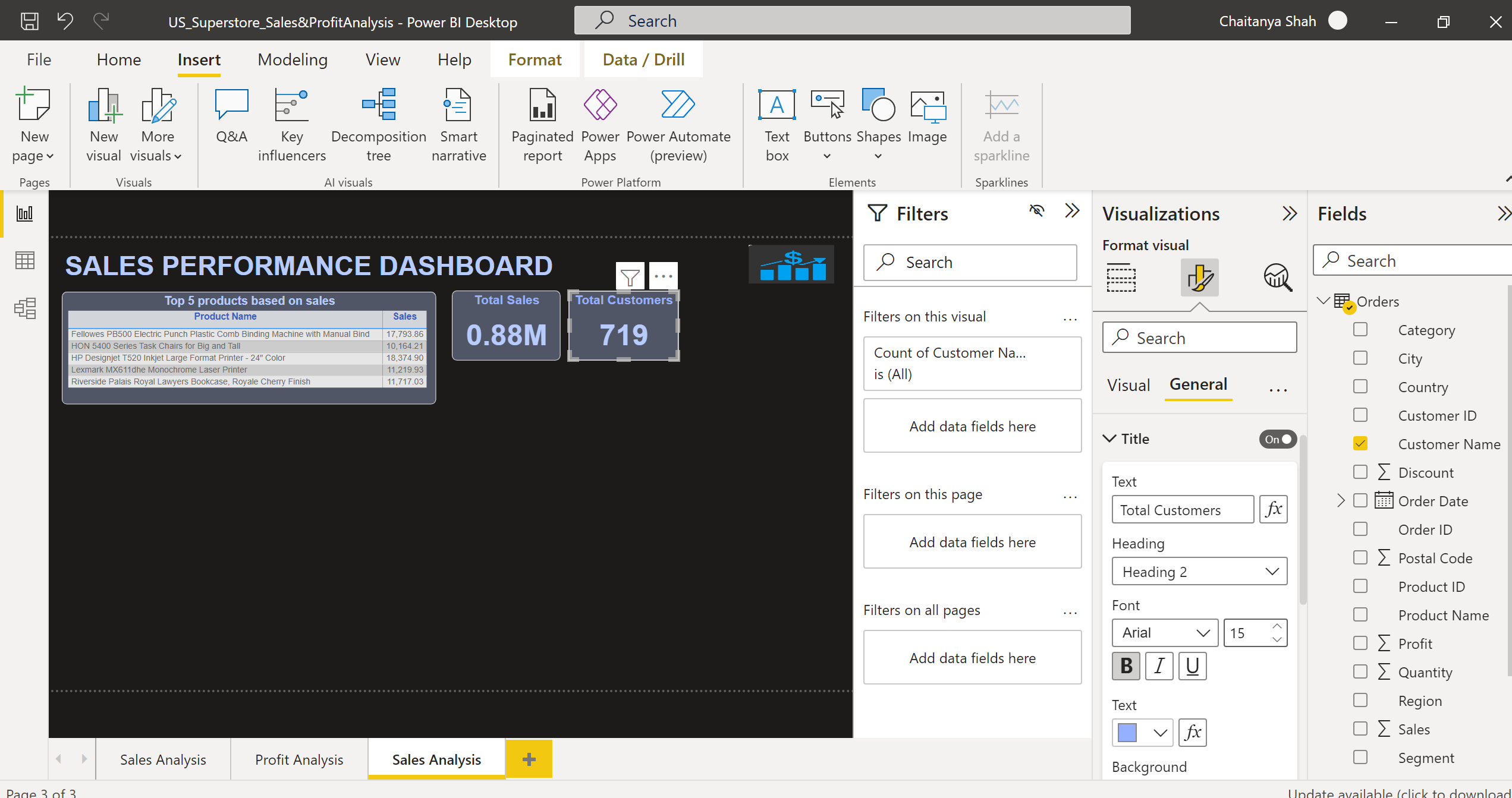
Select two card visuals from the build visual. In one card visual, drag the Sales column in Fields as Sum and give the card title as Total Sales. In another card visual, drag the Customer Name column in Fields as Count(Distinct) and give the card title as Total Customers.
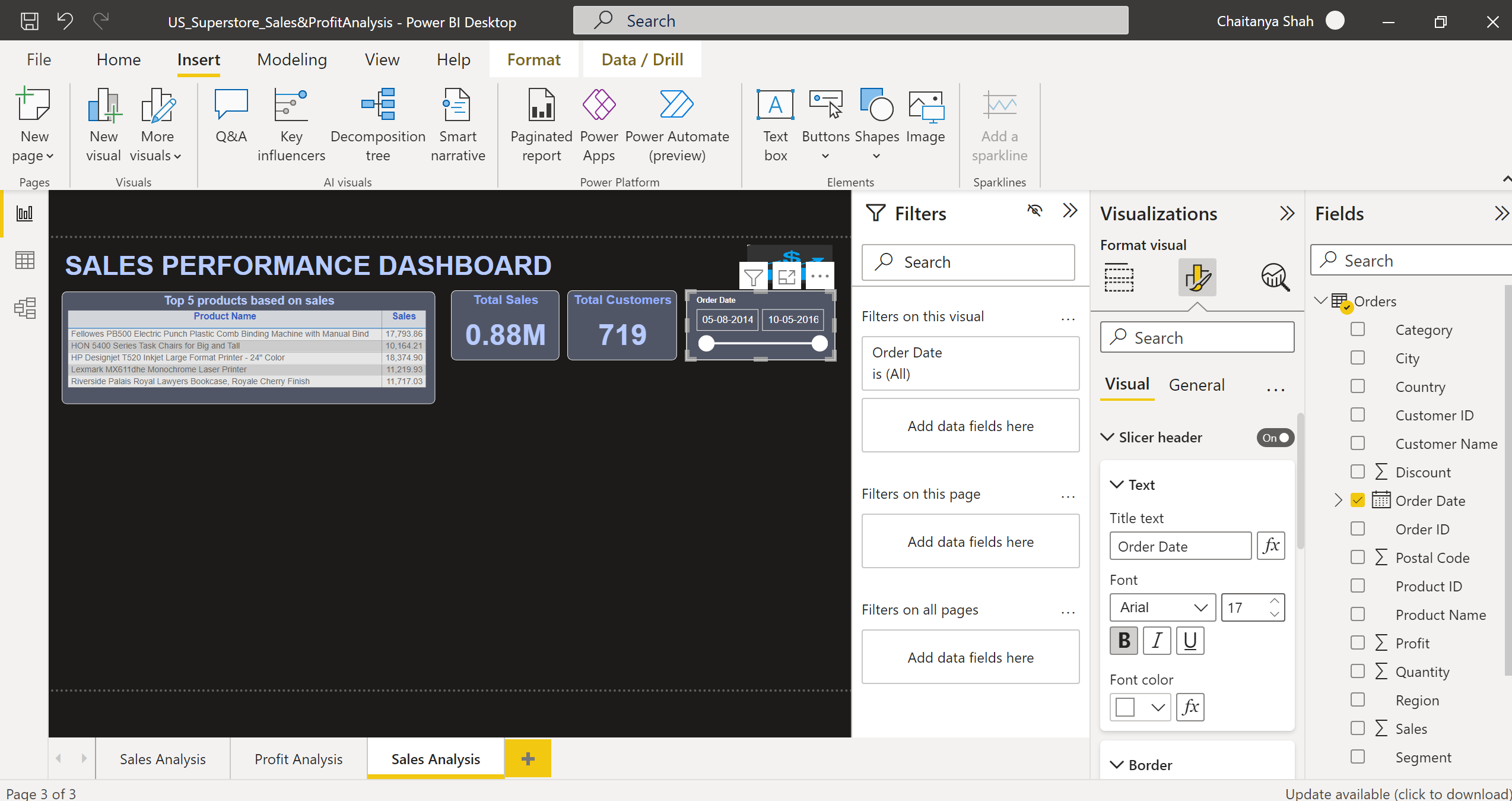
Select Slicer visual, drag the Order Date column in the Fields, provide Slicer Header as Order Date, and select slider color, border color, position, line width, and another formatting for slicer visual using the options in Format visual tab.
Select the Stacked column chart visual, drag the Segment column in the Axis and Sales column in Values as Sum. From Format visual in the right pane, provide font type, font size, color, and labels for the X-axis, and Y-axis of the stacked column chart. Provide title, X-axis, and Y-axis names properly. Manage color, alignment, font type, font size, background, border, tooltips, etc. from the visual and general tab of the Format visual pane. This graph helps users to visualize the sales based on the Consumer, Corporate, and Home office segments.
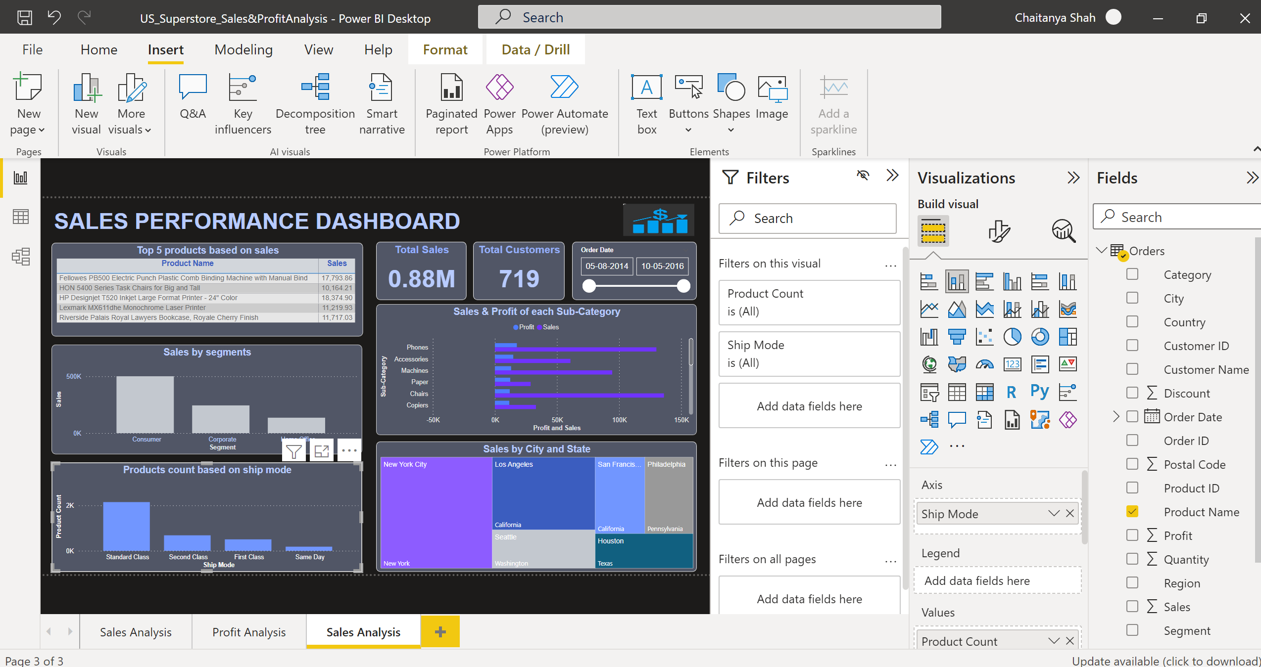
Select the Stacked column chart visual, drag the Ship Mode column in the Axis and Product Name column in Values as Count(Distinct). From Format visual in the right pane, provide font type, font size, color, and labels for the X-axis, and Y-axis of the stacked column chart. Provide title, X-axis, and Y-axis names properly. Manage color, alignment, font type, font size, background, border, tooltips, etc. from the visual and general tab of the Format visual pane. We can rename column names in Axis or Values using Rename for this visual option. This graph helps users to visualize the Products Count based on the Standard class, Second class, first class, and Same Day Ship Mode categories.
Similar to the above manner, visualize Sales based on City & State using TreeMap visual. Visualize Sales & Profit based on subcategories like Phones, Accessories, Chairs, etc., using a clustered bar chart visual.
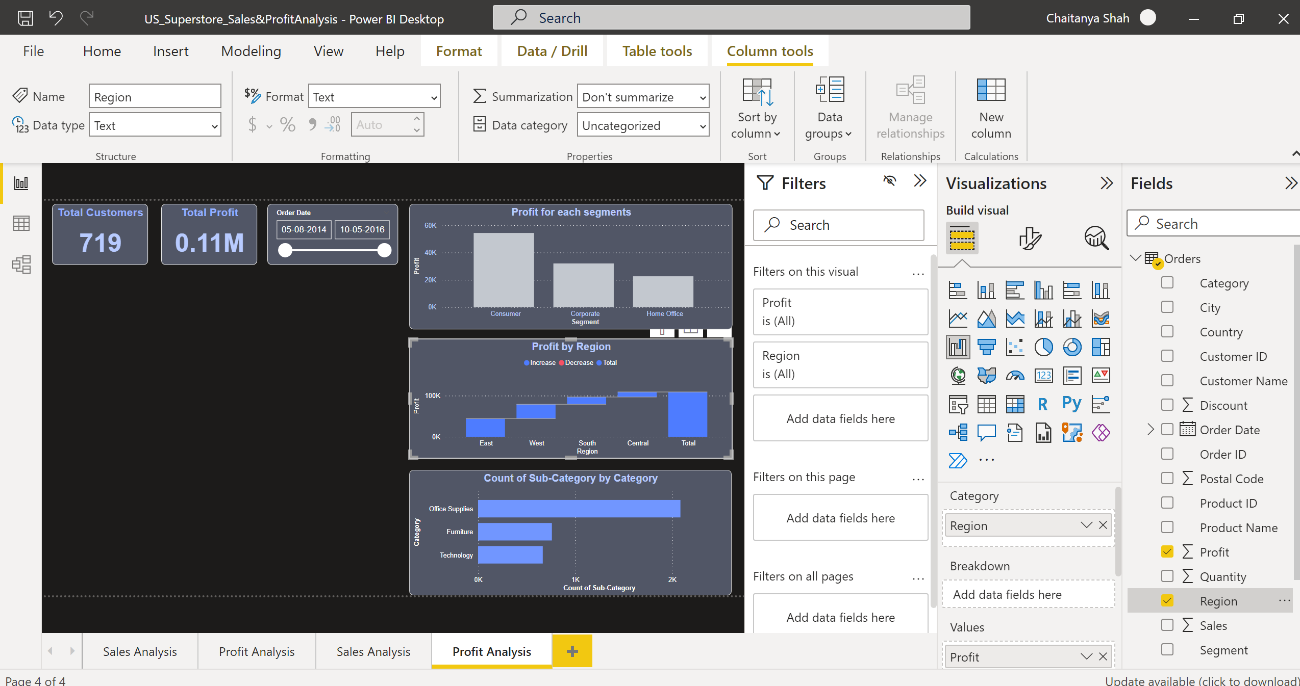
Click (+) to create a new report page and name it Profit Analysis.
Do the similar page formatting as done for Sales Analysis Page.
Select card visual, drag the Profit column in Fields as Sum, and give the card title as Total Profit.
Create Total customers card & Order Date slicer as done for Sales Analysis Page.
Create a Stacked column chart for displaying Profit based on segments.
Create a Stacked bar chart for displaying the Count of sub-categories by category.
Select the Waterfall chart visual, drag the Region column in the Category and the Profit column in Values as Sum. Manage color, alignment, font type, font size, background, border, tooltips, etc. from the visual and general tab of the Format visual pane.
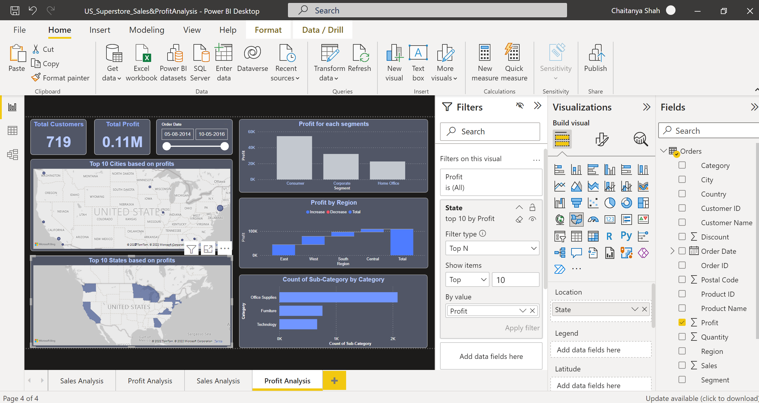
Use Filled Map visual, to display the Top 10 States based on Profits by applying the Top N filter on State.
Now, save the developed report.
Publishing the Report
Sign in to Power BI. To sign in, click here.
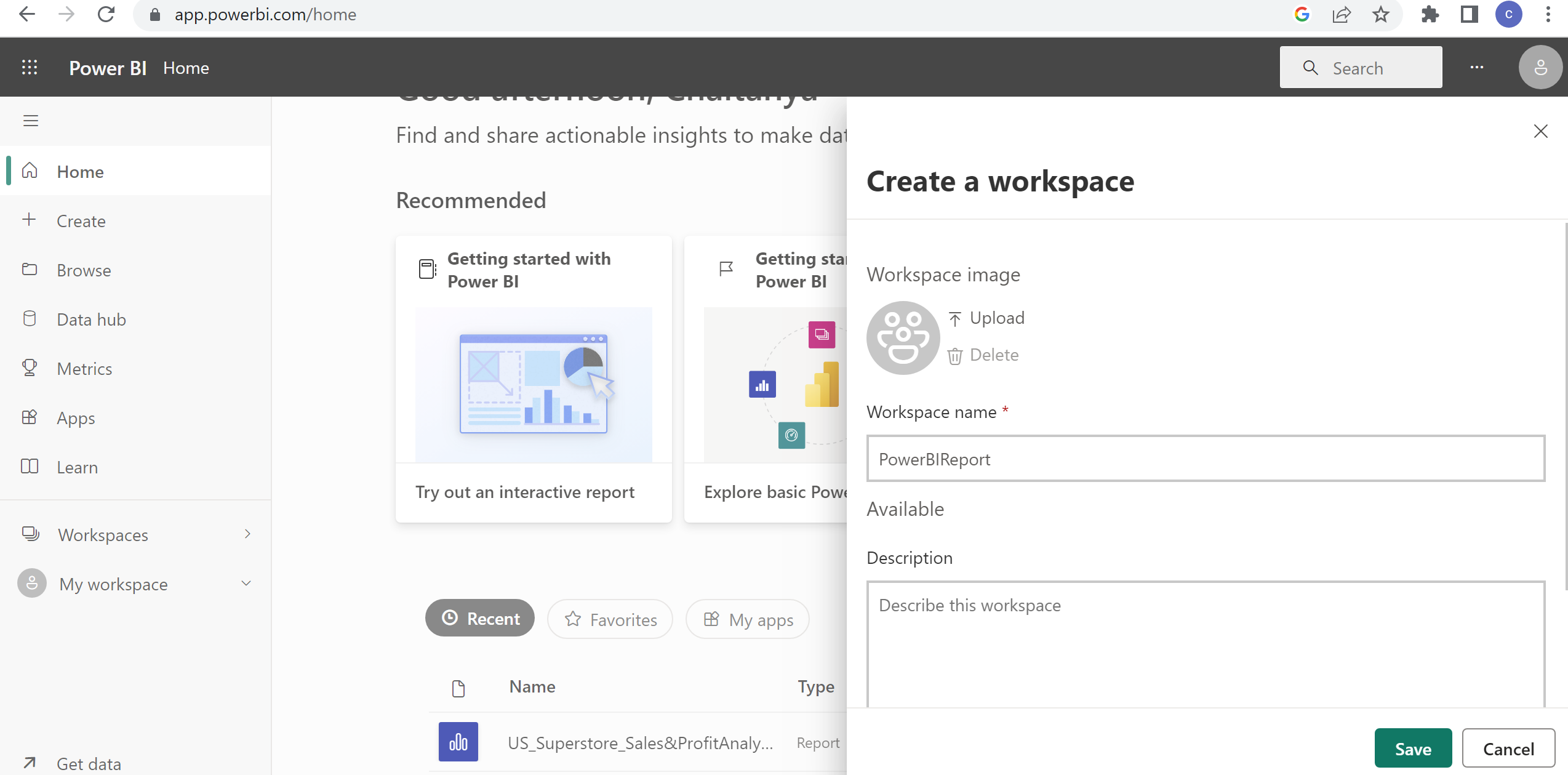
In the left pane, select Workspaces -> Create a Workspace.
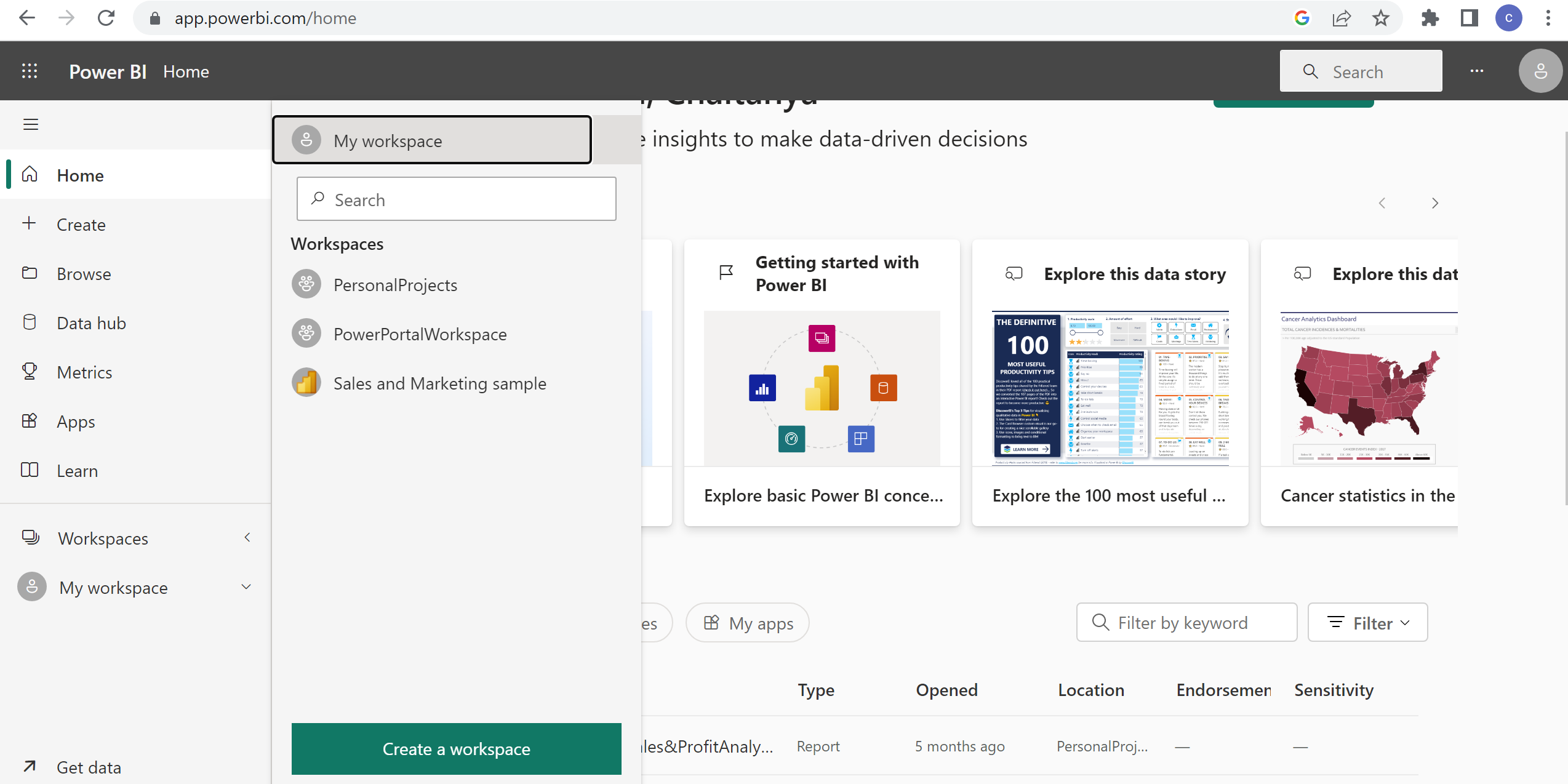
Give workspace name as PowerBIReport. Click Save.
Now, in the Power BI Desktop, select Publish.
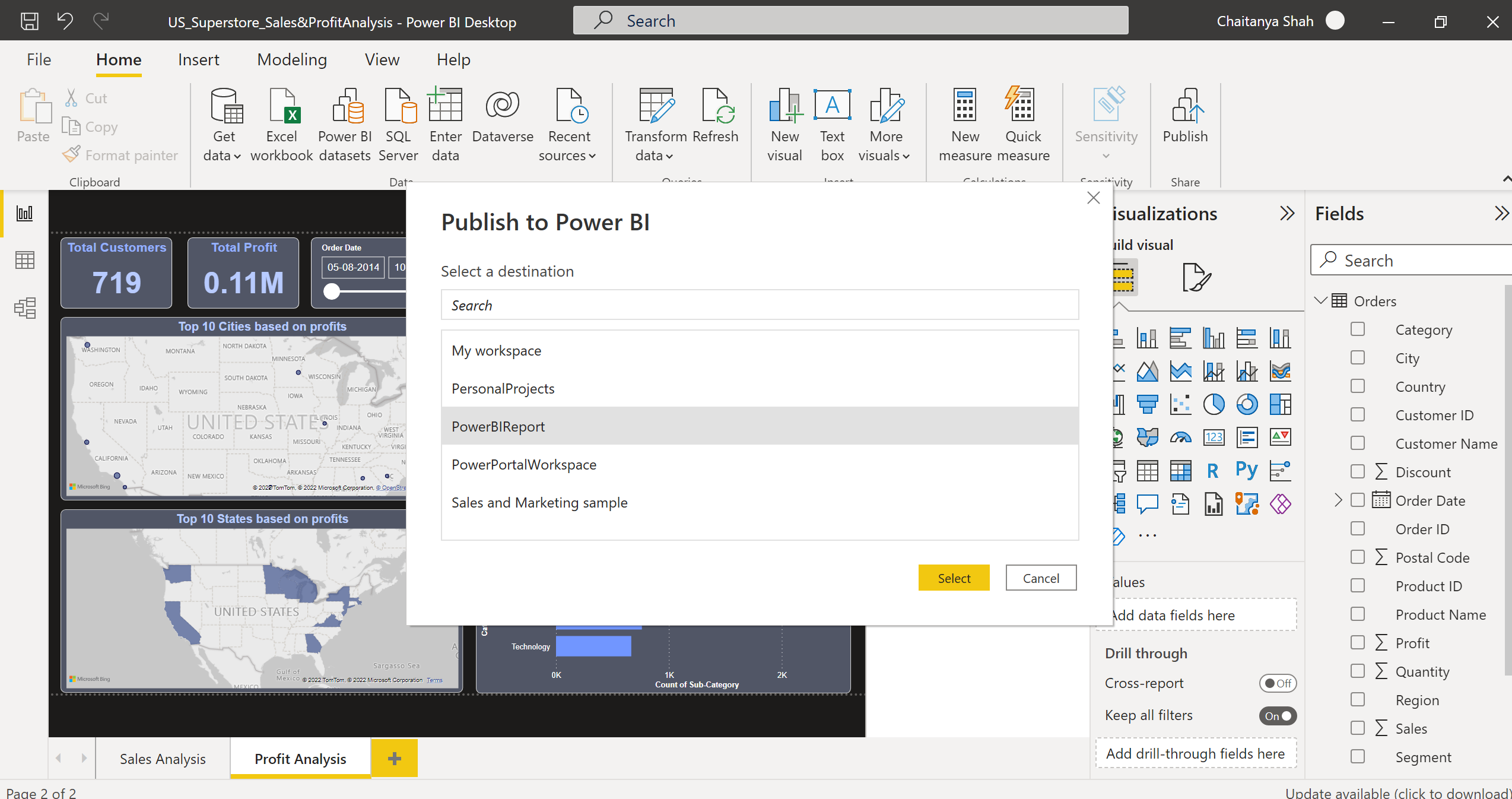
Choose PowerBIReport
workspace -> Select. The report is successfully published to the Power BI
Service.
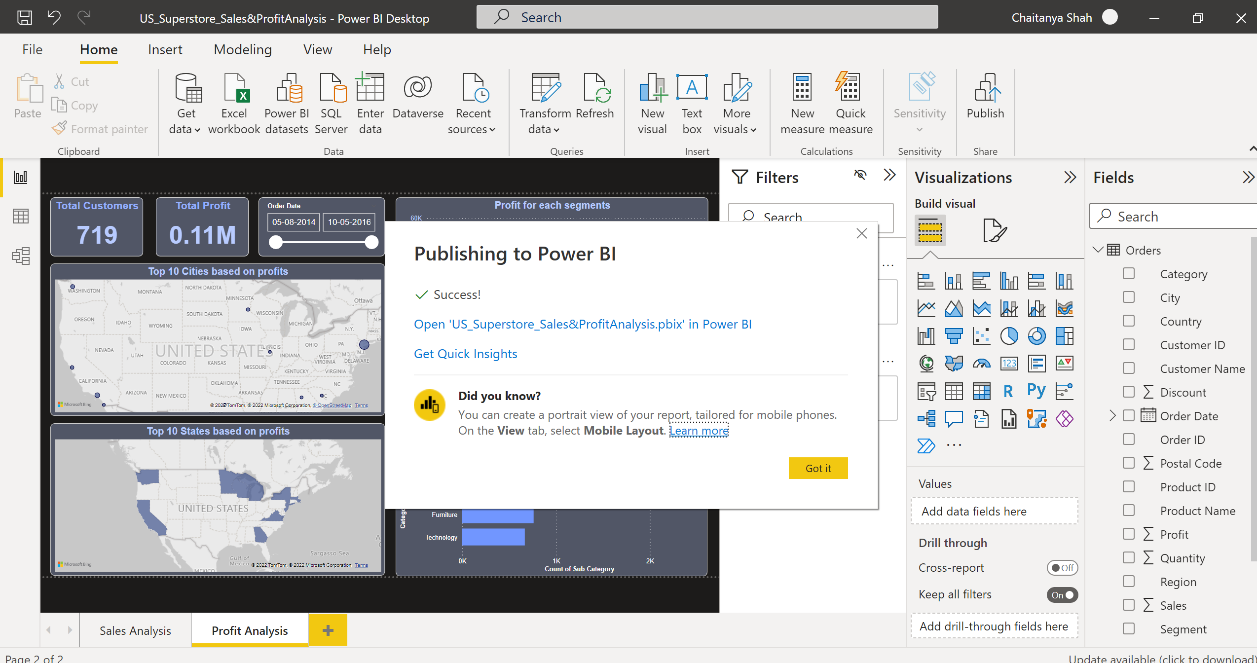
You can see it using the Open ‘Report_Name’ in the success pop-up.
Conclusion
We have seen how to build and publish a superstore sales and profit report in Power BI using the US superstore retail transaction data to get valuable insights about sales and profits. We understood how reports developed using its support of multiple data sources, are secure, and are easily scalable. We learned how we could build it for a real-time scenario. Below are the major takeaways:
· We understood what Power BI is and how we can get meaningful insights from data using its report.
· We have learned about the building blocks, such as visualizations, datasets, reports, dashboards, and tiles.
· We understood how to apply desktop data transformations using Power Query Editor.
· We have also seen how we can install its Desktop.
· We got a good understanding of how we can get data from multiple data sources in Power BI Desktop.
· We have seen the different data connectivity modes.
· We have also developed a report containing 2 pages based on superstore retail transaction data.
· We have learned how to shape data, drop unnecessary columns, filter, and sort columns in a real-world scenario.
· Apart from this, we saw how we could develop reports using built-in visuals such as cards, slicers, stacked bar charts, waterfall charts, maps, etc., and publish them in its Service.
The media shown in this article is not owned by Analytics Vidhya and is used at the Author’s discretion.
Related
- SEO Powered Content & PR Distribution. Get Amplified Today.
- Platoblockchain. Web3 Metaverse Intelligence. Knowledge Amplified. Access Here.
- Source: https://www.analyticsvidhya.com/blog/2023/01/a-case-study-superstore-sales-profit-report-using-power-bi/

