Executive Summary
- With the fourth Bitcoin halving fast approaching, estimated in April 2024, a tightness is forming within the Bitcoin supply which has reached historical levels.
- We assess a variety of measures for both ‘available supply’, as well as rates of ‘supply storage’ by longer-term investors which exceeds new issuance by 200%+.
- Using a relationship between Market Cap and Realized Cap, we estimate this supply tightness results in capital inflows into BTC is having an outsized impact on valuation.
Assessing Supply Dynamics Into the 2024 Bitcoin Halving
The halving event is one of the most anticipated events on the Bitcoin calendar, occurring every 210,000 blocks, and cutting the rate of new coin issuance by 50%. Whilst the fourth halving is pre-determined to occur at block-height 840,000, the exact date and time is unknown due to the natural variability and probabilistic nature of mining blocks.
Our best estimate given the current average block interval is that the halving is 158-days away, expected on the 23-April-2024.

Given the high CAPEX and OPEX demands of mining, Bitcoin miners have historically distributed a majority of their BTC income to cover costs. The YTD high of USD value issued to miners via newly minted supply is ~$1B/month, which is a non-trivial capital inflow headwind.
In a post 2024 halving world, this would be cut to $500M/month, which is comparable with the $450M/month distribution pressure around the FTX lows, set one year ago.
💡

Aside from the technical elegance and unstoppable nature of the Bitcoin halving, it is also a point of interest for investors. All prior halvings have experiencing impressive market performance in the 365-days that followed.
This naturally creates a point of intrigue as to whether the halving is the primary driver of these price appreciation cycles, or merely one of many factors. In this edition we will explore this through the lens of supply and investor behavior patterns to add some colour to the debate from an on-chain perspective.
We will break this into three analysis stages:
- Assessing the ‘Available and Active’ Supply
- Measuring rates of ‘Supply Storage and Saving’
- Analysing the Impact of Capital Flows on Market Valuation
🛠️

Assessing Available Supply
Our first port of call is to establish an estimate of the volume of BTC which is mobile, active, and freely circulating. In other words, what is the available supply that investors can reasonably expect to change hands in the near term?
The chart below covers several supply heuristics using ‘coin-age’ as the main input, measuring the time since a coin was last spent on-chain. Short-Term Holder Supply is currently at multi-year lows of 2.33M BTC, and captures coins up to 155-days old that are statistically the most likely to be spent.
Other metrics which describe ‘hotter’ supply include coins younger than 1-month (1.39M BTC), but could also consider Futures Open Interest (0.41M BTC BTC) as a form of ‘supply exposure’ in derivative markets.
Combined, this ‘hot supply’ volume is equivalent to between 5% and 10% of the circulating supply which is participating in day-to-day trade.

Glassnode developed another supply heuristic that monitors the spending behavior of wallets, classified into Illiquid, Liquid and Highly Liquid buckets. The latter two are shown below which represent wallets that both receive coins and also spend a significant proportion of them.
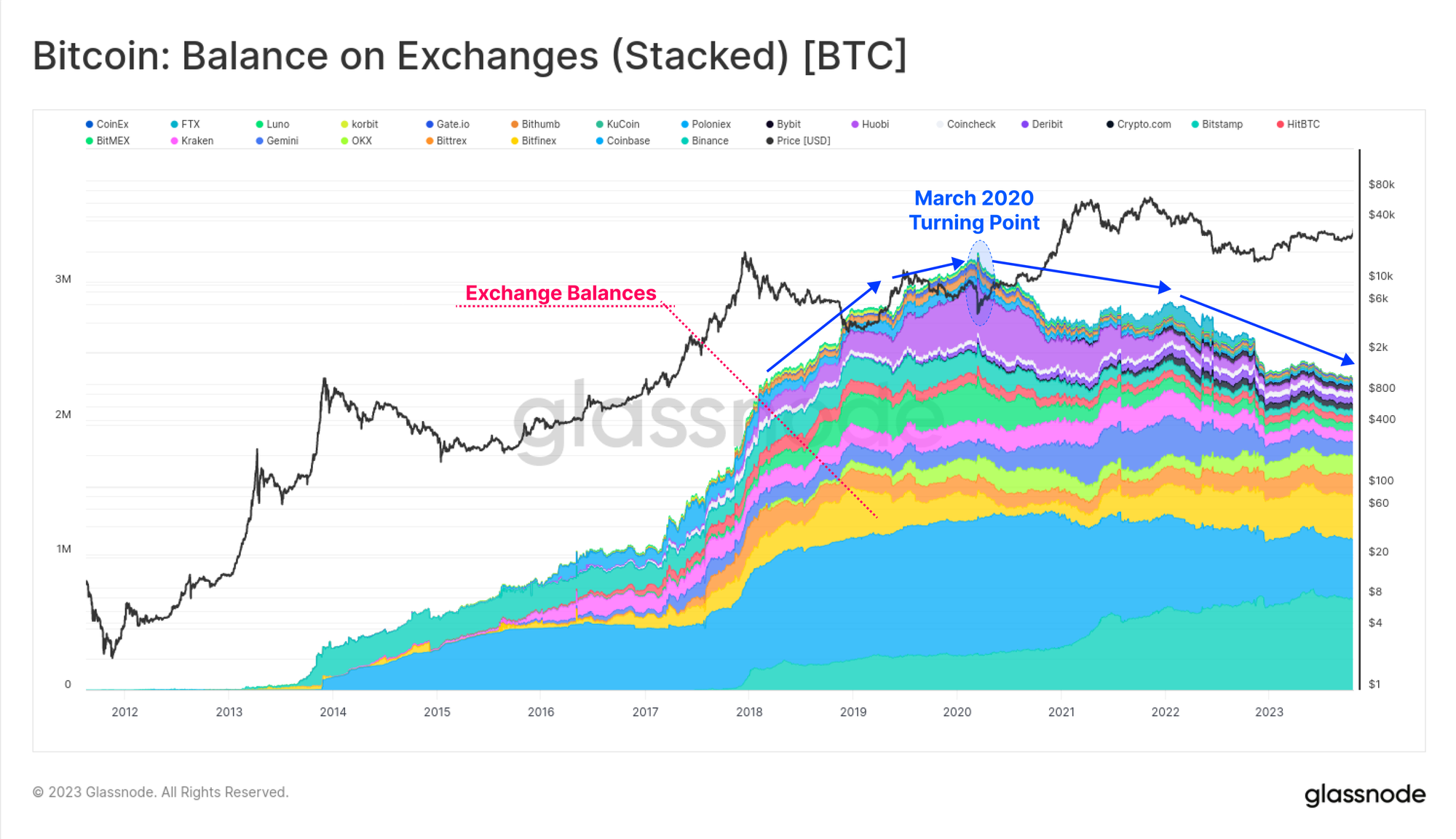
Of note is the multi-year decline that started in March 2020 when the world experienced a seismic shift brought on by the pandemic and social response to it.

There is significant overlap between Liquid and Highly Liquid supply and Exchange Balances for obvious reasons. This multi-year downtrend is visible again, suggesting coins are moving out of Exchange wallets and towards more Illiquid wallets with little history of spending.
An important nuance of this is the role of both institutional grade custodians, and ETF style products like GBTC (a useful reference for any future spot ETF vehicles). The chart below shows our best estimate of aggregate on-chain volumes for our Coinbase Exchange, Coinbase Custody, and GBTC clusters.
Note again the March 2020 turning point where demand for both GBTC and custody products increased significantly, both of which will classify as Illiquid supply in many instances.

If we compare Short-Term Holder Supply and Exchange Balances, we can see they are of a similar magnitude of around 2.3M BTC. Combined, these two measures of ‘available supply’ equate to 23.8% of the circulating supply, which is now at an all-time-low.
It could be argued that this puts available BTC supply at historical lows on a relative basis.

Measuring Rates of Stored and Saved Supply
We have established that the general trend for various measures of ‘available supply’ is declining. This trend is now a few years old, but has notably accelerated since the market wide sell-off in June 2022 (LUNA-UST and 3AC).

By contrast, when we overlay the inverse measures of ‘saved or stored’ supply, we can see a remarkable divergence is forming. Here we consider ‘stored supply’ using the following heuristics:
- Long-Term Holder Supply (Coins older than -155-days, dark blue)
- Illiquid Supply (wallets with limited spending history, light blue)
- Vaulted Supply (deep HODLed and Lost supply, see Cointime Economics, green)
This divergence is meaningful in that it suggests coins are generally migrating away from Exchange balances, speculators, and active trade, and towards cold storage, custody, and wallets of longer-term investors.

To get a sense of scale, we can compare the rate at which coins are being stored and saved relative to new issuance. At present, approximately 81k BTC are mined each quarter which will soon decrease to ~40.5k BTC/qtr after the halving.

If we overlay the 90-day change in Illiquid Supply, we can see there has been a sustained uptick in illiquid balances through all prior halving events. This suggests investor buy-side tends to ramp up in the lead up to and through the halving, often significantly exceeding the rate of issuance both before and after the event.
Illiquid Supply is currently increasing at a rate of 180k BTC/qtr which is 2.2x more than issuance.

Through the lens of ‘stored supply’ using investor holding time as the input, we see a similar accumulation pattern for Long-Term Holders (blue) and Vaulted Supply (green). Interestingly, this investor behavior seems to come in three waves:
- Wave 1 during the middle of the bear as prices correct sharply from the ATH.
- Wave 2 during later stages of the bear as the cycle floor is established.
- Wave 3 leading into and through the halving as investors acquire in anticipation.
🛠️
Workbench Tip: Here we have hidden negative values to improve visualisation using the if-then function if(f1,”<“,0,0,f1).

Accumulation rates can also be assessed using wallet size heuristics, where this chart considers all entities holding less than 100 BTC. These Shrimp (< 1BTC), Crabs (1 to 10BTC) and Fish (10 to 100BTC) capture a wide cross section of investors, from retail through to high net worth individuals.
In aggregate, their accumulation rates have exceeded new issuance since Feb 2022, being the longest and most sustained period in history.

To summarise, the chart below shows the net balance change of these various ‘stored’ supply metrics since 1-Jan-2022. We use the change in circulating supply (orange) as our baseline, and see that the rates of accumulation by investors ranges from between 1.1x through to almost 2.5x new issuance.
Not only are our measures of ‘available supply’ at historical lows, the rates of ‘supply storage’ by investors are also meaningfully higher than issuance rates in a pre-halving environment. The cyclical nature of Bitcoin market cycles duirng bear markets and halving events can be described by these investor accumulation patterns, reminding us of a saying in markets;
Bear markets author the bull that follows (and vice versa)

Analysing Shifting Capital Tides
In several recent WoC editions, we have focused on the rotation of capital throughout the digital asset ecosystem (see WoC 41, 42, and 44). In these editions, we use The Realized Cap as a proxy for capital inflows, outflows and rotation between assets.
At a behavioral level, long-term investors in Bitcoin tend to buy low and sell high, a process which realizes profit, and revalues coins from a low cost basis to a higher one. A coin acquired at $6k in 2018 is sold at $60k in 2021, requiring 900% more capital to flow in and acquire the same coin volume.
An important aside: whilst ‘stored supply’ is increasing today, the chart below is showing the inverse, where profits are taken, and ‘stored supply’ is spent back into liquid circulation.

With this framework in mind, we can compare the amount of capital which must flow in (or out) of the Bitcoin Realized Cap to achieve a $1 change in the Market Cap.
This final metric was first proposed in a recent research report, and can be though of as a liquidity or volatility measure. It describes how much the Realized Cap must change to achieve a $1.0 change in the Market Cap of Bitcoin. We note some interesting details:
- In late stage bull markets (orange zones) more than $0.75, and often over $1.0 in capital inflows is needed to achieve a $1.0 Market Cap change. This has histrionically been found to be a unsustainable condition.
- During bear markets, as capital and investor attention drains, this can drop to between $0.10 and $0.30. This leads to more volatile price swings, as small capital inflows or outflows result in an outsized impact.
This metric is close to the long-term median (in red) of $0.25, suggesting Bitcoin supply and liquidity is fairly tight. A capital inflow/outflow of $0.25 is creating a $1.0 change in the market cap. In many ways, this aligns with the supply dynamics discussed above, where ‘available supply’ is indeed historically low, storage rates are up, and liquidity is thinner as a result.
🛠️
Workbench Tip: This chart uses an if(f1,”>”,0.75,0,m1) function to highlight price m1 whene the metric f1 is above a threshold value of 0.75.

Summary and Conclusions
The fourth halving event is fast approaching and represents an important fundamental, technical, and philosophical milestone for Bitcoin. For investors, it is also an area of intrigue given the impressive return profile in prior cycles.
In this edition we explored the tightness forming within the Bitcoin supply using a variety of supply measures and heuristics. There is notable confluence between these metrics suggesting ‘available supply’ is at historical lows, and rates of ‘supply storage’ exceed current issuance by a factor of up to 2.4x.
Disclaimer: This report does not provide any investment advice. All data is provided for information and educational purposes only. No investment decision shall be based on the information provided here and you are solely responsible for your own investment decisions.
Exchange balances presented are derived from Glassnode’s comprehensive database of address labels, which are amassed through both officially published exchange information and proprietary clustering algorithms. While we strive to ensure the utmost accuracy in representing exchange balances, it is important to note that these figures might not always encapsulate the entirety of an exchange’s reserves, particularly when exchanges refrain from disclosing their official addresses. We urge users to exercise caution and discretion when utilizing these metrics. Glassnode shall not be held responsible for any discrepancies or potential inaccuracies. Please read our Transparency Notice when using exchange data.

- SEO Powered Content & PR Distribution. Get Amplified Today.
- PlatoData.Network Vertical Generative Ai. Empower Yourself. Access Here.
- PlatoAiStream. Web3 Intelligence. Knowledge Amplified. Access Here.
- PlatoESG. Carbon, CleanTech, Energy, Environment, Solar, Waste Management. Access Here.
- PlatoHealth. Biotech and Clinical Trials Intelligence. Access Here.
- Source: https://insights.glassnode.com/the-week-onchain-week-46-2023/

