Executive Summary
- The strong Bitcoin uptrend found resistance this week, breaking to a new yearly high of $44.5k before experiencing the third sharpest selling off of 2023.
- Several on-chain pricing models suggest that ‘fair value’ based on investor cost basis and network throughput are lagging, hovering between $30k and $36k.
- In response to strong price appreciation over recent months, Bitcoin Short-Term Holders have taken profits at a statistically meaningful magnitude, pausing the climb.
The Bitcoin market has performed a round-trip this week, opening at $40.2k, rallying to a new yearly high of $44.6k, before selling off sharply to $40.2k late on Sunday evening. The upside move into the yearly high consisted of two rallies over +5.0%/day (+1 standard deviation moves). The sell-off was equally as powerful, dropping by over $2.5k (-5.75%) making for the third largest one-day down move for 2023.
As we covered last week (WoC 49), Bitcoin has had a standout year, up over 150% YTD at the peak, and outperforming a majority of other assets. With this in mind, it is important to keep an eye on how investors are responding to their new paper gains as the year approaches the close.

Navigating Cycles via On-chain Pricing Models
A useful toolset for navigating market cycles are investor cost basis, measured from the on-chain transactions for various cohorts. The first cost basis model metric we will consider is the Active Investor Realized Price 🟠, which computes a Fair Value of Bitcoin based on our Cointime Economics framework.
This model applies a weighting factor to the realized price in line with the degree of supply tightness (HODLing) across the network. Large-scale HODLing acts to constrain supply, increasing the estimated ‘fair value’, and vice-versa. The chart below highlights periods where the spot price trades above the classic Realized Price 🔵 (a floor model), but below the cycle all-time-high. From this we have a few observations:
- The time between a successful break of the Realized Price and making a new ATH has historically been 14 to 20 months (with 11-months thus far in 2023).
- The path to a new ATH has always involved major fluctuations of ±50% around the Active Investor Realized Price 🟠 (shown in oscillators for each cycle).
Should history be our guide, it would paint a roadmap of several months of choppy conditions around this ‘fair value’ model (currently at ~$36k).

The Mayer Multiple is another popular as a technical pricing model for Bitcoin, simply describing the ratio between price and 200-day moving average. The 200-day MA is a widely recognized indicator for establishing macro bull or bear bias, making it a useful reference point for assessing overbought and oversold conditions.
Historically, overbought and oversold conditions have coincided with Mayer Multiple values exceeding 2.4, or below 0.8, respectively.
The present value of the Mayer Multiple indicator is at 1.47, close to the ~1.5 level which often forms a level of resistance in prior cycles, including the Nov 2021 ATH. Perhaps as an indicator for the severity of the 2021-22 bear market, it has been 33.5-months since this level was breached, the longest period since the 2013-16 bear.

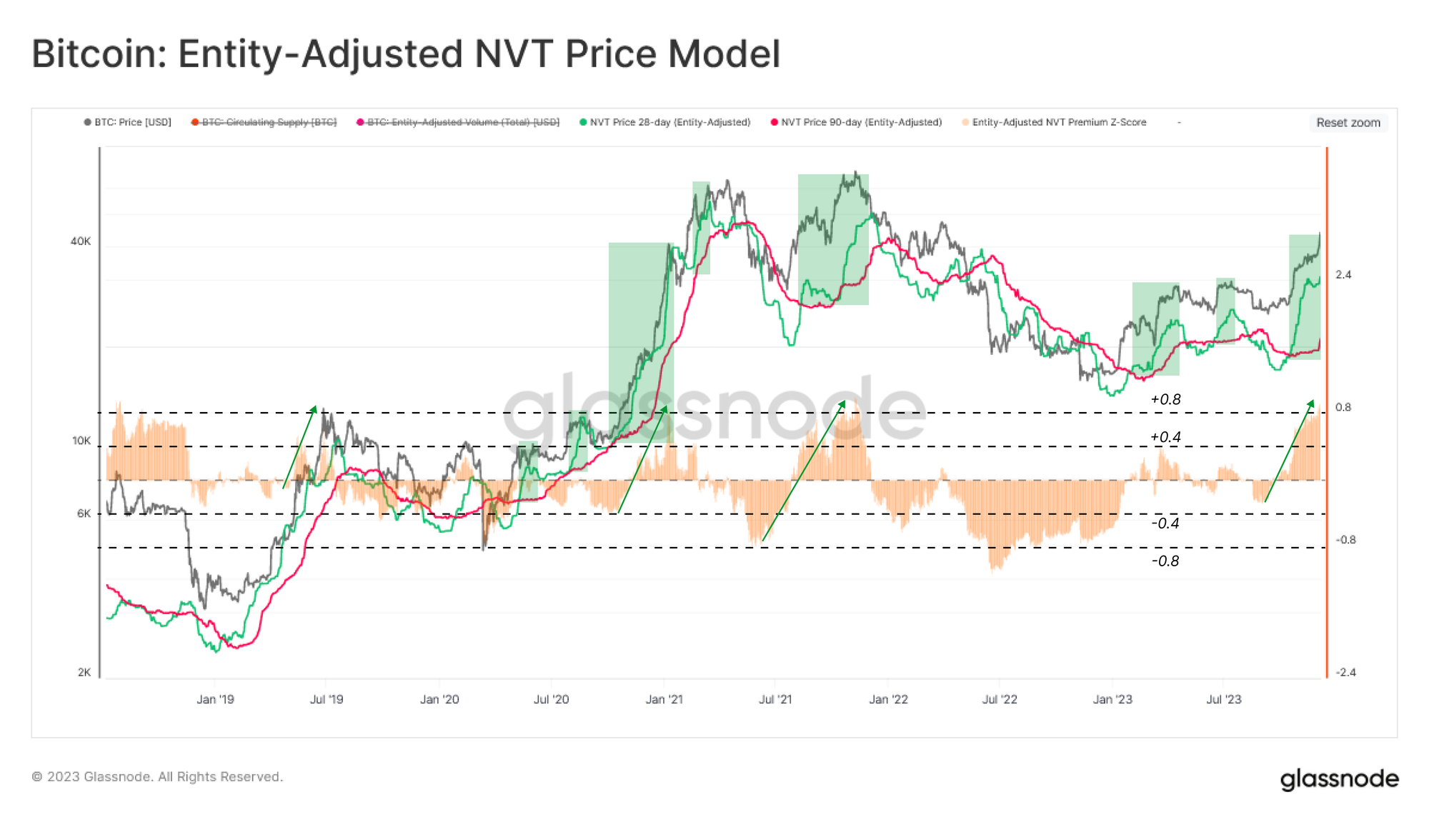
Another lens for assessing ‘fair value’ for Bitcoin is to translate on-chain activity into the price domain via the NVT Price model. The NVT Price is seeking a fundamental valuation of the network based on its utility as a settlement layer for USD-denominated value.
Here, we consider a 28-day 🟢 and a 90-day 🔴 variants, providing a pair of fast and slow signals, respectively. A typical bear-to-bull transition phase sees the faster 28-day variant trading above the 90-day model, a condition which has been in play since October.
The NVT Premium 🟠 can also be used to assess spot pricing relative to the slower 90-day NVT Price. The recent rally printed one of the sharpest spikes in the NTV premium indicator since the market top in Nov 2021. This suggests a potential near-term ‘overvaluation’ signal relative to network throughput.
The Marginal Investor
In prior editions of this newsletter (WoC 38) we explored the outsized influence that new investors (also called Short-Term Holders) have in shaping near-term price action such as local tops and bottoms. Conversely, activity by Long-Term Holders tends to have more significant influence as the market reaches macro extremes, such as breaking to new ATHs or during painful capitulation events and bottom formation (see Following the Smart Money and Buying High and Selling Low).
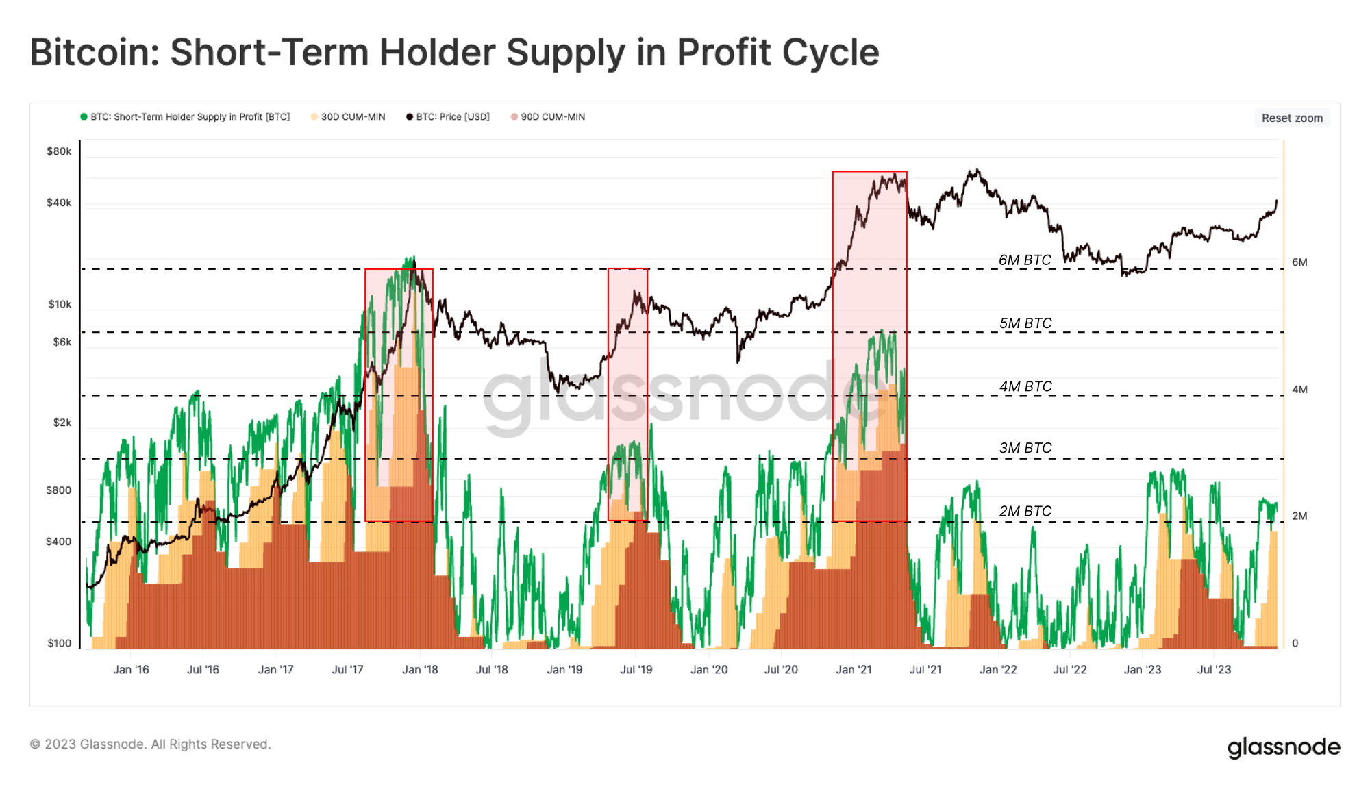
To reinforce the impact of STH behavior, the following chart highlights the relationship between price moves (trends and volatility) and changes in the profitability of this cohort of investors:
- STH Supply In Profit 🟢: The number of coins held ‘in profit’ by STHs, having a cost-basis lower than the current spot price.
- 30D-Floor 🟨: The minimum ‘in-profit’ STH coin supply over the last 30-days.
- 90D-Floor 🟥: The minimum ‘in-profit’ STH coin supply over the last 90-days.
These 30D and 90D indicators allow us to gauge the proportion of STH capital which is ‘in -profit’ over different time windows. In other words, we can compare these traces to measure how many STH coins have been held ‘in-profit’ for under 30-days, 30 to 90-days, and more than 90-days.
Historically, rallies towards new ATHs coincide with the 90-day metric reaching above 2M BTC, suggesting a moderately long hold time by this cohort (a robust investor base). The rally since October has primarily lifted the 30-days variant, suggesting a solid STH foundation has not yet been established since trading above the $30k mid-cycle level (see WoC 43).
We also note 2023 traces are relatively low compared to past cycles, reinforcing the relative supply tightness we covered in WoC 46.
Short-Term Fear and Greed
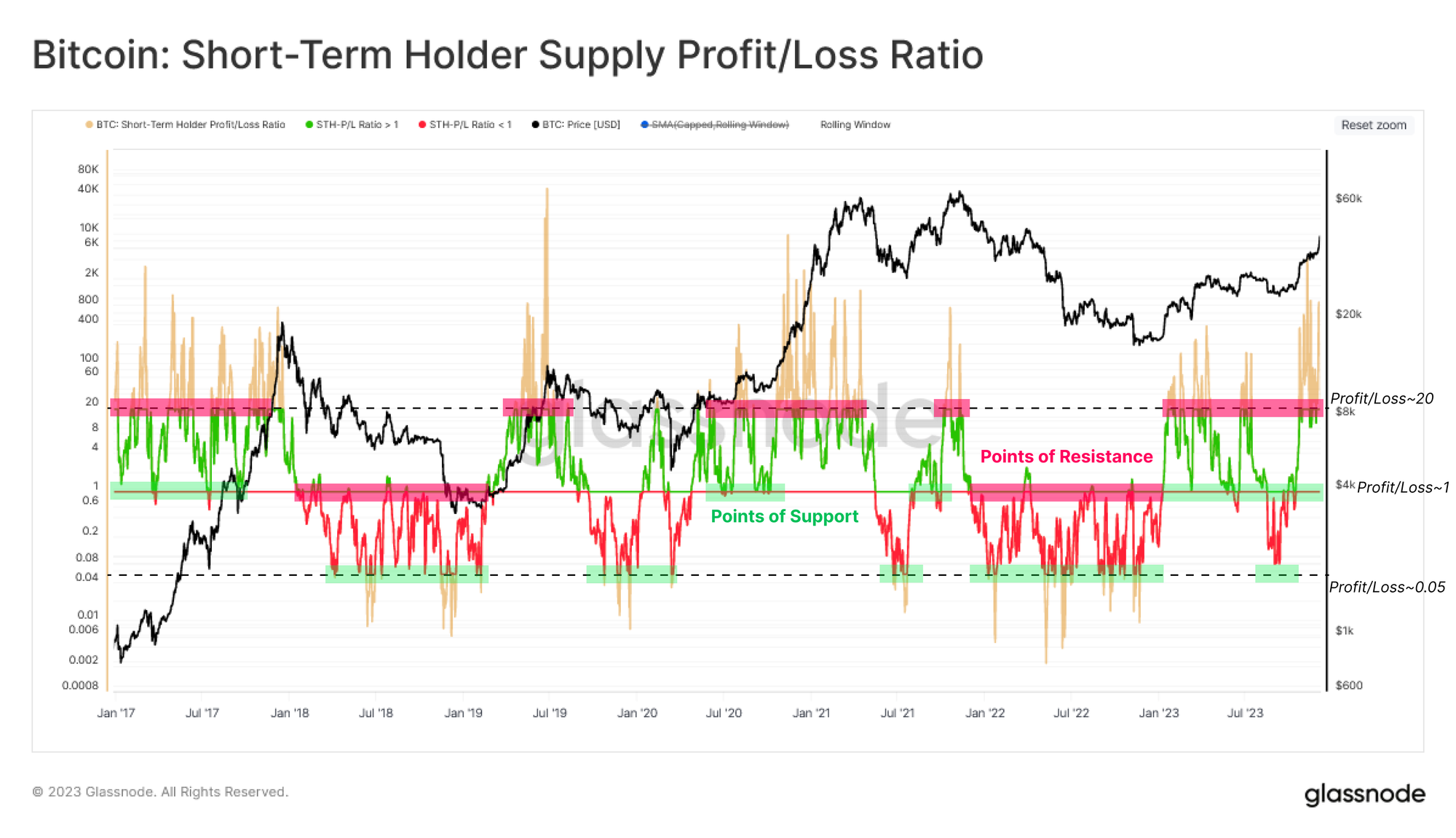
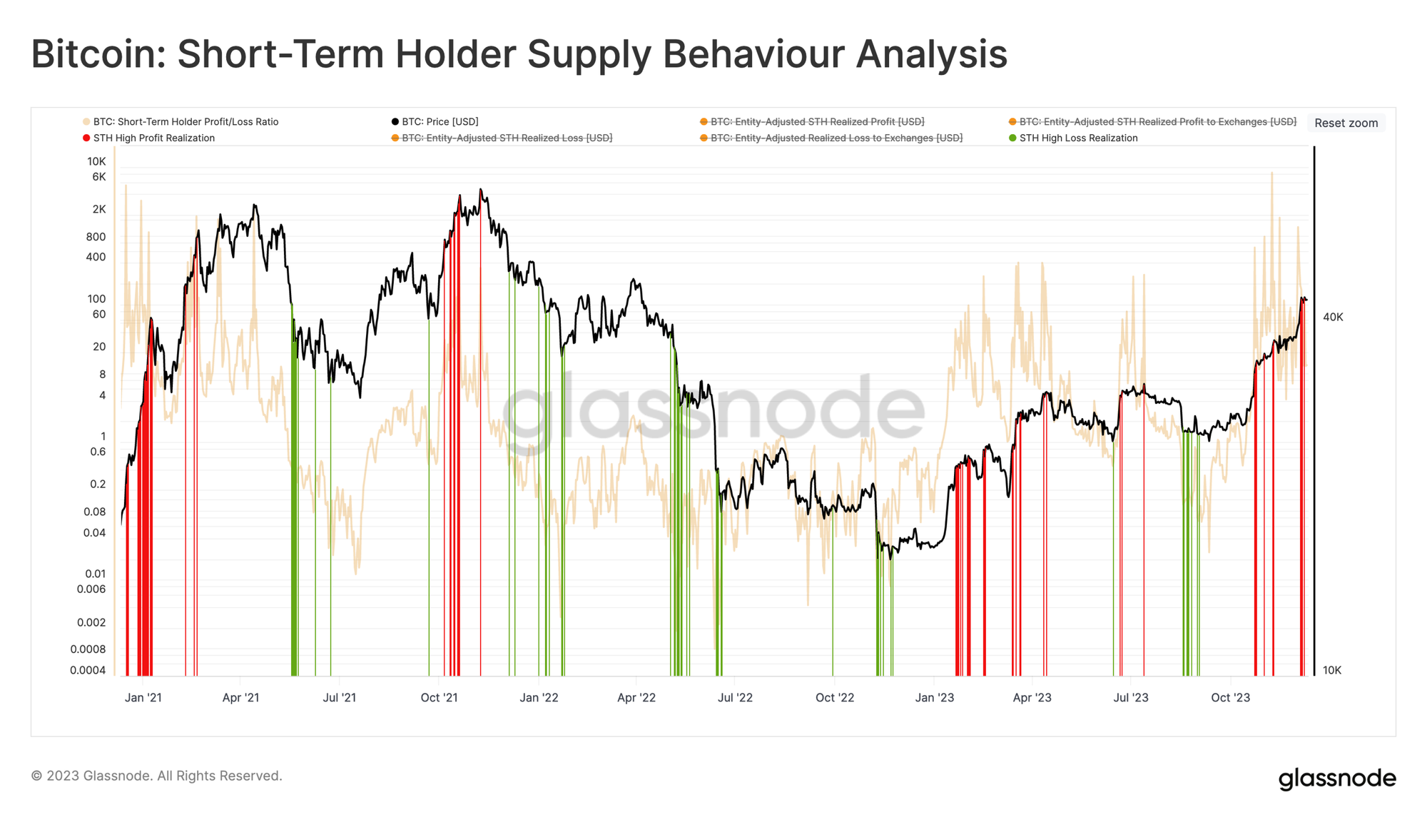
The next step is to build a tool that identifies periods of heightened fear and greed among these newer investors, focusing on overbuying (tops) or overselling (bottoms) signals. We introduced the STH-Supply Profit / Loss Ratio in WoC 18, which provides a proportional look at unrealized profit to loss. As shown in the chart below:
- Profit/Loss Ratios > 20 historically align with overheating conditions.
- Profit/Loss Ratios < 0.05 historically align with oversold conditions.
- Profit/Loss Ratios ~ 1.0 signifies break-even and tends to align with support/resistance levels within the prevailing market trend.
Since January, this metric has traded above ~1, with several retests and support found at this level. These conditions are historically associated with ‘buy-the-dip’ investor behavior patterns common during uptrends.
We also note that the October rally drove this metric well above the overheated level of 20, which signals a higher-risk structure and a similar ‘overheated’ condition to the NTV-Premium indicator.
The above oscillator accounts for the Unrealized Profit/Loss held by STHs, which can be considered their ‘incentive to spend.’ The next step is to assess whether these new investors took action and Realized Profits (or losses), bringing supply back onto the market and creating sell-side resistance.
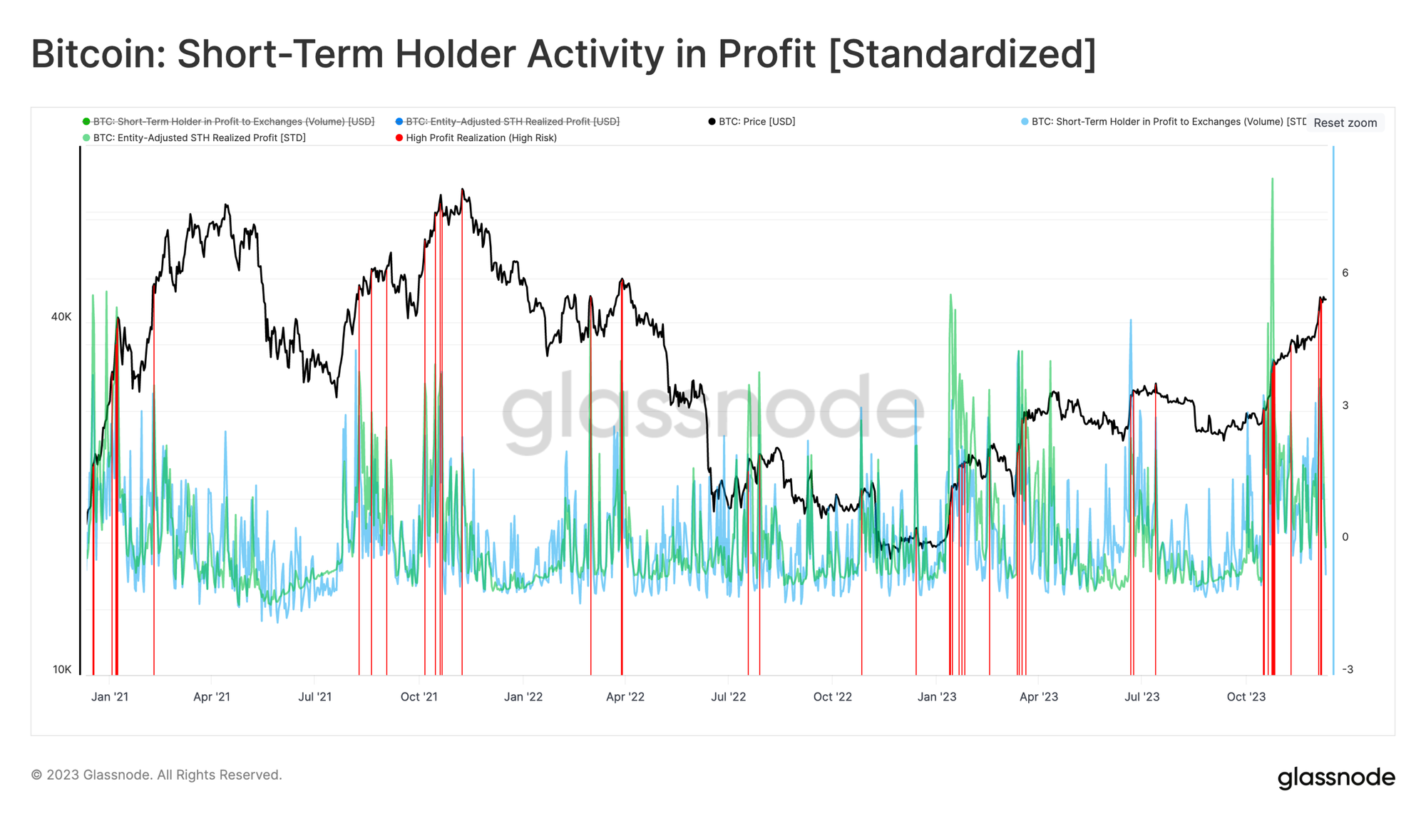
The chart below maps four different measures of realized profit/loss by STHs (all normalized by Market Cap):
- 🟢 STH Volume in Profit to Exchanges and 🔵 STH Realized Profit
- 🟠 STH Volume in Loss to Exchanges and 🔴 STH Realized Loss
The key insight from this study is identifying periods where there is a reading across both the Realized Profit/Loss, and Volume in Profit/Loss to Exchange pairs. In other words, STHs are both sending lots of coins to exchanges, and the average delta between acquisition and disposal prices is large.
With this in mind, this week’s rally to $44.2k provoked a high degree of STH profit-taking activity, suggesting this cohort acted upon their paper gains, taking advantage of demand liquidity.

We can then distill this observation further by highlighting days where STH realized profit increased by more than one standard deviation over the last 90-day average 🟥. We can see that this indicator has flagged local peaks throughout the last three years.
Using the same workflow, periods of high loss taking by STHs typically reaches one standard deviation level during major sell-off events. This signals when investors panic and send recently acquired coins back to exchanges for disposal at a loss.
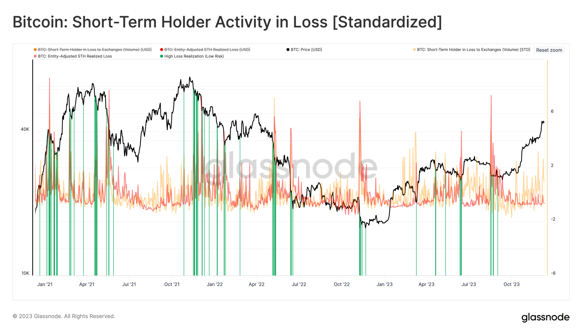
We can of course bring both of these indicators into a single chart, creating a tool to help identify near-term overheated/oversold conditions based on the spending behavior of the STH cohort.
As we can see, the recent rally to $44.2k was accompanied by a statistically meaningful degree of profit-taking by STHs. Alongside the NTV-premium and extended Realized Profit/Loss Ratio, we can see a confluence of factors suggesting a potential saturation of demand (exhaustion) may be in play.
Conclusion
Bitcoin performed a round-trip this week, rallying to new yearly highs before selling off back towards its weekly open. After such a powerful 2023 thus far, this rally in particular seems to have met resistance, with on-chain data suggesting STHs are a key driver.
We present a series of indicators and frameworks highlighting local over and under-valuation for Bitcoin. These metrics draw on both investor cost basis, technical averages, and on-chain fundamentals such as transaction volumes. We can then seek confluence within (un)realized profit/loss metrics, which show when investors start taking chips off the table.
Disclaimer: This report does not provide any investment advice. All data is provided for information and educational purposes only. No investment decision shall be based on the information provided here and you are solely responsible for your own investment decisions.
Exchange balances presented are derived from Glassnode’s comprehensive database of address labels, which are amassed through both officially published exchange information and proprietary clustering algorithms. While we strive to ensure the utmost accuracy in representing exchange balances, it is important to note that these figures might not always encapsulate the entirety of an exchange’s reserves, particularly when exchanges refrain from disclosing their official addresses. We urge users to exercise caution and discretion when utilizing these metrics. Glassnode shall not be held responsible for any discrepancies or potential inaccuracies. Please read our Transparency Notice when using exchange data.

- SEO Powered Content & PR Distribution. Get Amplified Today.
- PlatoData.Network Vertical Generative Ai. Empower Yourself. Access Here.
- PlatoAiStream. Web3 Intelligence. Knowledge Amplified. Access Here.
- PlatoESG. Carbon, CleanTech, Energy, Environment, Solar, Waste Management. Access Here.
- PlatoHealth. Biotech and Clinical Trials Intelligence. Access Here.
- Source: https://insights.glassnode.com/the-week-onchain-week-50-2023/

