Executive Summary
- Exchanges remain the centrepiece of the digital asset industry, where the vast majority of trade takes place.
- Our assessment, based on entity-adjusted data, indicates that 54% of the economical on-chain volume for Bitcoin is related to either exchange deposits or withdrawals.
- Drawing insights from the lessons of the FTX collapse, we introduce three metrics to pinpoint unusual exchange activity: the Reshuffling Ratio, the Reliance Ratio, and the Whale Withdrawal Ratio.”
- Using this exchange risk framework, we assess Binance, Coinbase, Huobi and FTX to provide an overview of various exchange on-chain behaviors.
🕰️ Introducing Cointime Economics
We are proud to release a groundbreaking new framework for Bitcoin On-chain Analysis, prepared in a joint venture between Glassnode and ARK-Invest. Material is available in several formats to introduce this new concept:
The chaos of the FTX failure in Nov 2022 was a stark reminder of counter-party risk within the digital asset industry. Whilst hindsight is 20/20, exchanges remain the centrepiece of trade, and thus risk mitigation and management become critical.
The Glassnode suite currently offers on-chain data covering balances and fund flows associated with 20+ centralized exchanges. In this edition, we will present a few components of a framework for assessing exchange risk using on-chain data.
The supply held on centralized exchanges peaked at 3.203M BTC in March 2020, and has steadily declined since. Total exchange balances reached a five-year low this week of 2.256M BTC. Note that these exchange balances consider the direct exchange-related wallet clusters but do not include dedicated custodians or ETF style instruments (like GBTC, or Microstrategy etc.).
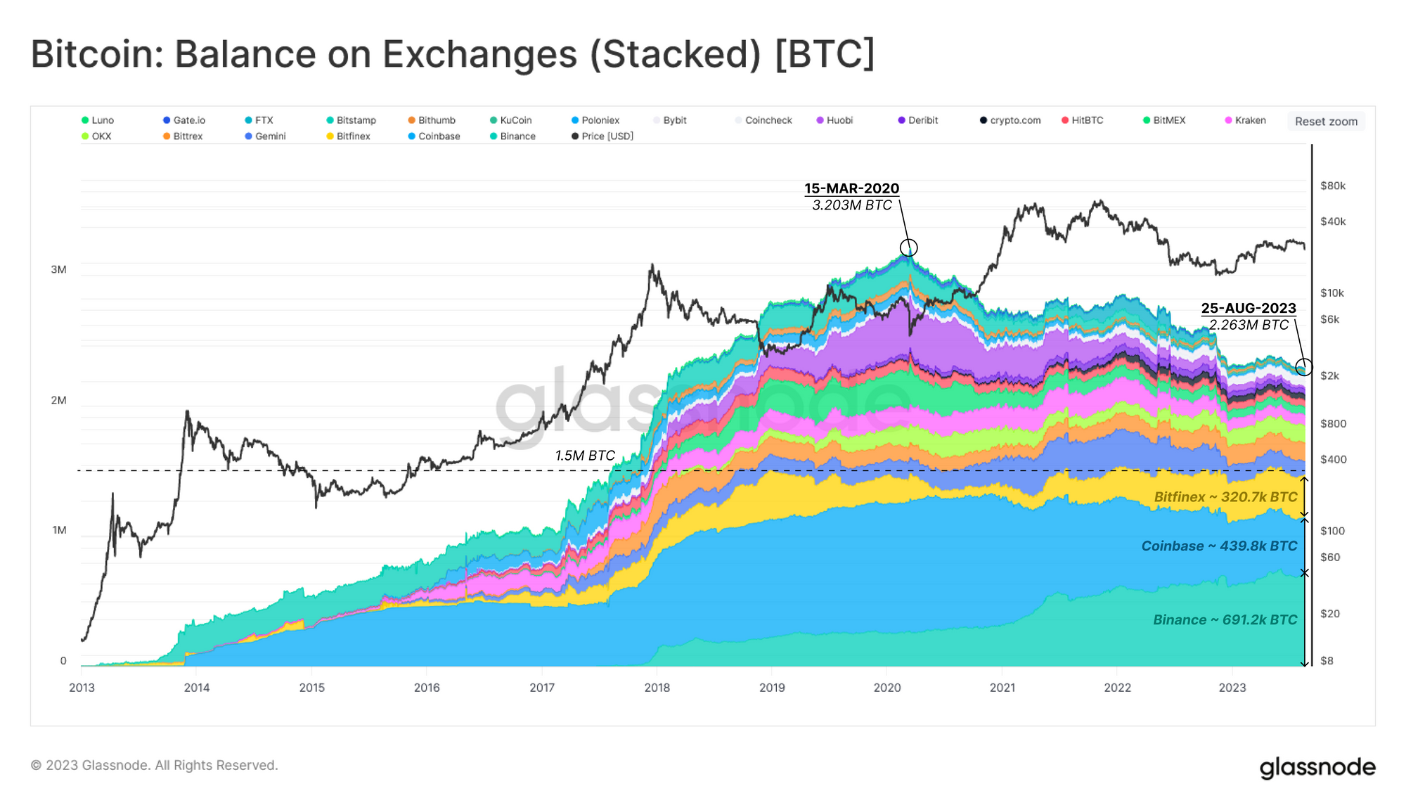
One remarkable aspect of this chart is the dominance of the top three exchanges, which have continuously held around ~1.5M BTC since early 2019. The current supply held on these exchanges is estimated to be as follows:
- Binance 691.2k BTC
- Coinbase 439.8k BTC
- Bitfinex 320.7k BTC

The chart below illustrates the relative supply distribution between centralized exchanges 🟡 and non-exchange entities 🟠. We also show Entity-Adjusted Transfer Volume as a form of ‘active’ layer on top 🟣, and excluding the 1.457 million BTC considered Lost Supply ⚫
Exchanges reserves comprise 2.31M BTC (11.8%) of the circulating supply, while 122k BTC (0.6%) worth of economic value is transferred on-chain each day.
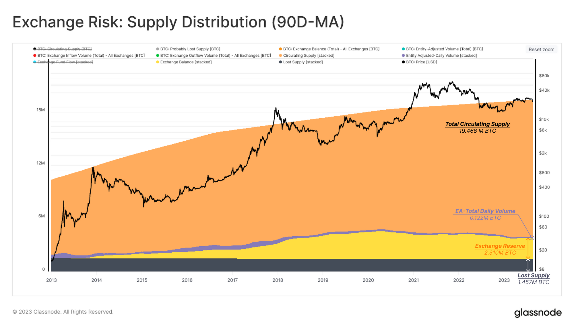
Of this 122k BTC volume, exchange deposits or withdrawals account for over 54% of it (67.3k BTC/day, usually 50/50 deposits/withdrawals). As such, observations of the economic flows in and out of exchanges tend to be quite information dense.
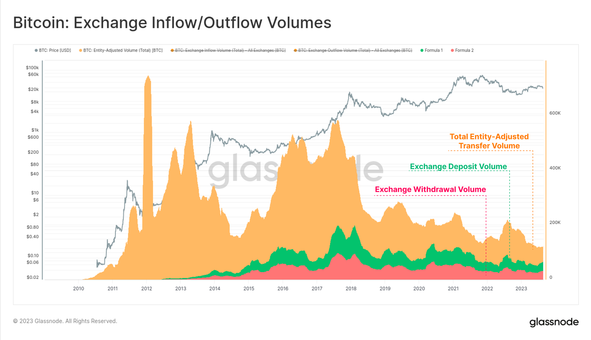
Exploring Exchange Flows
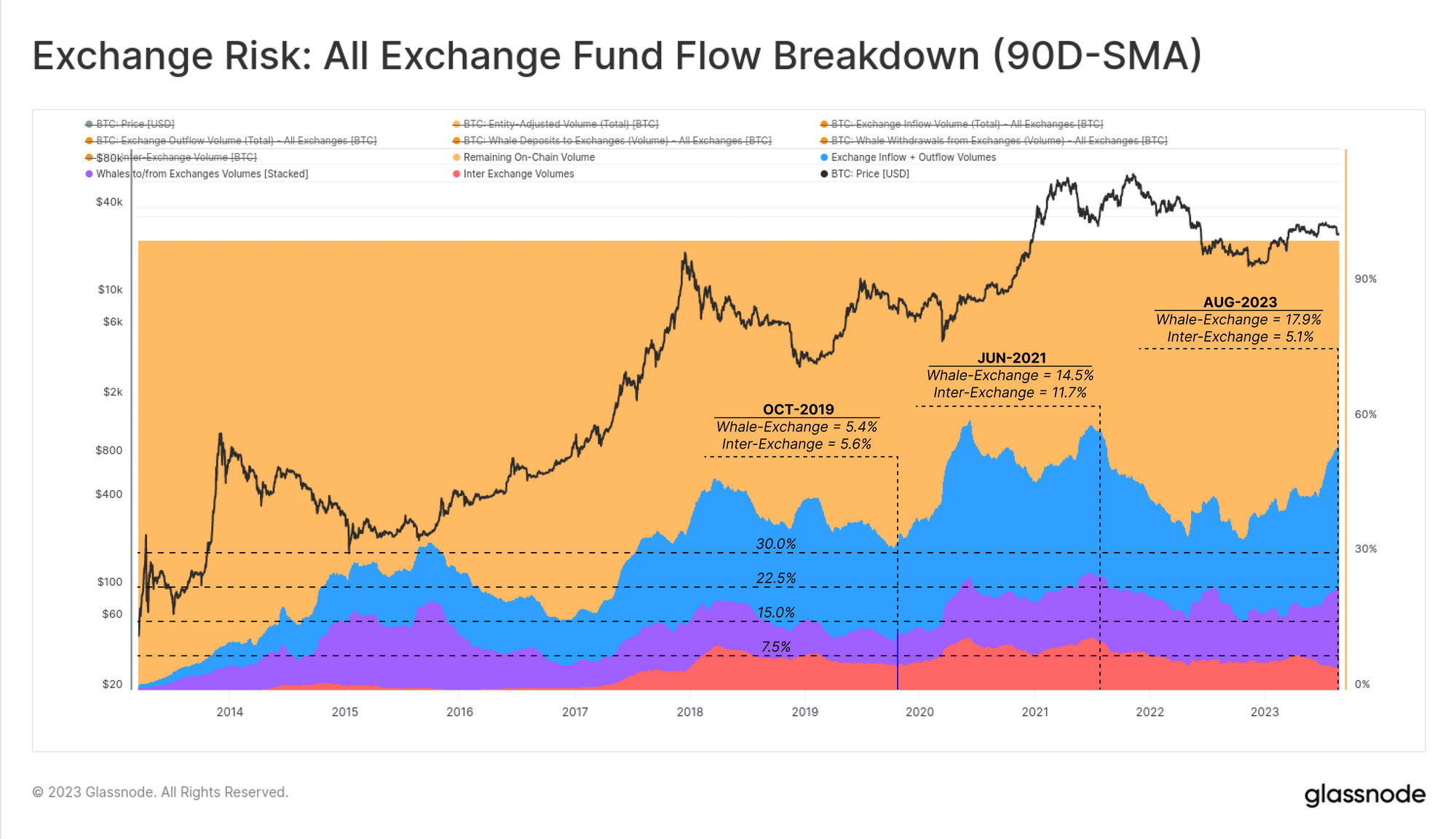
With an appreciation for the magnitude of exchange flows, we can dive deeper into the funds flowing between entities and exchanges. In the next chart, we have added Exchange inflow and outflow volumes together to form a single metric, Exchange Fund Flow 🟦 (with a 90-day average applied).
Here we can see the dominance of Exchange Fund Flows 🔴 has reached 54% of economic volumes, and is in a macro uptrend. Exchange dominance reached 58% in June 2021, before falling sharply as global interest rates started accelerating higher, liquidity started tightening and the bear market set in soon after. Dominance started rising again in October 2022 as both global liquidity and the market recovered from the FTX fallout.

We can break down the dominance of on-chain volumes flows into four buckets:
- 🟠 Non-exchange related on-chain volume (Entity-Adjusted).
- 🔵 All Exchange related flows (inflows and outflows).
- 🟣 Whale-to/from-exchanges: funds transferred to/from whales (1k BTC+) and exchanges.
- 🔴 Inter-Exchange flows: funds transferred from one exchange cluster to another.
Inter-exchange flow have remained relatively stable at around 7.5% of total on-chain volume, setting a peak of 11.7% in June 2021. Meanwhile, the whale-exchange share has recently reached a new all-time high of 17.9% (covered in WoC 30).
As we can see, the overall dominance of exchange related flows (54%) 🔵 are currently near the all-time-highs.
An Exchange Risk Framework
The first part of this report established a view over the macro dominance that exchanges play in the Bitcoin ecosystem. However in the wake of FTX, exchanges can also be a source of counter-party risk.
In the next section, we aim introduce a framework which may be used to analyze the associated risk for an individual exchange. Throughout this section, we consider the FTX data-set as a reference point for high-risk instances in the future. Reflecting the dominance of Coinbase, and the recent market commentary around Binance and Huobi, we will present data associated with these exchanges for comparison purposes only.
We will present this framework using three indicator constructions:
- The Internal Reshuffling Ratio – the proportion of the exchange balance which is transacted internally over a period of time.
- Exchange Reliance Ratio – the degree to which an exchanges balance moves to/from other exchanges (inter-exchange transfers).
- Whale Withdrawal Ratio – indicators that large entities are withdrawing at elevated rates.
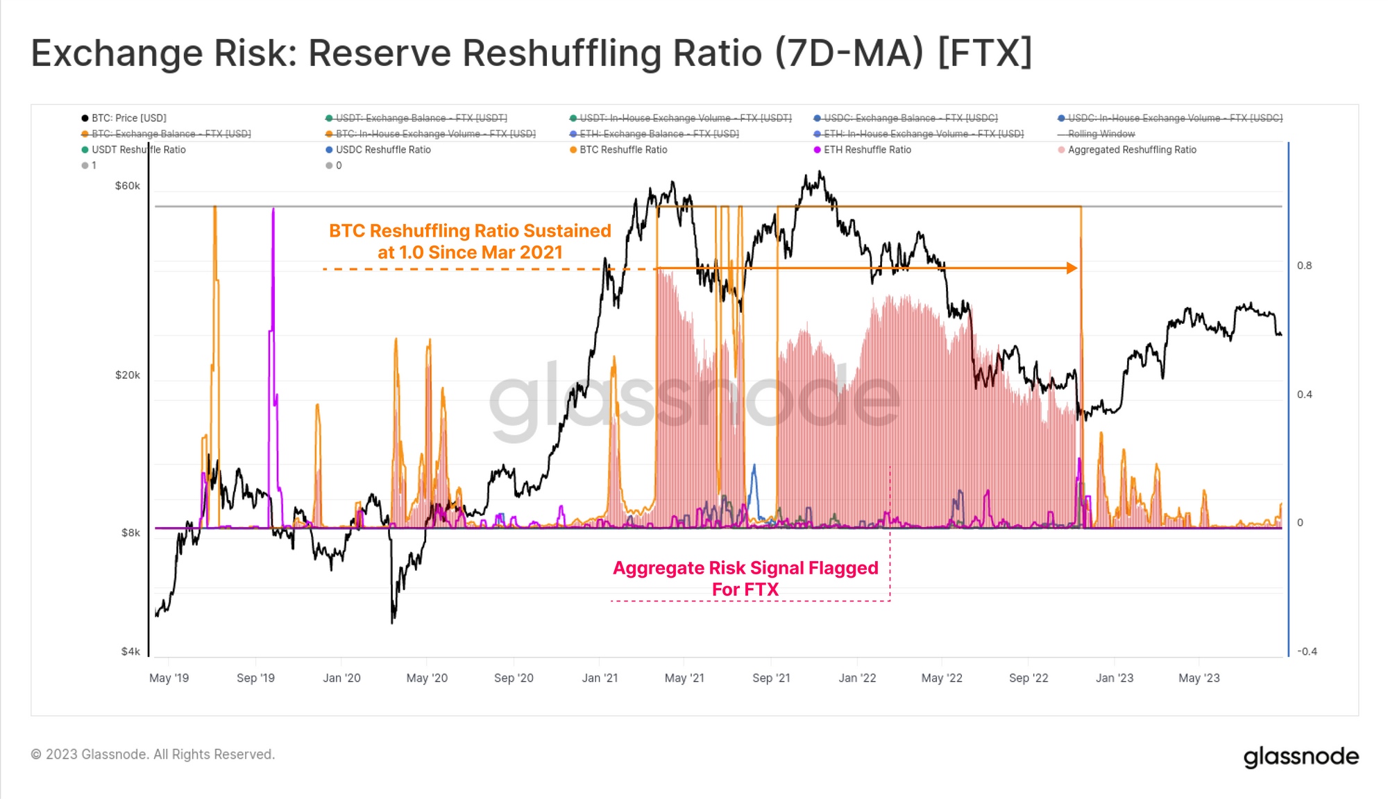
The Internal Reshuffling Ratio
The first indicator considers the ratio of volume transacted within the exchange cluster, and the total balance reserve for the asset of interest. To deliver a comparable indicator across all exchanges and assets, the output values are capped by a range of 0 to 1.

The core idea is to identify situations where more than 100% of the exchange balance has transacted within the exchange cluster over a 7-day period. If this structure persists over a long time, and/or across multiple asset types, it may be warning sign of mismanagement of funds.
For FTX, we can see that their BTC balance sustained values of 1.0 from March 2021 until failure in Nov 2022. We also show an ‘Aggregated Risk’ score considering four of the largest assets BTC, ETH, USDC and USDT.
If we compare this to the other three exchanges, we can see there are some exchange specific nuances:
- Binance (top left): During periods of major volatility, the reshuffling ratio experiences abrupt peaks across all assets which quickly cool off. Since these are seemingly a market response and are not sustained, it is likely a result of working through new deposits and withdrawals.
- Coinbase (top right): Very few reshuffling events are noted except for USDC which is sustained at 1.0 for long periods. This is highly likely associated with Coinbase’s partnership with issuer Circle, and acting as a primary venue for USDC on/off boarding.
- FTX (btm left): The reshuffling ratio of BTC signalled a high-risk status for 14 months prior to the exchange’s collapse. This in hindsight, was likely a result of Alameda misappropriating customer funds.
- Huobi (btm right): A similar volatility linked activity to Binance is seen for this exchange.

The chart below compares the Aggregated Reshuffling Ratios for the four exchanges across the four assets. Here we use a threshold value of 5% (of aggregate balance reshuffled) to flag potentially high-risk events. From this perspective, Binance and Coinbase see very little internal ‘churn’ of their balances.
FTX stands out for all the wrong reasons, as we now know.
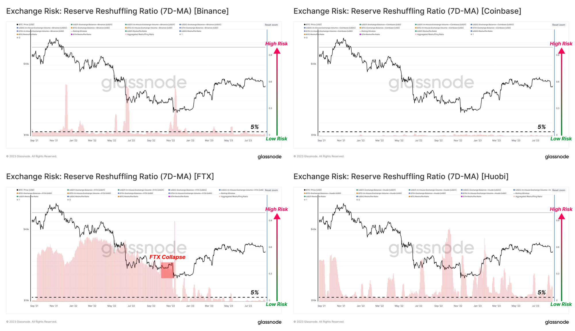
Huobi can be ranked somewhere in between these cases, with a volatility-linked Reshuffling Ratio similar to Binance, however, amplified given the progressively declining asset balance on the exchange (a decreasing denominator).
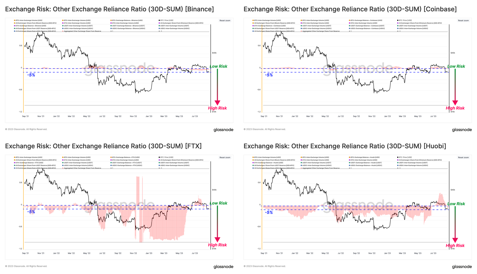
Exchange Reliance Ratio
Another potential indicator of exchange risk may be when a significant portion of an exchange’s balance is regularly transferred to/from another exchange. This may suggest an elevated degree of reliance or co-dependence of liquidity between these exchanges.

Similar to the prior section, we have calculated this ratio for the top four assets in the market and capped output values to a range of -1 to 1. We can also see the direction of funds by whether the ratio is positive (net inflows) or negative (net outflows), as well as investigate the source and destination.
Large negative values in this indicator suggest that assets are rapidly flowing out of the subject exchange and moving towards another exchange counter-party, raising an alert if it lasts for a sustained period of time.
Reviewing the top four assets across the aforementioned exchanges:
- Binance (top left): All assets have a neutral and close-to-zero reliance ratio, suggesting fund flowing from or to other exchanges are small by comparison to the balance on Binance. The USDC reliance ratio has been indicating a high deposit rate regime since September 2022, potentially explained by looking at the USDC on Coinbase.
- Coinbase (top right): Similar to Binance, all assets show a neutral reliance ratio. However, the USDC indicator shows a high withdrawal rate since September 2022. This suggests that a significant relocation of USDC supply has been occurring from Coinbase to Binance over the last 12 months.
- FTX (btm left): The Reliance ratios for all four assets were significantly negative well before the exchange failed. This suggests that investors (and Alameda) were withdrawing all major assets towards other exchange accounts.
- Huobi (btm right): Assessing this risk indicator for Huobi, we can see a relatively large negative Reliance Ratio across all assets, suggesting net transfers from Huobi to other exchanges.

We again show an aggregated the Reliance Ratio which shows Binance and Coinbase have a very small reliance of -5% or higher, indicating that their behavior is largely independent of other exchanges.
On the other hand, FTX and Huobi have a highly negative aggregated Reliance Ratios, indicating a sustained regime of entities active on other exchanges withdrawing funds from these entities.
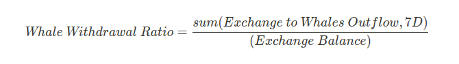
Bitcoin Whale Withdrawal Ratio
The final indicator is a tool to monitor whether bitcoin whales are increasing their withdrawal rate. This parameter is calculated as the ratio between total weekly whale outflows and the bitcoin balance on the exchange. In other words, we are looking for the percentage of supply removed by whales over the last seven days.
Alongside the Whale Withdrawal Ratio 🟧, we also present the all-time average of this indicator 🔴 as a benchmark over the long-term.
- Both Coinbase and Binance show a very low Whale Withdrawal Ratio over last two years, with a long-term average value remaining below 5%.
- For FTX, the jump in the Whale Withdrawal Ratio started when LUNA and 3AC collapsed, and sustained high levels right through to the ultimate failure of the exchange itself.
- For Huobi, we can see a relatively low-risk pattern up until June 2023. It is over recent months that whale entities have seen a sustained uptick in withdrawal activity relative to the Huobi BTC balance. We note again that this will in part be driven by the sustained drawdown in Huobi BTC balances, which itself is an indicator for heightened awareness.

Summary and Conclusions
The failure of FTX was a painful reminder for the digital asset industry that counterparty risk remains with centralized exchanges and custodians. With hindsight as our guide, we developed three metrics which provide a limited view on some potential risk vectors within exchange entities, leveraging our on-chain data and labelling clusters.
What we find is that through the lens of the Reshuffling Ratio, Reliance Ratio, and Whale Withdrawal Ratio, Coinbase and Binance share a relatively similar and unalarming overall on-chain footprint. FTX, unfortunately stands out as a prime example of risk indicators to watch out for. For Huobi, the persistent decline in their exchange balance across the four major assets BTC, ETH, USDT and USDC will have an amplifying effect on these metrics, however it does suggest that a degree of caution may be warranted.
Note: This report is limited in scope and only considers a small subset of indicators using lessons learned from the FTX event. We considered only the major four assets and four exchanges for brevity, however the concepts can be reformulated and iterated upon for others.
Disclaimer: This report does not provide any investment advice. All data is provided for information and educational purposes only. No investment decision shall be based on the information provided here and you are solely responsible for your own investment decisions.

- SEO Powered Content & PR Distribution. Get Amplified Today.
- PlatoData.Network Vertical Generative Ai. Empower Yourself. Access Here.
- PlatoAiStream. Web3 Intelligence. Knowledge Amplified. Access Here.
- PlatoESG. Automotive / EVs, Carbon, CleanTech, Energy, Environment, Solar, Waste Management. Access Here.
- PlatoHealth. Biotech and Clinical Trials Intelligence. Access Here.
- ChartPrime. Elevate your Trading Game with ChartPrime. Access Here.
- BlockOffsets. Modernizing Environmental Offset Ownership. Access Here.
- Source: https://insights.glassnode.com/the-week-onchain-week-35-2023/

