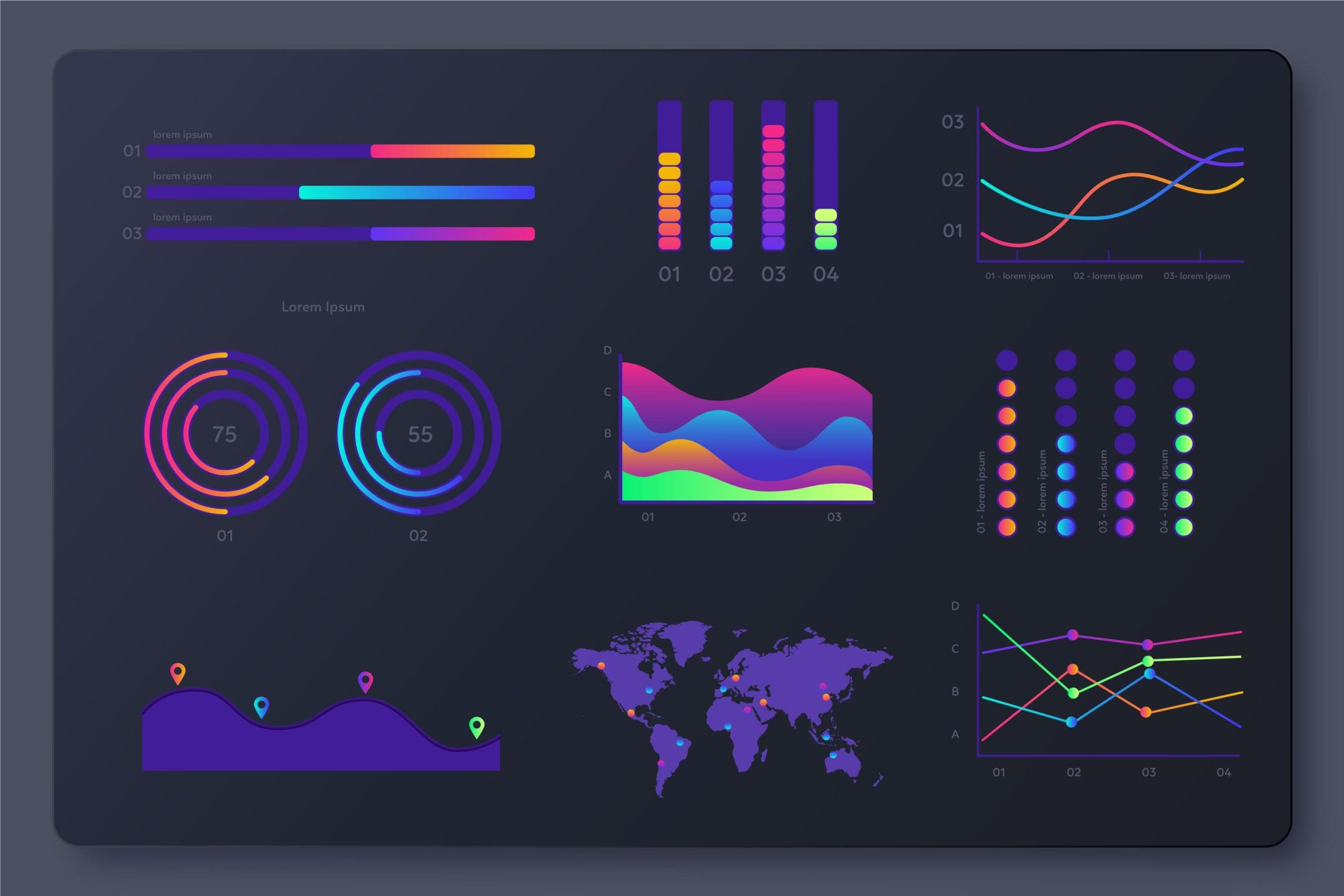
Image by pikisuperstar on Freepik
We’ve all become keenly aware of the power that data, and consequently, analytics can bring to the table for businesses and organizations of all stripes. However, presentation matters—without a simple-to-understand, compelling way of getting information across, all our analytic capabilities don’t amount to much.
Enter data visualization, stage left. By leveraging the most immediate and dominant of all the senses, complex and intricate datapoints can be condensed into an actionable format that everyone involved in the process can intuitively understand.
Consequently, the ability to effectively communicate insights and ideas through visual representations has become increasingly crucial. Effective visualizations can cut through the noise, highlight patterns and relationships, and guide the viewer’s attention to the most crucial insights.
This article discusses the psychological principles and techniques that underpin the creation of persuasive and effective data visualizations.
The psychology of visual processing in data visualization is a deeply fascinating area that intersects psychology, neuroscience, and design principles. It focuses on how humans interpret, understand, and respond to visual data presentations. It highlights the incredible efficiency of our visual system compared to other forms of data processing.
The human brain processes visuals incredibly fast. In fact, research shows that it can understand things like shape, color, and orientation in as little as 13 milliseconds. This speed makes visual data much more immediate and impactful than text-based information?.
Therefore, figures alone often won’t do justice to your efforts. For example, compared to previous performance, even a simple chart supplemented with percentage changes and numbers does a much better job of explaining how your cloud cost optimization efforts are paying off for the organization compared to a simple, bland statement of fact.
Additionally, the Dual Processing Theory explains that we have two types of thinking: fast, instinctual (System 1) and slow, analytical (System 2). Visualizations tap into System 1, letting us grasp complex info quickly without needing to engage in deeper, slower analysis.
The way we use color, shape, and placement can affect how well people remember and make decisions based on the visualization. Understanding how visual elements influence perception and memory helps in creating more effective visuals?.
Creating effective data visualizations means leveraging the human innate visual processing skills to present complex information in an instantly understandable and memorable way.
Creating persuasive data visualizations involves a blend of storytelling, strategic data selection, and effective design principles. Here’s a breakdown of essential components to consider when aiming to craft visualizations that not only inform but also convince your audience:
Strategic Storytelling
Every effective data visualization begins with a clear, specific objective. This means knowing precisely what action or understanding you want to provoke in your audience. From there, crafting a narrative around your data helps to engage the audience, making the information more relatable and compelling.
This narrative should have a clear introduction, body, and conclusion, each part building on the last to guide your audience toward the desired understanding or action.
Appropriate Data Selection
Choosing the right data for your audience is crucial. The data should be directly relevant to your audience’s interests or needs. This tailored approach ensures that the visualization speaks directly to the concerns or curiosity of the audience, making the message more persuasive.
One of the issues with data selection is that it can be time-consuming. However, you don’t have to do everything manually — using automated document generation tools cuts down on the time required, allowing you to devote more of your efforts to analyzing the most engaging datapoints to use in your presentation. On top of that, you can also use a variety of visualization tools — there’s no need to make handcrafted presentations for absolutely everything.
Design Principles
This principle is made up of several components including:
- Alignment. Proper alignment of data displays, both vertically and horizontally, ensures that the information can be accurately compared and understood without causing confusion or misinterpretation through optical illusions.
- Color choice. Colors should be used deliberately to highlight key data points and draw the audience’s attention to the most important parts of the visualization. It’s also important to choose color combinations that are accessible to everyone, including those with color vision deficiencies.
- Title and label clarity. Titles and labels play a significant role in guiding the audience through data visualization. They should be clear, informative, and concise, providing context and emphasizing the key takeaways of the visualization.
- Interactivity. When appropriate, incorporating interactivity into your visualizations can enhance the user experience, making the data exploration more engaging and insightful. However, it’s crucial that this feature enhances rather than complicates the understanding of the data.
To create persuasive data visualizations, it’s essential to follow best practices that make your data clear, engaging, and easy to understand. Here are some tips:
- Choose the right visualization Tool. Selecting an appropriate tool is crucial. Options like ChartExpo, Power BI, and Looker Studio are praised for their ease of use and effectiveness in creating clear charts even for non-technical audiences.
- Use colors strategically. Colors can significantly impact how information is processed and remembered. Use contrasting colors to highlight key insights and ensure your color choices are accessible to color-blind individuals. Avoid using too many colors in a single chart to maintain clarity.
- Highlight key insights. Make sure to draw attention to the most important parts of your data. This could involve using visual cues like reference lines, or simply highlighting significant bars in a bar chart.
- Look for business insights. Aligning data visualizations with high-level business objectives helps ensure that your visualizations are not just informative but also actionable. Use data to forecast trends and make informed decisions.
- Pick the right type of chart. The choice of chart is critical for clarity and effectiveness. Bar charts, line graphs, scatter plots, pie charts, and more have specific uses that make them more suitable for certain types of data. For example, bar charts are great for comparing categorical data, while line graphs are ideal for showing trends over time.
- Ensure context and comprehension. Data visualization should not only present numbers attractively but should also convey a clear message that’s easy to understand. This includes using a compelling title, ensuring proportional scaling, and being clear with labels and legends.
- Utilize different chart types for specific purposes. Different charts serve different analytical needs, such as bubble charts for adding an extra dimension to scatter plots, or waterfall charts for visualizing sequential changes. Composition charts like pie charts, stacked charts, and Sankey diagrams can elucidate the structure of data and its changes over time.
One of the primary advantages is the simplification of complex data. Data visualization converts vast amounts of information into a format that’s easier to process and understand, enabling users to grasp complicated concepts quickly and efficiently. This is particularly crucial in environments where quick decision-making is essential.
Data visualization also enhances storytelling. It allows businesses to present their narratives compellingly, making it easier to communicate with stakeholders, train teams, or attract customers. This approach is effective for presenting ideas and strategies, such as proposing the integration of new technologies or processes to improve departmental efficiency.
Moreover, it increases productivity by providing immediate insights, which helps in quick action and reduces delays due to data misinterpretation. By making data easier to digest, teams can focus on actionable items and improvements rather than spending time trying to understand complex datasets.
Risk management is another area where data visualization proves invaluable. It helps organizations to better understand and navigate scenarios involving uncertainties and risks, by visually simplifying data to highlight potential areas of concern.
Sometimes, management and the C-suite require a bit of nudging. I’m not playing the blame game here — people in positions of authority simply don’t have the time to micromanage and be hyper-aware of all the minute details and complexities on the ground level of operations. To use an example, if you’re aware that SAP consulting would benefit your department and lead to greater integration and efficiency, presenting that information all at once, in a compelling narrative laden with charts and graphs has a much better chance of working than simply mentioning the fact and letting the initial impression peter out while other priorities are discussed.
Data visualizations provide a powerful way to cut through the noise and deliver insights that truly resonate.
However, the true mastery of persuasive data visualization lies in striking the perfect balance between aesthetics and functionality. It requires a deep appreciation for the interplay between visual design principles, cognitive processes, and human behavior.
Only by striking that balance can we create visualizations that are not merely beautiful but also clear, insightful, and profoundly impactful.
Nahla Davies is a software developer and tech writer. Before devoting her work full time to technical writing, she managed—among other intriguing things—to serve as a lead programmer at an Inc. 5,000 experiential branding organization whose clients include Samsung, Time Warner, Netflix, and Sony.
- SEO Powered Content & PR Distribution. Get Amplified Today.
- PlatoData.Network Vertical Generative Ai. Empower Yourself. Access Here.
- PlatoAiStream. Web3 Intelligence. Knowledge Amplified. Access Here.
- PlatoESG. Carbon, CleanTech, Energy, Environment, Solar, Waste Management. Access Here.
- PlatoHealth. Biotech and Clinical Trials Intelligence. Access Here.
- Source: https://www.kdnuggets.com/the-psychology-of-data-visualization-how-to-present-data-that-persuades?utm_source=rss&utm_medium=rss&utm_campaign=the-psychology-of-data-visualization-how-to-present-data-that-persuades


