At the intersection of investment strategy and cultural lore within the Bitcoin community lies the Bitcoin Rainbow Chart. More than a mere guide to the market’s emotional terrain, it stands as a whimsical emblem, bringing levity to bearish phases and marking the high spirits of bullish runs.
Its spectrum of colors maps neatly onto the investor psyche, from optimism to anxiety, encapsulating the chart’s essence: part serious investment compass, part playful nod to Bitcoin’s own unpredictability. The chart embodies the fusion of finance and community culture that is the quintessential reason Bitcoin continues to succeed.
The Evolution of the Bitcoin Rainbow Chart
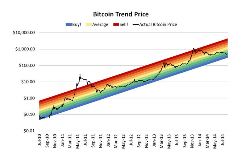
In the aftermath of the Mt. Gox debacle, the Bitcoin Rainbow Chart, courtesy of Reddit user ‘azop’, emerged as a ray of light. Presenting Bitcoin’s logarithmic price progression in a rainbow array of colors. Though notably missing indigo and not being rounded, it deviated from a traditional rainbow.
Its straightforward, color-coded guidance demystified Bitcoin pricing for newcomers. Cooler hues hinted at buying opportunities while warmer ones pointed to potential sales. Surprisingly, it became a guide for investors, with those adhering to its simple color cues often profiting.
Originally adorned with mere prompts of “Sell!”, “Average”, and “Buy!”, the Rainbow Chart transcended its jestful origins as a meme, evolving into a cultural mainstay. Even as Bitcoin’s value dipped after MtGox, the community retained an infectious optimism.
Insights into the Bitcoin Rainbow Chart
The BTC Rainbow Chart serves a dual function: it acts as a psychological price anchor and a tool for investors to more easily recognize where bitcoin sentiment stands. Its a tool in our bitcoin analyzing toolbelt. But simplicity can also mean not fully understanding how market changes work, which can lead to overly simple investment plans.
Despite criticism, the chart reflects the overall mood in the digital asset market, although it is not a complete analysis. Some individuals have even employed it in their bitcoin analysis, using it to analyze the adoption of the peer to peer bitcoin network and its subsequent market capitalization.
The Transformation Over Time
When first introduced into Bitcoin culture, the Rainbow Chart depicted a future of endless price growth and abundance, often making wildly optimistic predictions. During darker bear market times, it provided hope and reassurance to those who held bitcoin. However, as Bitcoin matured, the chart adopted a more nuanced outlook.
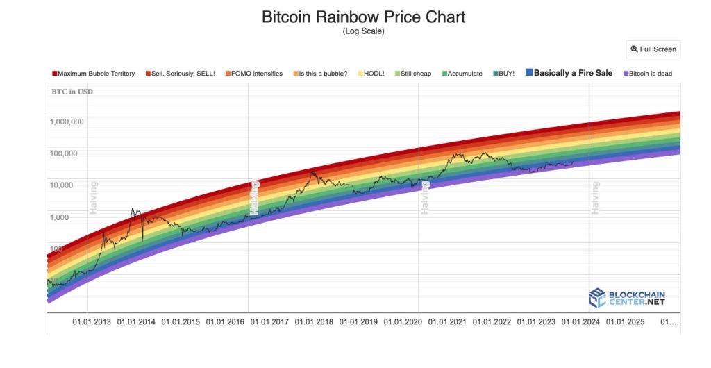
The Bow-Shaped Update: A Dose of Reality
In 2019, the bitcoin chart was updated to use logarithmic regression, giving it the signature bow shape. This modification reflected more modest, slowing growth over time – a nod to reality rather than runaway exuberance. The revised forecast aimed for more grounded data-driven analyzing, tempering the original model’s boundless enthusiasm.
The updated chart acknowledged the cycles of Bitcoin, showing periods where the halvings occur on the graph. This representation aligned better with Bitcoin’s trajectory of early explosive growth giving way to steadier accumulation phases. The Rainbow Chart had evolved to incorporate data-driven insights, balancing optimism with measured projections.
The Pundits Still Have Not Killed Bitcoin
Many naysayers have tried to write obituaries for Bitcoin over the years. According to the website 99bitcoins.com Bitcoin has been declared dead 474 times as of the time of this writing.
Yet, Bitcoin has demonstrated a remarkable resilience over time, continually rebounding despite the myriad of predictions forecasting its demise. No commentator, regardless of their influence, has yet managed to extinguish Bitcoin’s momentum.
With every block added to the blockchain, the likelihood dwindles that detractors will succeed in their efforts to obliterate this digital currency. The steadfast increase in its acceptance and integration suggests that Bitcoin’s endurance may well surpass the skepticism it faces.
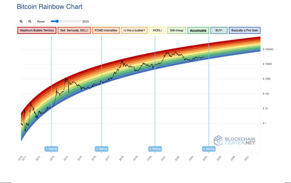
The New and Improved Bitcoin Rainbow Chart V2
After Bitcoin’s price volatility in 2022, an updated Bitcoin rainbow chart emerged:
– A revised formula including recent data.
– More moderate future growth predictions further out on the graph.
– Extended lower bands indicating prolonged buying opportunities rather than abrupt upswings.
Reading the Chart
None of this is financial advice and it is worthwhile doing your own research! With that caveat, lets breakdown the color bands. This is key to using the chart effectively:
– Dark Red: Signals overbought conditions and an optimal selling opportunity.
– Orange: Warns of a potential bubble in the price range.
– Yellow: Hold bitcoin – neutral market conditions.
– Light Green: Indicates the likely beginning of an uptrend.
– Green: The asset is broadly undervalued relative to long term price movements.
– Blue and Green: Excellent opportunities to buy Bitcoin.
– Indigo(only on V1 of the chart): Deeply undervalued, fire sale conditions.
Cultural Impact and Market Sentiment
As a meme turned market staple, the Rainbow Chart signifies the Bitcoin community’s irreverence and resilience, especially amid downturns. It has democratized financial analyzing, although over-reliance could create overconfidence without broader comprehension.
Just as Bitcoin has flourished despite widespread skepticism, the Rainbow Chart has similarly thrived as a viral phenomenon despite criticisms of its methodological rigor. The chart’s endurance speaks to the power of memes and grassroots engagement within the Bitcoin community.
No group manifests this quite like Bitcoiners, who have popularized the Rainbow Chart while also recognizing its limitations. In that sense, the chart reflects the community’s irreverence and pragmatism in equal measure.
Conclusion: A Balanced Perspective
The updated Bitcoin Rainbow Chart V2 offers a balanced perspective, blending cautious optimism with acknowledgment of Bitcoin’s historical resilience. While not a crystal ball, the chart remains a treasured tool that fuses analytical insights with reflections on the market’s tenacity through ups and downs.
The Rainbow Chart’s evolution from meme to more nuanced sentiment gauge mirrors Bitcoin’s maturing status as an asset class. It highlights the need for a measured approach when evaluating market trends, neither overexuberant in the good times nor despairing in the bad. For newcomers, the chart serves as a reminder that while an insightful guide, it cannot predict the market’s every turn.

You would not take profit in unstable currencies if you had access to sound money. So why take profit in fiat currencies if you have access to the soundest, scarcest form of money ever created? With prudence and perspective, Bitcoiners recognize that patience is key to realizing the Rainbow Chart’s bright horizons.
- SEO Powered Content & PR Distribution. Get Amplified Today.
- PlatoData.Network Vertical Generative Ai. Empower Yourself. Access Here.
- PlatoAiStream. Web3 Intelligence. Knowledge Amplified. Access Here.
- PlatoESG. Carbon, CleanTech, Energy, Environment, Solar, Waste Management. Access Here.
- PlatoHealth. Biotech and Clinical Trials Intelligence. Access Here.
- Source: https://bitcoinnews.com/the-bitcoin-rainbow-chart-a-cultural-icon/?utm_source=rss&utm_medium=rss&utm_campaign=the-bitcoin-rainbow-chart-a-cultural-icon

