Fast-rising concentrations of carbon dioxide in the atmosphere are the main driver of human-caused global warming.
Working out how to reduce these emissions is a cornerstone of international climate negotiations.
However, unlike some other forms of pollution, this greenhouse gas is invisible to the human eye. This makes it harder to communicate the challenge of global warming to the public.
But dramatic new visualisations by the US National Aeronautics and Space Administration – better known as NASA – show CO2 emissions build up in the atmosphere over the course of a year.
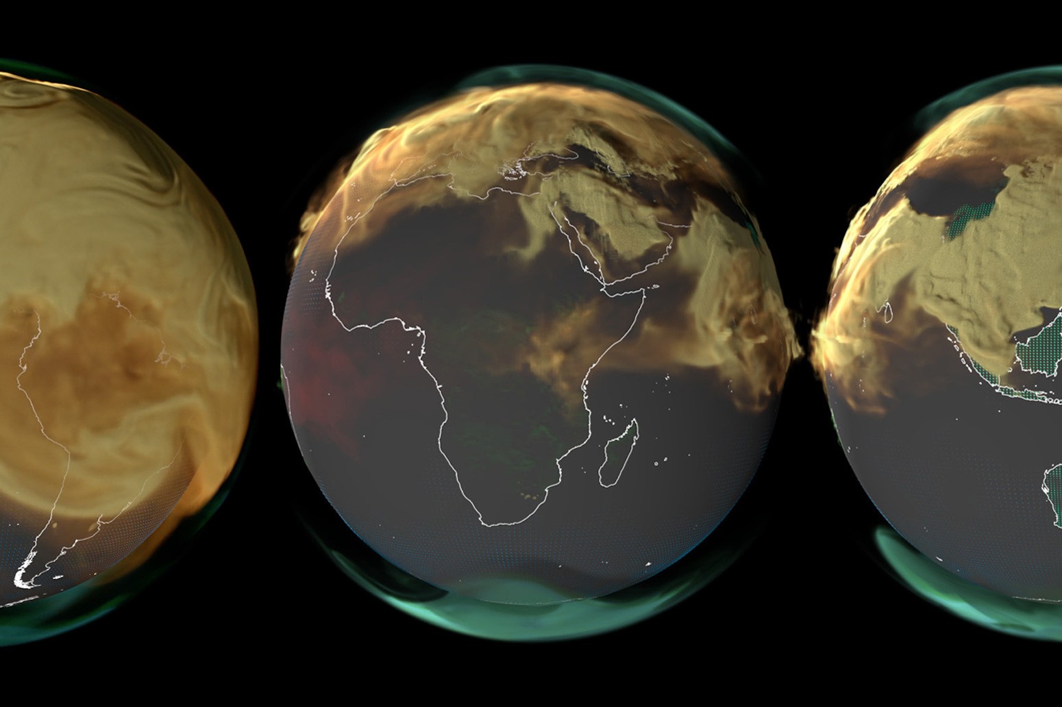
The videos show CO2 emissions from a range of sources: human-caused burning of fossil fuels (yellow); human-caused burning biomass (red); land ecosystems (green) and the ocean (blue). The pulsing squares indicate the absorption of CO2 by land ecosystems and the ocean.
The visualisations highlight the imbalance in CO2 emissions between the northern and southern hemispheres. They also show how CO2 is carried around the world on air currents once in the atmosphere.
The project is a “great example” of “show, don’t tell” science communication, a climate scientist from the UK Met Office tells Carbon Brief. He adds that the videos “help us understand complex processes at a ‘gut level’”.
[embedded content] CO2 emissions from fossil fuels (yellow), biomass (red), the land ecosystems (green) and the ocean (blue) over the year 2021. The pulsing squares show atmospheric CO2 absorption by the land ecosystem (green) and ocean (blue). Credit: NASA
Sources and sinks
Carbon is constantly moving between the land, atmosphere and ocean in a process called the “global carbon cycle”.
Before the Industrial Revolution, the cycle was roughly balanced, with similar amounts of carbon being emitted into the atmosphere and absorbed by the land and ocean. Around the 1850s, humans began burning fossil fuels at a significant scale, rapidly speeding up the movement of carbon into the atmosphere.
Currently, humans are releasing more than 37bn tonnes of CO2 into the atmosphere every year. Around half of this gas is absorbed by the land and ocean, while the remaining half builds up in the atmosphere. Since humans first started burning fossil fuels in significant volumes in the mid-1800s, atmospheric CO2 levels have risen by 50%.
Dr Lesley Ott, a climate scientist at NASA’s Goddard Space Flight Center, is the scientific consultant on the new videos. She tells Carbon Brief that the carbon cycle can be difficult to visualise and says that the team have been working for years on a way to tell the “story” intuitively.
The NASA team calculated CO2 emissions – and absorption – from four key components of the global carbon cycle over the calendar year of 2021.
Ott tells Carbon Brief that the team used “the best available data from a combination of in situ observations and satellites”, by drawing on a number of different data sources and models.
For example, she tells Carbon Brief that emissions from fossil fuel use are determined from an in-house emissions inventory, while the land carbon sink is assessed using a land biosphere model combined with satellite data on fire emissions.
The waterfall diagram below shows CO2 emissions and absorption from fossil fuel use (yellow), burning biomass (red), the land carbon sink (green) and the ocean (blue) from January to December 2021.
Each coloured bar represents additions to, or reductions of, atmospheric CO2 concentrations from each source, progressively over the year. Reading from left to right, the chart shows the combined impact of successive CO2 sources and sinks, with the grey bar showing the net impact overall.
Numbers below the x-axis represent reductions in atmospheric CO2 concentrations, while numbers above the axis are increases.
In the visualisation above, the biomass burning and fossil fuel bars rise steadily throughout the year, indicating rising CO2 emissions. However, the land and ocean both absorb and release CO2 as the year goes on, causing these bars to grow and shrink in size as the year progresses.
Overall, the atmospheric concentration of CO2 increased by around two parts per million (ppm) throughout 2021. This was driven by emissions from fossil fuel use and biomass burning, which were partly counteracted by the CO2 absorbed in land ecosystems and the ocean.
Dr Doug McNeall is a climate scientist at the UK Met Office with experience in climate science communication and producing visuals. He describes this visualisation as a “race between the natural sinks in the system taking up carbon during part of the year and the steady release of carbon dioxide from human sources, relentlessly marching on”.
Visualising CO2
To visualise the buildup of human-produced CO2 in the atmosphere, the NASA team also produced videos showing where the gas is emitted and how it is transported around the globe by air currents.
Dr Gavin Schmidt is director of the NASA Goddard Institute for Space Studies and was not directly involved in producing the videos. He says that the videos address a long-standing problem: “How do you understand the effects of something that’s totally invisible?”
He tells Carbon Brief that by “colouring” the CO2, viewers can “see” changes over the course of a year. The resulting videos are “visually very striking”, he says.
[embedded content] CO2 emissions from fossil fuels (yellow), biomass (red), the land ecosystems (green) and the ocean (blue) over the year 2021. The pulsing squares show atmospheric CO2 absorption by the land ecosystem (green) and ocean (blue). Credit: NASA
The videos clearly show the emissions imbalance between the northern and southern hemispheres. McNeall tells Carbon Brief that the visualisations “quickly and simply shows how high population density areas in the northern hemisphere have a huge influence on CO2 emissions”.
Schmidt adds that it is “very hard for air masses to mix across the equator”. This is due to the Earth’ general circulation pattern, in which hot air from the equator rises, moves towards the poles, and then sinks and travels back to the equator. This circulation system causes the north-south imbalance in atmospheric CO2 levels to persist for “longer than you might have imagined”, he says.
The videos also reveal regional differences in sources of CO2 emissions. For example, the middle video shows Europe and Africa. In this video, high fossil fuel emissions from Europe and the Middle East quickly dominate the globe. However, there is also a clear signal of emissions from agricultural burning in central Africa, driven by the fires that are used to clear crop residue.
Meanwhile, the flashing green squares show the daily pattern of CO2 absorption from the land carbon sink. NASA explains that the flashing is caused by plants absorbing carbon while the sun is shining and releasing it during the night.
These videos are “a great example of using the rule ‘show, don’t tell’ for science communication”, McNeall tells Carbon Brief. He adds that they “help us understand complex processes at a ‘gut level’”.
Sharelines from this story
- SEO Powered Content & PR Distribution. Get Amplified Today.
- PlatoData.Network Vertical Generative Ai. Empower Yourself. Access Here.
- PlatoAiStream. Web3 Intelligence. Knowledge Amplified. Access Here.
- PlatoESG. Automotive / EVs, Carbon, CleanTech, Energy, Environment, Solar, Waste Management. Access Here.
- BlockOffsets. Modernizing Environmental Offset Ownership. Access Here.
- Source: https://www.carbonbrief.org/striking-new-nasa-videos-show-co2-emissions-rapidly-building-up-in-atmosphere/

