This article was published as a part of the Data Science Blogathon
Exploratory Data Analysis (EDA) is a process of describing the data by means of statistical and visualization techniques in order to bring important aspects of that data into focus for further analysis. This involves inspecting the dataset from many angles, describing & summarizing it without making any assumptio
“Exploratory data analysis is an attitude, a state of flexibility, a willingness to look for those things that we believe are not there, as well as those we believe to be there” – John W. Tukey
Exploratory data analysis is a significant step to take before diving into statistical modeling or machine learning, to ensure the data is really what it is claimed to be and that there are no obvious errors. It should be part of data science projects in every organization.
Why Exploratory Data Analysis is important?
Just like everything in this world, data has its imperfections. Raw data is usually skewed, may have outliers, or too many missing values. A model built on such data results in sub-optimal performance. In hurry to get to the machine learning stage, some data professionals either entirely skip the exploratory data analysis process or do a very mediocre job. This is a mistake with many implications, that includes generating inaccurate models, generating accurate models but on the wrong data, not creating the right types of variables in data preparation, and using resources inefficiently.
In this article, we’ll be using Pandas, Seaborn, and Matplotlib libraries of Python to demonstrate various EDA techniques applied to Haberman’s Breast Cancer Survival Dataset.
Data set description
The dataset contains cases from the research carried out between the years 1958 and 1970 at the University of Chicago’s Billings Hospital on the survival of patients who had undergone surgery for breast cancer.
The dataset can be downloaded from here. [Source: Tjen-Sien Lim ([email protected]), Date: March 4, 1999]
Attribute information :
- Patient’s age at the time of operation (numerical).
- Year of operation (year — 1900, numerical).
- A number of positive axillary nodes were detected (numerical).
- Survival status (class attribute)
1: the patient survived 5 years or longer post-operation.
2: the patient died within 5 years post-operation.
Attributes 1, 2, and 3 form our features (independent variables), while attribute 4 is our class label (dependent variable).
Let’s begin our analysis . . .
1. Importing libraries and loading data
Import all necessary packages —
import numpy as np
import pandas as pd
import matplotlib.pyplot as plt
import seaborn as sns
import scipy.stats as stats
Load the dataset in pandas dataframe —
df = pd.read_csv('haberman.csv', header = 0)
df.columns = ['patient_age', 'operation_year', 'positive_axillary_nodes', 'survival_status']
2. Understanding data
df.head()
Output:

Shape of the dataframe —
df.shape
Output:
(305, 4)
There are 305 rows and 4 columns. But how many data points for each class label are present in our dataset?
df[‘survival_status’].value_counts()
Output:

- The dataset is imbalanced as expected.
- Out of a total of 305 patients, the number of patients who survived over 5 years post-operation is nearly 3 times the number of patients who died within 5 years.
df.info()
Output:
- All the columns are of integer type.
- No missing values in the dataset.
2.1 Data preparation
Before we go for statistical analysis and visualization, we see that the original class labels — 1 (survived 5 years and above) and 2 (died within 5 years) are not in accordance with the case.
So, we map survival status values 1 and 2 in the column survival_status to categorical variables ‘yes’ and ‘no’ respectively such that,
survival_status = 1 → survival_status = ‘yes’
survival_status = 2 → survival_status = ‘no’
df['survival_status'] = df['survival_status'].map({1:"yes", 2:"no"})
2.2 General statistical analysis
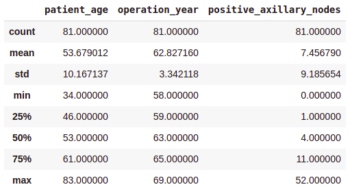
df.describe()
Output:

- On average, patients got operated at age of 63.
- An average number of positive axillary nodes detected = 4.
- As indicated by the 50th percentile, the median of positive axillary nodes is 1.
- As indicated by the 75th percentile, 75% of the patients have less than 4 nodes detected.
If you see, there is a significant difference between the mean and the median values. This is because there are some outliers in our data and the mean is influenced by the presence of outliers.
2.3 Class-wise statistical analysis
survival_yes = df[df['survival_status'] == 'yes']
survival_yes.describe()
Output:

survival_no = df[df[‘survival_status’] == ‘no’] survival_no.describe()
Output:
From the above class-wise analysis, it can be observed that —
- The average age at which the patient is operated on is nearly the same in both cases.
- Patients who died within 5 years on average had about 4 to 5 positive axillary nodes more than the patients who lived over 5 years post-operation.
Note that, all these observations are solely based on the data at hand.
3. Uni-variate data analysis
“A picture is worth ten thousand words”
– Frank R. Bernard
3.1 Distribution Plots
Uni-variate analysis as the name suggests is an analysis carried out by considering one variable at a time. Let’s say our aim is to be able to correctly determine the survival status given the features — patient’s age, operation year, and positive axillary nodes count. Which among these 3 variables is more useful than other variables in order to distinguish between the class labels ‘yes’ and ‘no’? To answer this, we’ll plot the distribution plots (also called probability density function or PDF plots) with each feature as a variable on X-axis. The values on the Y-axis in each case represent the normalized density.
1. Patient’s age
sns.FacetGrid(df, hue = "survival_status").map(sns.distplot, "patient_age").add_legend()
plt.show()
Output:

- Among all the age groups, the patients belonging to 40-60 years of age are highest.
- There is a high overlap between the class labels. This implies that the survival status of the patient post-operation cannot be discerned from the patient’s age.
2. Operation year
sns.FacetGrid(df, hue = "survival_status").map(sns.distplot, "operation_year").add_legend()
plt.show()
Output:

Just like the above plot, here too, there is a huge overlap between the class labels suggesting that one cannot make any distinctive conclusion regarding the survival status based solely on the operation year.
3. Number of positive axillary nodes
sns.FacetGrid(df, hue = "survival_status").map(sns.distplot, "positive_axillary_nodes").add_legend()
plt.show()
Output:

This plot looks interesting! Although there is a good amount of overlap, here we can make some distinctive observations –
- Patients having 4 or fewer axillary nodes — A very good majority of these patients have survived 5 years or longer.
- Patients having more than 4 axillary nodes — the likelihood of survival is found to be less as compared to the patients having 4 or fewer axillary nodes.
But our observations must be backed by some quantitative measure. That’s where the Cumulative Distribution function(CDF) plots come into the picture.
The area under the plot of PDF over an interval represents the probability of occurrence of the random variable in the given interval. Mathematically, CDF is an integral of PDF over the range of values that a continuous random variable takes. CDF of a random variable at any point ‘x’ gives the probability that a random variable will take a value less than or equal to ‘x’.
counts, bin_edges = np.histogram(survival_yes[‘positive_axillary_nodes’], density = True) pdf = counts/sum(counts) cdf = np.cumsum(pdf) plt.plot(bin_edges[1:], cdf, label = ‘CDF Survival status = Yes’)
counts, bin_edges = np.histogram(survival_no[‘positive_axillary_nodes’], density = True) pdf = counts/sum(counts) cdf = np.cumsum(pdf) plt.plot(bin_edges[1:], cdf, label = ‘CDF Survival status = No’) plt.legend() plt.xlabel(“positive_axillary_nodes”) plt.grid() plt.show()
Output:

Some of the observations that could be made from the CDF plot —
- Patients having 4 or fewer positive axillary nodes have about 85% chance of survival for 5 years or longer post-operation, whereas this number is less for the patients having more than 4 positive axillary nodes. This gap diminishes as the number of axillary nodes increases.
3.2 Box plots and Violin plots
Box plot, also known as box and whisker plot, displays a summary of data in five numbers — minimum, lower quartile(25th percentile), median(50th percentile), upper quartile(75th percentile), and maximum data values.
A violin plot displays the same information as the box and whisker plot; additionally, it also shows the density-smoothed plot of the underlying distribution.
Let’s make the box plots for our feature variables –
plt.figure(figsize = (15, 4))
plt.subplot(1,3,1)
sns.boxplot(x = 'survival_status', y = 'patient_age', data = df)
plt.subplot(1,3,2)
sns.boxplot(x = 'survival_status', y = 'operation_year', data = df)
plt.subplot(1,3,3)
sns.boxplot(x = 'survival_status', y = 'positive_axillary_nodes', data = df)
plt.show()
Output:

- The patient age and the operation year plots show similar statistics.
- The isolated points seen in the box plot of positive axillary nodes are the outliers in the data. Such a high number of outliers is kind of expected in medical datasets.
Violin Plots –
plt.figure(figsize = (15, 4))
plt.subplot(1,3,1)
sns.violinplot(x = 'survival_status', y = 'patient_age', data = df)
plt.subplot(1,3,2)
sns.violinplot(x = 'survival_status', y = 'operation_year', data = df)
plt.subplot(1,3,3)
sns.violinplot(x = 'survival_status', y = 'positive_axillary_nodes', data = df)
plt.show()
Output:

Violin plots in general are more informative as compared to the box plots as violin plots also represent the underlying distribution of the data in addition to the statistical summary. In the violin plot of positive axillary nodes, it is observed that the distribution is highly skewed for class label = ‘yes’, while it is moderately skewed for ‘no’. This indicates that –
- For the majority of patients (in both the classes), the number of positive axillary nodes detected is on the lesser side. Of which, patients having 4 or fewer positive axillary nodes are more likely to survive 5 years post-operation.
These observations are consistent with our observations from previous sections.
4. Bi-variate data analysis
4.1 Pair plot
Next, we shall plot a pair plot to visualize the relationship between the features in a pairwise manner. A pair plot enables us to visualize both distributions of single variables as well as the relationship between pairs of variables.
sns.set_style('whitegrid')
sns.pairplot(df, hue = 'survival_status')
plt.show()
Output:

In the case of the pair plot, it can be seen that the plots on the upper half and lower half of the diagonal are the same, only the axis is interchanged. So, they essentially convey the same information. Analyzing either would suffice. The plots on the diagonal are different from the rest of the plots. These plots are kernel density smoothed histograms representing the univariate distribution of a particular feature.
As we can observe in the above pair plot, there is a high overlap between any two features and hence no clear distinction can be made between the class labels based on the feature pairs.
4.2 Joint plot
While the Pair plot provides a visual insight into all possible correlations, the Joint plot provides bivariate plots with univariate marginal distributions.
sns.jointplot(x = 'patient_age', y = 'positive_axillary_nodes', data = df)
plt.show()
Output:

- The pair plot and the joint plot reveal that there is no correlation between the patient’s age and the number of positive axillary nodes detected.
- The histogram on the top edge indicates that patients are more likely to get operated in the age of 40–60 years compared to other age groups.
- The histogram on the right edge indicates that the majority of patients had fewer than 4 positive axillary nodes.
4.3 Heatmap
Heatmaps are used to observe the correlations among the feature variables. This is particularly important when we are trying to obtain the feature importance in regression analysis. Although correlated features do not impact the performance of the statistical model, it could mess up the post-modeling analysis.
Let’s see if there exist any correlation among our features by plotting a heatmap.
sns.heatmap(df.corr(), cmap = ‘YlGnBu’, annot = True)
plt.show()
Output:

The values in the cells are Pearson’s R values which indicate the correlation among the feature variables. As we can see, these values are nearly 0 for any pair, so no correlation exists among any pair of variables.
5. Multivariate analysis with Contour plot
A contour plot is a graphical technique for representing a 3-dimensional surface by plotting constant z slices, called contours, in a 2-dimensional format. A contour plot enables us to visualize data in a two-dimensional plot. Here is a diagrammatic representation of how the information from the 3rd dimension can be consolidated into a flat 2-D chart –

Contour plot example | Source: https://www.mathworks.com/help/matlab/ref/surfc.html
Plotting a contour plot using the seaborn library for patient’s age on x-axis and operation year on the y-axis —
sns.jointplot(x = 'patient_age', y = 'operation_year' , data = df, kind = 'kde', fill = True)
plt.show()
Output:

From the above contour plot, it can be observed that the years 1959–1964 witnessed more patients in the age group of 45–55 years.
Epilogue
In this article, we learned some common steps involved in exploratory data analysis. We also saw several types of charts & plots and what information is conveyed by each of these. This is just not it, I encourage you to play with the data and come up with different kinds of visualizations and observe what insights you can extract from it.
About me
Hi, I am Pratik Nabriya, a Data Scientist currently employed with an Analytics & AI firm based out of Noida. My key skills include Machine learning, Deep learning, NLP, Time-Series Analysis, SQL and I’m familiar with working in a Cloud environment. I love to write blogs and articles in my spare time and share my learnings with fellow data professionals.
Related
PlatoAi. Web3 Reimagined. Data Intelligence Amplified.
Click here to access.

