Introduction
For creating eye-catching and educational statistics visuals, Seaborn provides a high-level interface. Seaborn makes it simple to build and modify line plots, which are helpful for displaying data trends over time. This tutorial goes over how to set up your environment, make both simple and personalized line plots, and customize your plots with different effects.
Overview
- Learn how to set up Seaborn and generate sample data using NumPy for creating line plots.
- Develop skills to create basic line plots in Seaborn and customize them by changing line styles, colors, and adding markers.
- Understand how to plot multiple lines on a single plot to compare different datasets effectively.
- Master adding annotations to highlight key points and saving plots as image files for better data communication.
Table of contents
Setting Up Your Environment
Before you begin, ensure you have the necessary libraries installed. You can install Seaborn and its dependencies using pip:
pip install seaborn matplotlib numpyImporting Libraries
First, import the required libraries. Seaborn relies on Matplotlib for underlying plotting and NumPy for data manipulation.
import seaborn as sns
import numpy as np
import matplotlib.pyplot as plt
Generating Sample Data
For demonstration purposes, let’s generate some sample data using NumPy. We’ll create a simple dataset representing a sine wave and a cosine wave.
# Generate 1000 evenly spaced values from 0 to 10
x = np.linspace(0, 10, 1000)
# Generate corresponding sine and cosine values
y = np.sin(x)
y2 = np.cos(x)
Creating a Basic Line Plot
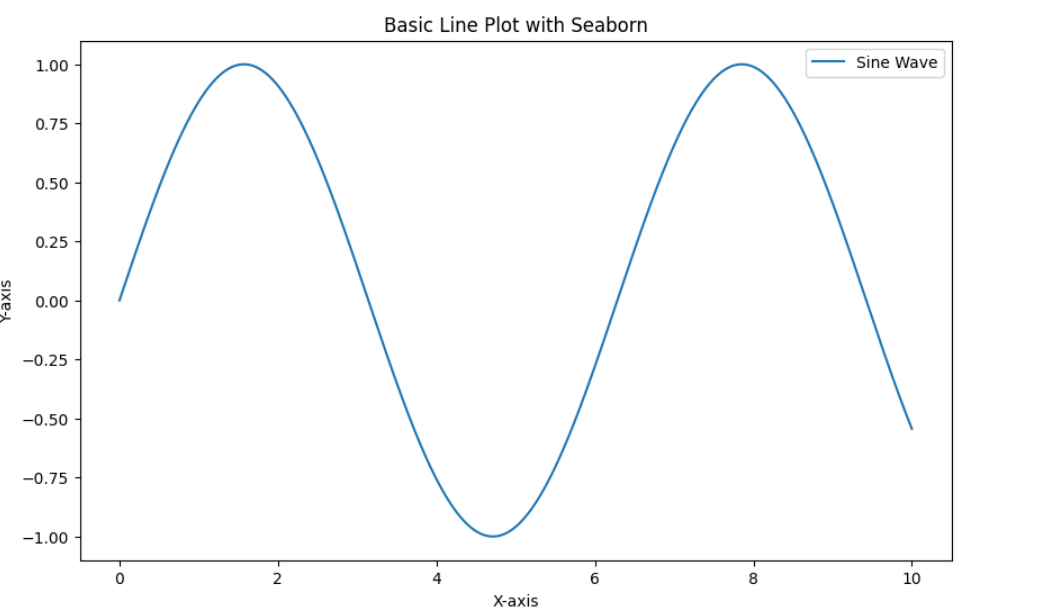
This section covers how to use Seaborn to build a simple line plot, with an emphasis on environment setup, sample data generation, and plot creation that is instructive. It covers customizing Seaborn to improve clarity by utilizing its user-friendly features.
plt.figure(figsize=(10, 6))  # Set the figure size
sns.lineplot(x=x, y=y, label='Sine Wave')  # Create a line plot with a label
plt.title('Basic Line Plot with Seaborn')  # Add a title
plt.xlabel('X-axis')  # Add X-axis label
plt.ylabel('Y-axis')  # Add Y-axis label
plt.legend()  # Display the legend
plt.show()  # Display the plot
Output:
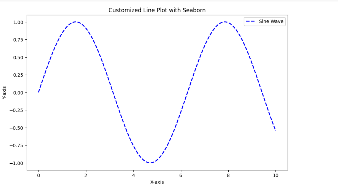
Customizing the Line Plot
You can change the colors, styles, and other elements of your Seaborn line plots.
Changing Line Styles and Colors
Making visual changes to your plot using Seaborn is simple. It allows you to simply adjust the line style, color, and width.
plt.figure(figsize=(10, 6))
sns.lineplot(x=x, y=y, color='blue', linestyle='--', linewidth=2, label='Sine Wave')
plt.title('Customized Line Plot with Seaborn')
plt.xlabel('X-axis')
plt.ylabel('Y-axis')
plt.legend()
plt.show()
Output:
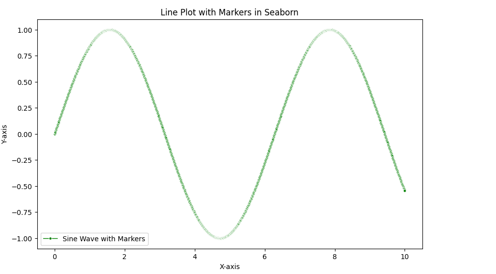
Adding Markers
To draw attention to certain data points, you can use markers in your line plot.
plt.figure(figsize=(10, 6))
sns.lineplot(x=x, y=y, color='green', linestyle='-', linewidth=1, marker='o', markersize=4, label='Sine Wave with Markers')
plt.title('Line Plot with Markers in Seaborn')
plt.xlabel('X-axis')
plt.ylabel('Y-axis')
plt.legend()
plt.show()
Output:
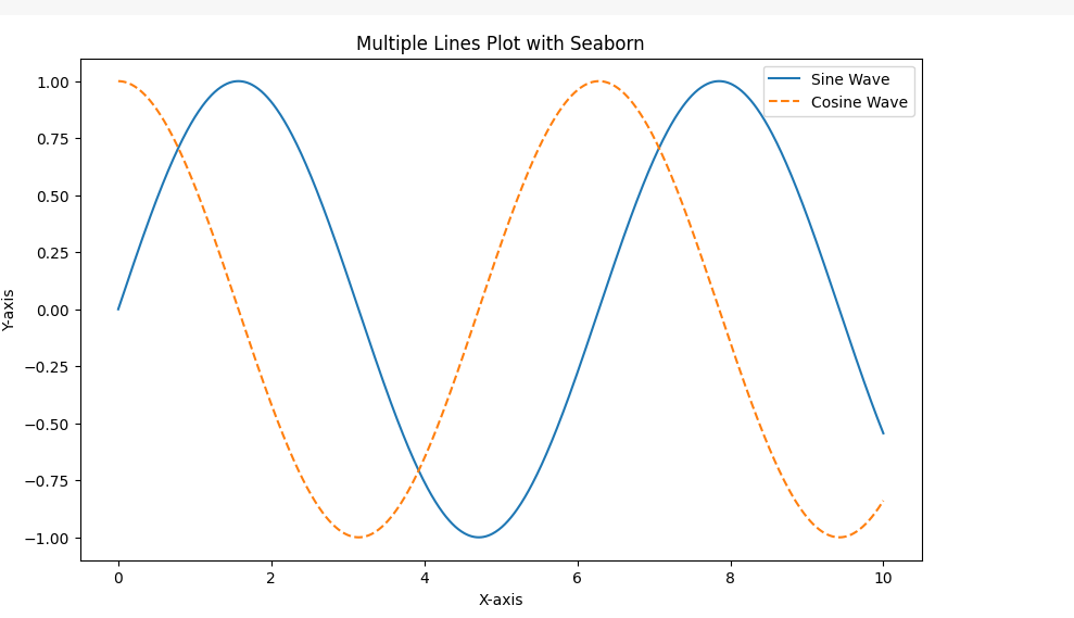
Multiple Lines
You can also plot multiple lines on the same plot to compare different datasets. This is widely used features of line plot.
plt.figure(figsize=(10, 6))
sns.lineplot(x=x, y=y, label='Sine Wave')
sns.lineplot(x=x, y=y2, label='Cosine Wave', linestyle='--')
plt.title('Multiple Lines Plot with Seaborn')
plt.xlabel('X-axis')
plt.ylabel('Y-axis')
plt.legend()
plt.show()
Output:
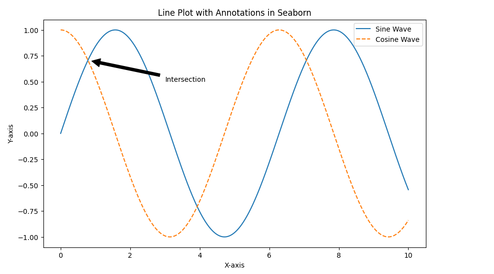
Adding Annotations
Annotations can highlight specific points on the line plot. They also provide additional information on your plot as shown in the code below:
plt.figure(figsize=(10, 6))
sns.lineplot(x=x, y=y, label='Sine Wave')
sns.lineplot(x=x, y=y2, label='Cosine Wave', linestyle='--')
plt.title('Line Plot with Annotations in Seaborn')
plt.xlabel('X-axis')
plt.ylabel('Y-axis')

# Annotate the point where sine and cosine intersect
plt.annotate('Intersection', xy=(np.pi/4, np.sin(np.pi/4)), xytext=(3, 0.5),
             arrowprops=dict(facecolor='black', shrink=0.05))

plt.legend()
plt.show()
Output:
Saving the Plot
You can save the plot to a file using savefig.
plt.figure(figsize=(10, 6))
sns.lineplot(x=x, y=y, label='Sine Wave')
sns.lineplot(x=x, y=y2, label='Cosine Wave', linestyle='--')
plt.title('Line Plot')
plt.xlabel('X-axis')
plt.ylabel('Y-axis')
plt.legend()
plt.savefig('line_plot_seaborn.png') # Save the plot as a PNG file
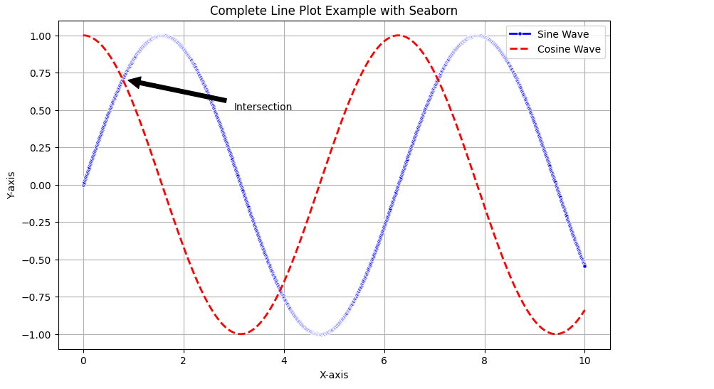
plt.show()Complete Code Example
Below is the complete code example that includes all the customizations that we have discussed above.
import seaborn as sns
import matplotlib.pyplot as plt
import numpy as np

# Generate sample data
x = np.linspace(0, 10, 1000)
y = np.sin(x)
y2 = np.cos(x)

# Create and customize the plot
plt.figure(figsize=(10, 6))
sns.lineplot(x=x, y=y, color='blue', linestyle='-', linewidth=2, marker='o', markersize=4, label='Sine Wave')
sns.lineplot(x=x, y=y2, color='red', linestyle='--', linewidth=2, label='Cosine Wave')
plt.title('Complete Line Plot Example with Seaborn')
plt.xlabel('X-axis')
plt.ylabel('Y-axis')

# Annotate the point where sine and cosine intersect
plt.annotate('Intersection', xy=(np.pi/4, np.sin(np.pi/4)), xytext=(3, 0.5),
             arrowprops=dict(facecolor='black', shrink=0.05))

plt.legend()
plt.grid(True)
plt.savefig('complete_line_plot_seaborn.png')
plt.show()
Output:
Conclusion
Your ability to create and modify line plots in Seaborn will significantly enhance your data visualization abilities. You may now efficiently annotate information, produce and display data, modify charts, compare various datasets, and manage your system. These skills will enable you to create visually appealing line plots. It also help in creating instructive line graphs that effectively communicate your data findings. In this article we explored creating line plot with seaborn.
Don’t miss this chance to improve your skills and advance your career. Learn Python with us! This course is suitable for all levels.
Frequently Asked Questions
A. Seaborn is a Python data visualization library based on Matplotlib. It provides a high-level interface for drawing attractive and informative statistical graphics.
A. Yes, you may alter the markers, colors, and line styles of line plots in Seaborn to improve their visual appeal and effectively communicate data insights.
A. Yes, Seaborn is beginner-friendly and offers intuitive ways to create visually appealing statistical plots with minimal code.
- SEO Powered Content & PR Distribution. Get Amplified Today.
- PlatoData.Network Vertical Generative Ai. Empower Yourself. Access Here.
- PlatoAiStream. Web3 Intelligence. Knowledge Amplified. Access Here.
- PlatoESG. Carbon, CleanTech, Energy, Environment, Solar, Waste Management. Access Here.
- PlatoHealth. Biotech and Clinical Trials Intelligence. Access Here.
- Source: https://www.analyticsvidhya.com/blog/2024/06/line-plot-with-seaborn/

