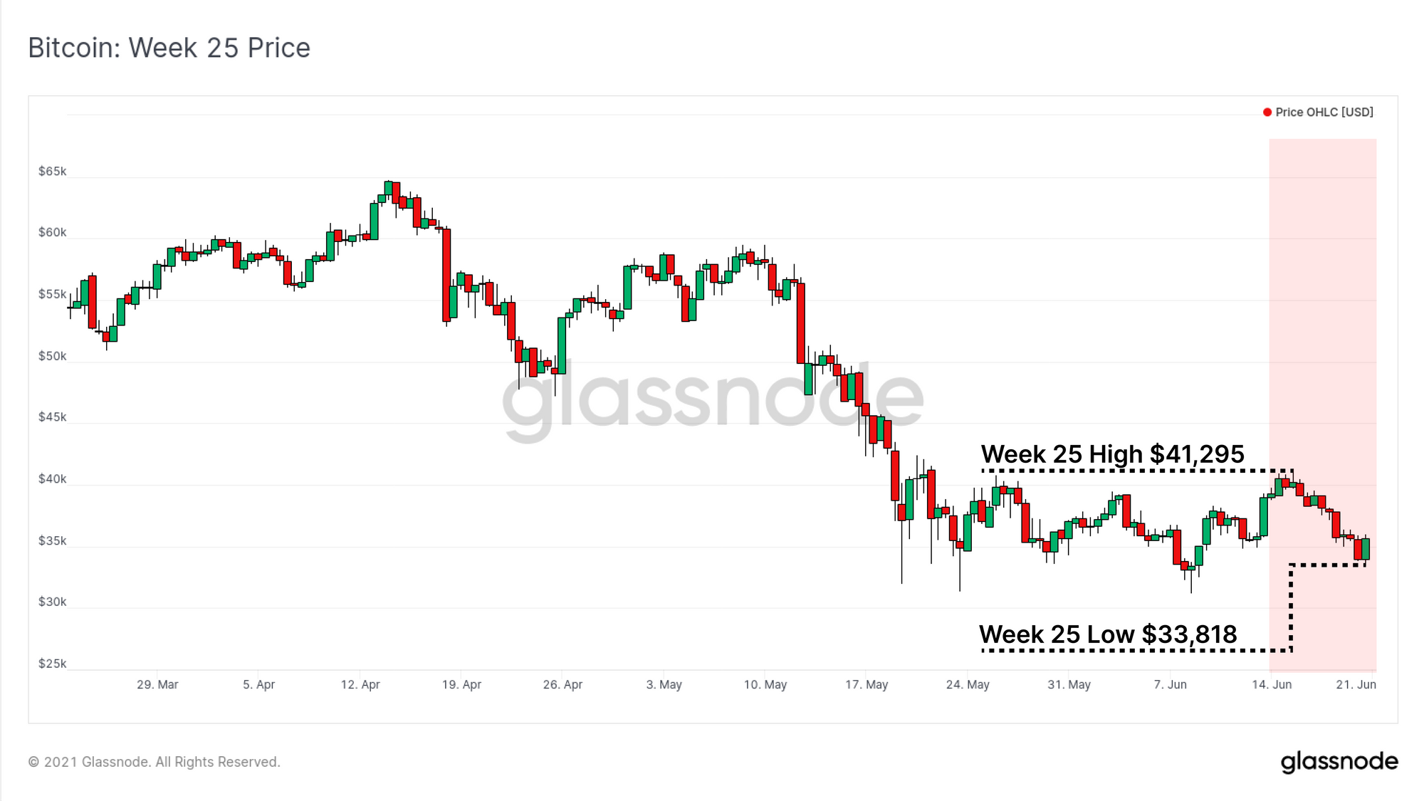
The Bitcoin market continues to show relative weakness in both price and on-chain activity this week. Prices have traded within the recent consolidation range, marking down from an early week high of $41,295, to a low of $33,818 over the weekend.
On-chain activity across the board is remarkably low across Bitcoin and Ethereum, with demand for block-space falling to levels last seen in 2020. However, whilst low demand for transactions is a generally bearish insight, it also reflects an unwillingness of strong hands to spend at these prices. Are they waiting for a relief rally?
Simultaneously, a seismic shift is underway in the Chinese mining markets as multiple regions enforce bans on the industry. This week we will explore the observable on-chain impact of both changes in hash-power, and in miner spending behaviour.
Tumbleweeds On-chain
It is very quite on-chain.
Both Bitcoin and Ethereum have experienced dramatic slow-downs in on-chain activity with active addresses and total transfer volume falling back to 2020 and early 2021 levels. Bitcoin active addresses have fallen by 24% from the generally sustained peak of 1.16M from March to early May. The current activity of 884k addresses was last seen this time last year.
For Ethereum, the fall in active addresses has been even larger, dropping 30% from the brief peak of around 676k addresses. Activity is now down to 474k addresses/day, last seen in Q1 2021.

When it comes to USD value settled on the networks, the decline in activity is even more dramatic. Both Bitcoin (change-adjusted) and Ethereum (ETH transfers) are settling -63% and -68% less USD value respectively, compared to the recent highs set in May.
Bitcoin is settling around $18.3B per day, whilst Ethereum is settling $5B/day in ETH transfers, both demonstrating equivalent volume to Q1 2021.

Naturally, the priority fees for inclusion in the next block have fallen significantly as network congestion almost completely clears. Bitcoin total fees paid have fallen to just under 30BTC/day (~$1.2M), coincident with levels in late 2019 and early 2020. This currently represents around 4% of miner revenue with the block-subsidy making up the remaining 96%.

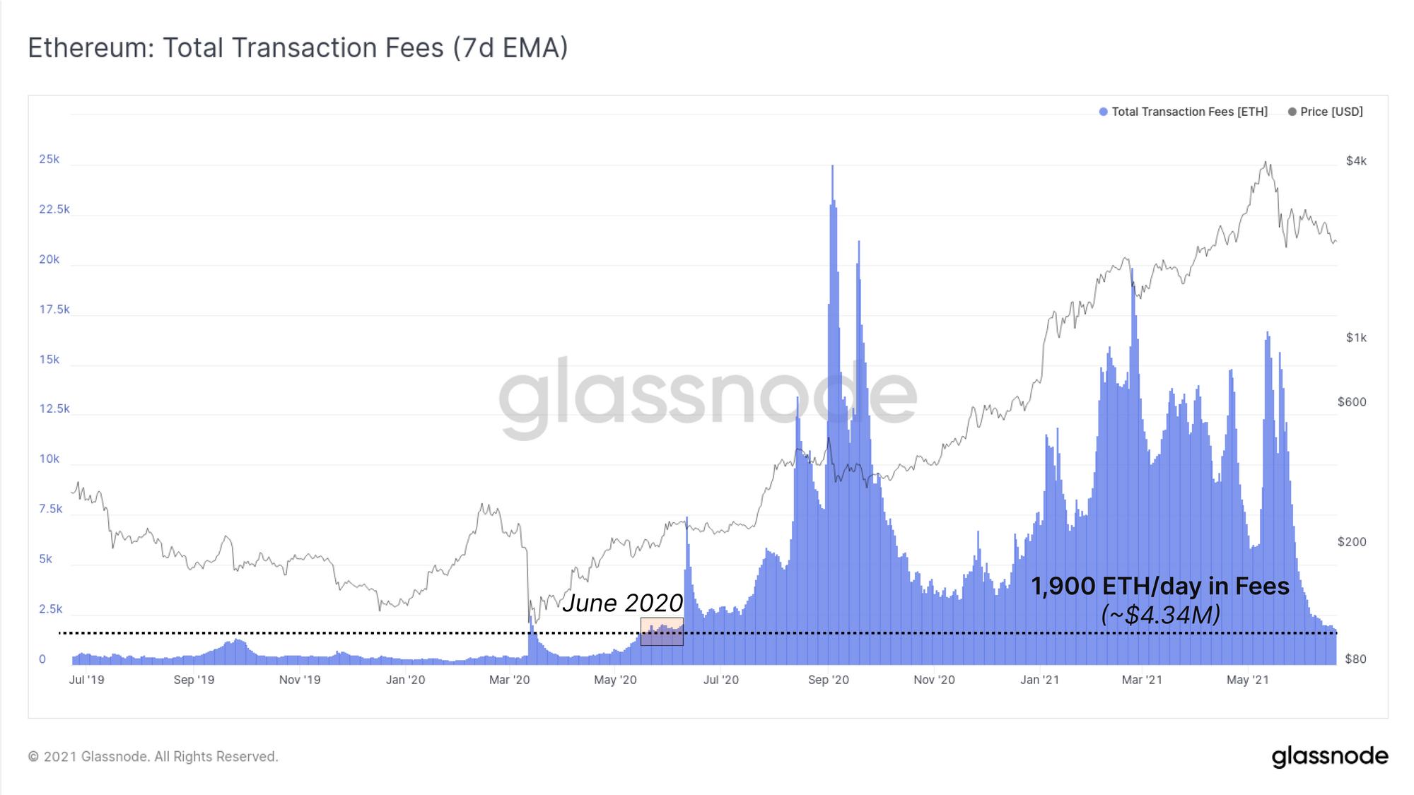
For Ethereum, daily fee revenue has fallen from over 15k ETH/day in early May to just 1.9k ($4.34M). This represents around 10% of total miner revenue being sourced from transaction fees. We have to look as far back as June 2020, before ‘DeFi Summer’, to find similar levels of transaction fees paid.
Supply and Spending Behaviour
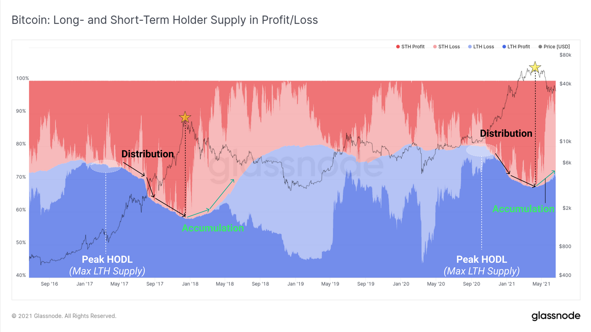
From a macro perspective, there are remarkable similarities to the 2017 macro peak in regards to the balance of supply held by Long (blue) and Short (red) Term Holders. The chart below shows the relative supply held by each cohort and whether they are in profit (dark colours) or loss (light colours).
After reaching ‘Peak HODL’ (maximum LTH supply), both cycles demonstrated a macro distribution event, as BTC wealth is transferred from Long term to Short term holders. After the top was put in, we have started to see the opposite effect, where Long-term holders stop spending and begin re-accumulating, despite their coins often falling into an unrealised loss.
Since the $64k top, Long-term holders own an additional 5.25% of the circulating supply of which 1.5% of this is currently underwater (held at an unrealised loss). Despite prices approaching the cost basis for many long-term holders, they continue to HODL on.
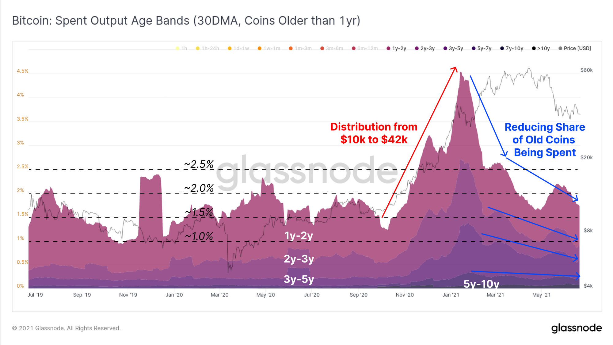
If we investigate aggregate spending behaviour over the last year, we see the proportion of young coins (those < 1yr old, excl. < 1day) on the move has continued to increase as a proportion of transaction flow. In the last few months, we see younger coins accounting for over 45% of the total transaction count. This is most likely a result of newer market entrants:
- Buying the euphoric top and then,
- Selling in capitulation and amidst the current choppy conditions.
What this metric does show that most of the current on-chain activity is due to buyers from the last 6-months spending their coins and realising losses.
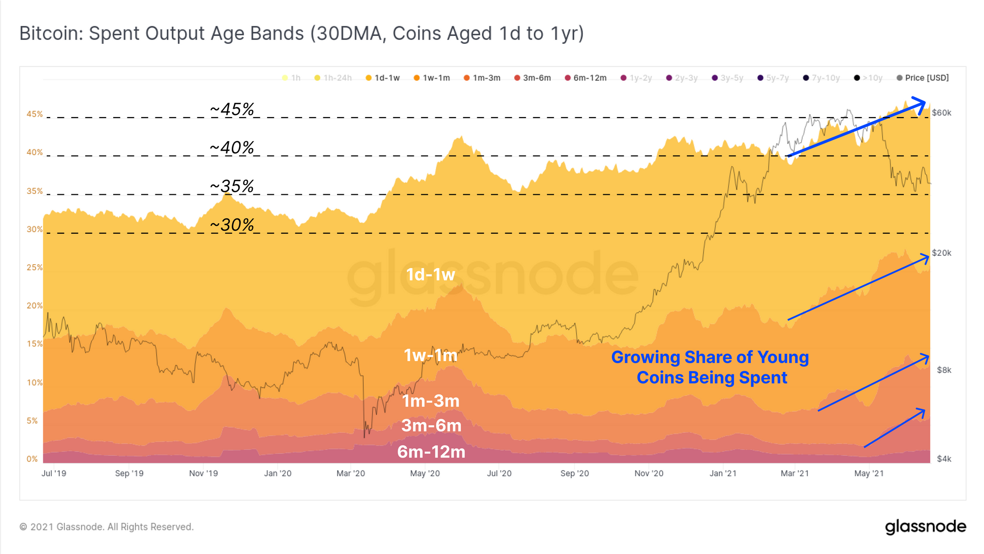
Conversely, older coins (those > 1yr old) have reduced their spending, with a notable decline after the May sell-off. This demonstrates the two sided reality of empty mempools:
1) Demand for on-chain settlement is extremely low (generally bearish)
2) However, this also indicates that long-term investors are not bailing out at these prices (neutral to bullish)
The Spent Output Age bands are a particularly useful tool to have on hand should the market experience a strong rally or further capitulation. A primary behaviour to watch out for is in an event where these older coins come roaring back to life, such as on a relief rally. If so, it may indicate that old hand investors are exiting into liquidity or panic selling (bearish). If not, and their coins stay dormant during volatility, it would be a strong indication that conviction to hold remains in play (bullish).
To confirm just how insignificant the spending behaviour of all coins is, we can look to the Binary CDD metric with a 7-day moving average applied. This metric will trend higher when the volume of coin-days destroyed is larger than the long term average. More coin-days are destroyed when older coins and/or large BTC size are moved on-chain.
Binary CDD has fallen so low that only 1 in every 7-days is experiencing lifespan destruction above the long term average. This state has persisted for almost all of June and commenced relatively quickly after the May sell-off indicating old hands are reluctant to sell at these prices. It also highlights how little demand for block-space there is.
The entire market appears to be waiting for the next move, and few are willing to make the first one. Whichever direction this breaks, the directional response of these lifespan metrics will provide valuable insight into the market bias. They will indicate whether old hands in particular are spending their illiquid coins and taking whatever exit liquidity is there, or if they are holding on like Rick Astley.

Weekly Feature: Seismic Mining Shift
One of the largest migrations of Bitcoin hash-power in history appears to be underway. Following an official ban on mining activities in a number of Chinese provinces, many miners are in the process of shutting down or migrating their hash-power outside of China’s borders.
Some mining farms went down in Sichuan overnight. Quick reactions
– the mining ban appears just as comprehensive as believed
– even hydro powered provinces aren’t being spared
– hashrate transition is real and the nature of bitcoin hashrate will entirely change in next 6-12 mo— nicolás carretero (@nic__carter) June 19, 2021
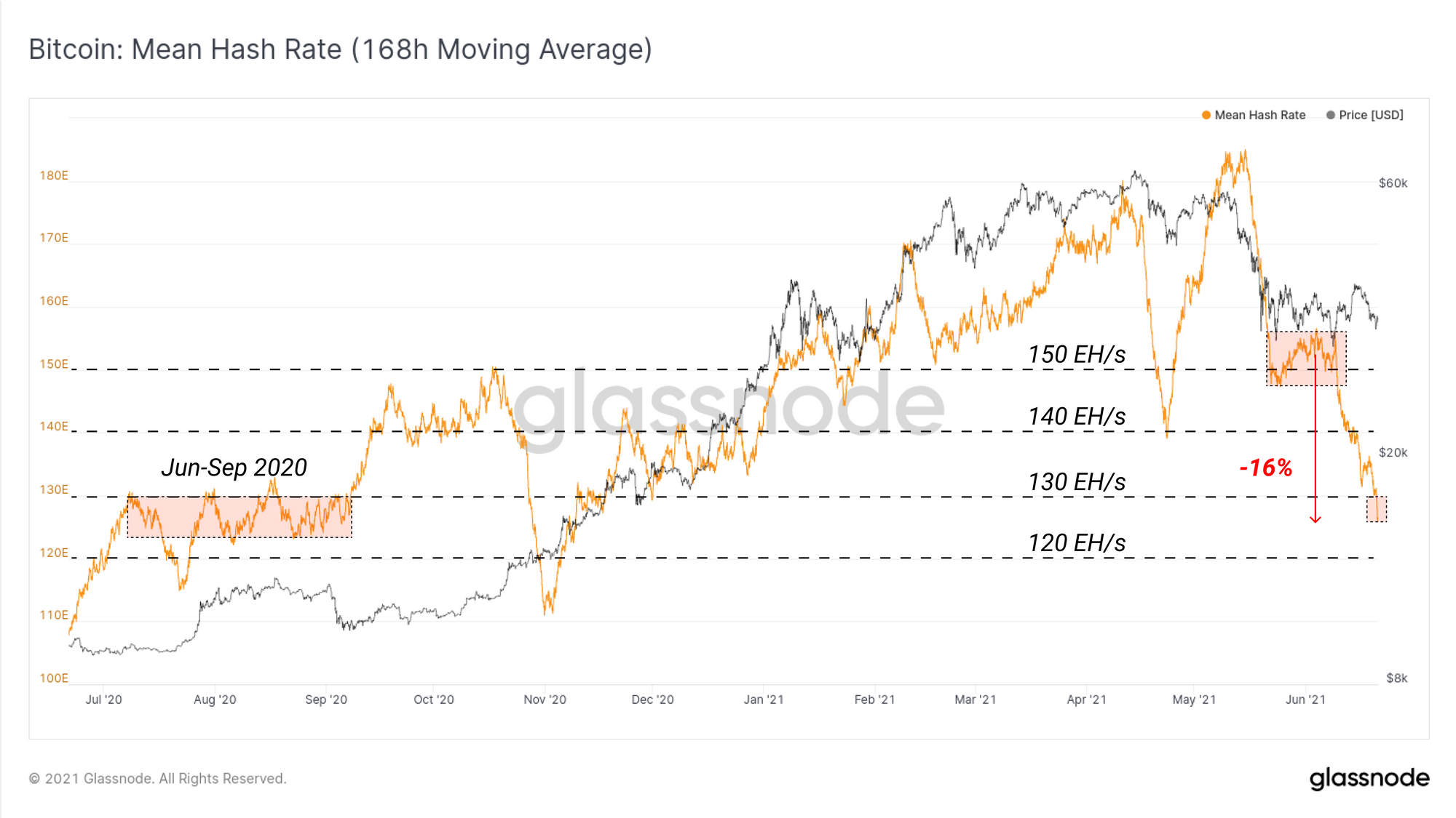
Over the past two weeks, the estimated mean hash-rate (7DMA) has declined by around 16%, falling from approximately 155 EH/s to around 125 EH/s. Hash-power has now returned to levels that were sustained throughout mid 2020.
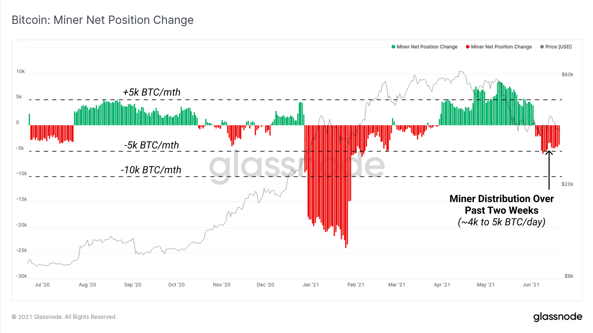
As the Chinese mining industry comes to grips with the logistical challenges of relocating, migrating or selling their hardware and facilities, some are likely to liquidate a portion of their accumulated BTC treasuries. These coin sales may represent miners hedging risk, obtaining capital to facilitate and fund logistics, and for some miners, may be a general exit from the industry entirely.
The Miner net position change metric shows the 30-day rate of change of miner unspent supply. This shows a notable increase in distribution over the last two weeks, generally coincident with the decline in overall hash-rate. Miners have on net distributed at a rate of around 4k to 5k per month over the last two weeks. This has reversed the trend of net accumulation which was active since April.
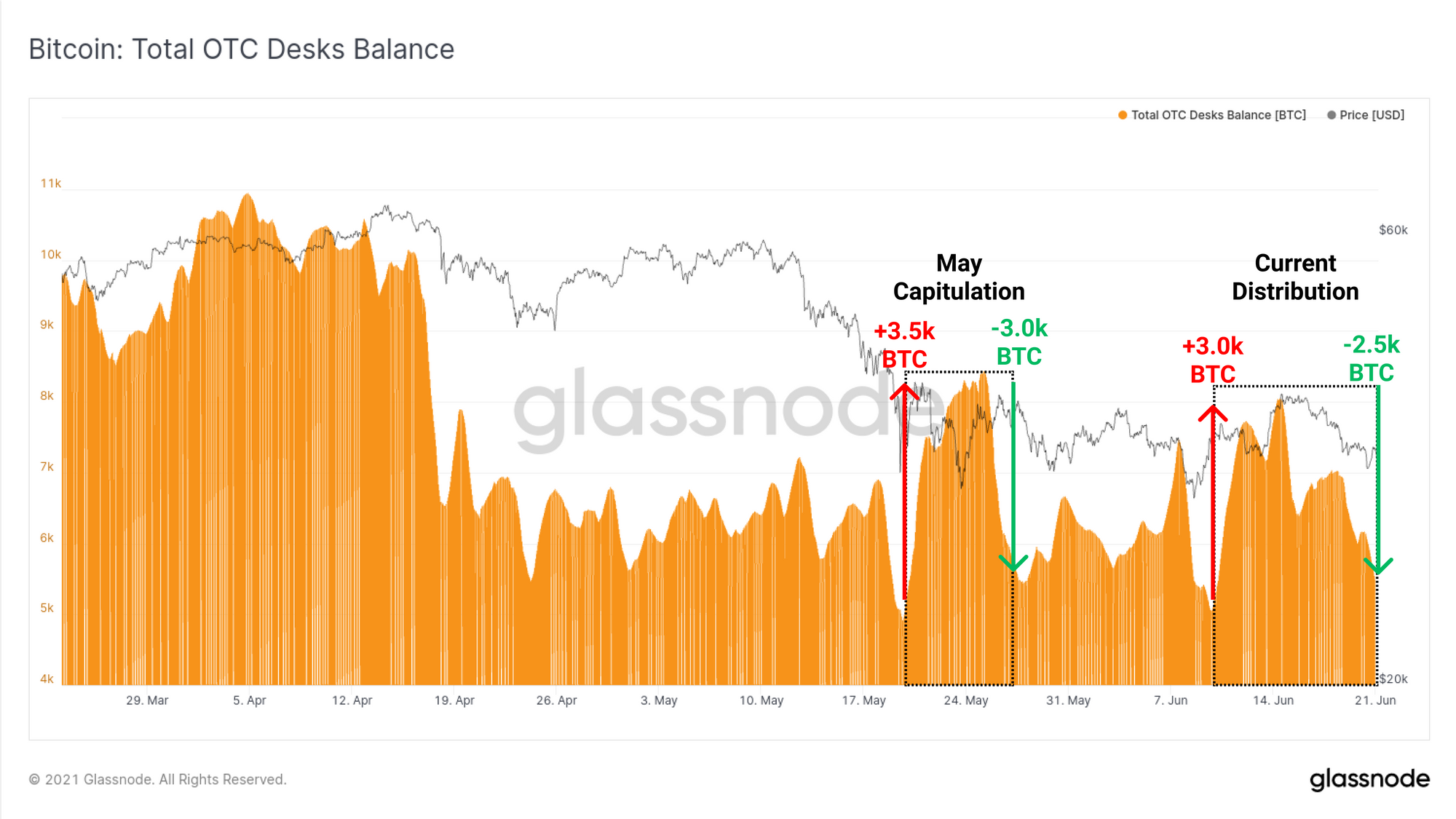
Finally, we take a look at the holdings on OTC desks which are utilised by miners for matching their large size distribution, with large volume buyers.
During both the May Sell-off and over the last two weeks, between 3.0k and 3.5k BTC in net inflows have been observed. However in both instances, almost the full inflow size was absorbed by buyers over just a few weeks. On aggregate, the total BTC holdings on OTC desks we monitor have remained relatively flat since April.
Week On-chain Dashboard
The Week On-chain Newsletter now has a live dashboard for all featured charts