This article was published as a part of the Data Science Blogathon.
Introduction
Recently I searched for an interesting dataset to learn something new. After searching for a long time, I got a dataset on Shark Attacks in Australia. This dataset contains about 1,100 + shark bites and attempted shark bites between 1791 and early 2022, gathered by the Taronga Conservative Society.
In this article, We will learn –
- How to use feather files in pandas and why we use them.
- How to plot barplot and pieplot using matplotlib and seaborn.
- Different facts about sharks, as a bonus.
So, fasten your seatbelts, and let’s get started.
The Data
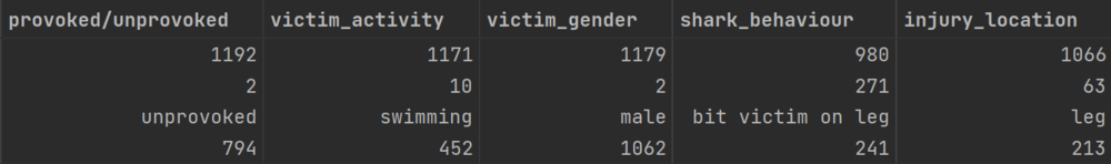
This dataset contains 60 columns. That will be overwhelming if I give details about every column. And also, we don’t need all columns here. Here I am giving the details about 12 columns. If you want to know about all columns, visit this link.
I also performed some preprocessing before using this data. You can download both the actual and preprocessed data from my repository’s data folder.
Data Dictionary
Data Analysis
Before analyzing the data, let’s import the nec
Now let’s import the data using pandas.
From the above code, you will notice that the file is in feather format. The feather format is useful for
The machine only reads Feather formatted files. Sometimes we need to load a large amount of data faster. Here csv format is not useful as the loading time of csv formatted data increases when the file size is large. Converting a csv file to a feather file helps us reduce the file size and the loading time of the data file is reduced drastically.
One thing you have to remember, If you have extensive data (like 5 to 6 GB) then try Apache Parquet.
If we run the above code, you will see the output below.
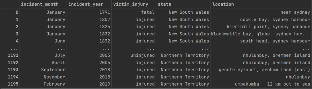
This data contains 1196 rows and 12 columns. After the data is successfully loaded, now let’s see the statistical summary of the data. First, we see the statistical summary of the numerical columns.
shark_data.describe()
The output will look something like the one below.
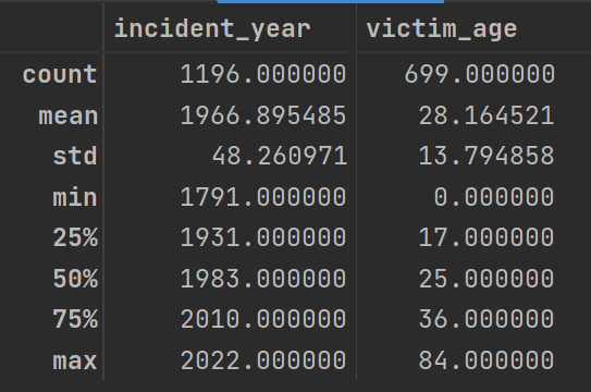
From the above result, we can easily see that —
-
The average age of the victim is 28 years, and the maximum age of a victim is 84 years. I think maximum shark attacks happened to the oldest fishermen. We will verify this fact later.
-
The minimum age of a victim is 0, a null value or an error.
For the incident_year column, the statistical summary doesn’t make sense. We have to see this column’s statistical summary by converting the column to categorical.
shark_data_copy = shark_data.copy()
shark_data_copy['incident_year'] =     shark_data_copy['incident_year'].astype('object')
shark_data_copy.describe(include='O')
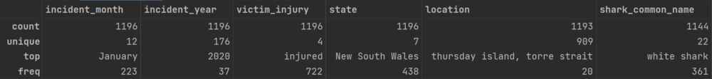
From the above result, we can observe that —
-
The maximum incident happened in January.
-
Shark incidents were mostly recorded in the year 2020.
-
722 people out of 1196 were injured in shark attacks.
-
Most of the shark attacks were reported from the New South Wales state of Australia.
-
Most attacks are made by White Shark. If you search on the internet, you will see that White Shark is responsible for by far the largest number of recorded shark bite incidents on humans. Below is the picture which proves the statement.

Are Shark Attacks increasing over the years in Australia?
Here we are going to see whether shark attacks are increasing over the years or not. We don’t need all the years from the table to know this. So, I selected the data count from 1998 to 2022 and plot a graph.
After running the above code, the plot will look like the one below.

From the above result, we can see an increasing trend which tells that shark attacks are increasing. Below is a screenshot of an Australian newspaper where this fact is stated.

White Shark Attacks
Previously, we saw from the statistical inference that white sharks attack most victims. Let’s see where the most attacks happened.
plt.figure(figsize=(10, 6))
sns.countplot(x='state', data=white_shark_case, palette='RdYlBu')
plt.xticks(rotation=45)
plt.show()

From the above bar plot, we can see that most attack happens in New South Wales. This type of shark is mostly found in New South Wales, Australia.
Now we see the victim’s activity when the shark attack happened.

From the above pie chart, it is visible that most of the victims enjoy boarding when the shark attack happens. That means this shark frequently comes to the surface of the water.
Who has more Shark Attack Cases after White Shark?
Now let’s see who has the second and third place based on shark attack cases.

From the above bar chart, tiger shark and wobbegong have second and third place respectively. Now we are going to see what is the victim activity when these two sharks attacked them.
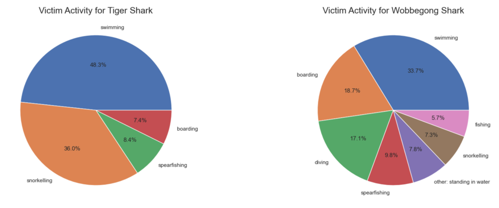
From the above charts, we notice that tiger shark attacks mostly happen when the victim is swimming or snorkeling. If you don’t know what is snorkeling, here is the definition from Wikipedia.
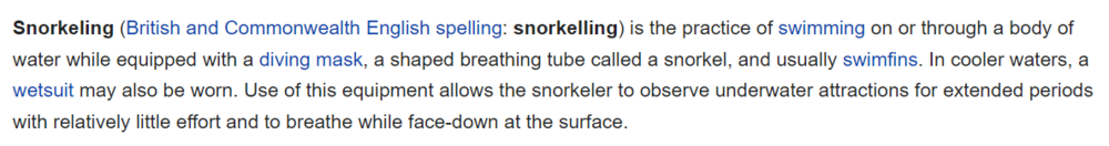
Wobbegong shark attack happens when the victim is swimming, boarding, or diving. Those sharks are interesting. If you see this type of shark at a glance, it seems like a carpet. Below is a picture of wobbegong.
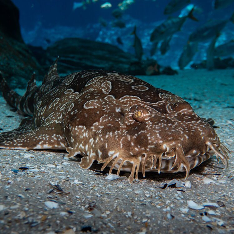
If you want to know more about wobbegong, you can see this video.
Let’s see the provoked/ unprovoked ratio for the white shark, tiger shark, and wobbegong shark, respectively.

White shark has more unprovoked attacks than others. Wobbegong shark has an almost equal ratio of provoked and unprovoked attacks.
Now let’s see how many people are injured, uninjured, or take fatal damage in their attacks. For this, just use the previous code snippet replacing provoked/unprovoked to victim_injury.

Surprisingly, though the wobbegong shark injured so many people, they are not in the first place based on shark attacks. It may happen because of the highest ratio of fatal injuries dealt with by white sharks.
C
So, That’s all I got. I know that this article is pretty long, but I think it is worth reading. In this article, you learned how to –
- Read the feather file using pandas and when to use it.
- Modify the data according to your needs.
- Customize different charts.
But the analysis doesn’t end here. If you got something, let me know in the comments. If there is something wrong from my side, I am always here to listen to you. You can also do some more in the plots – there are so many options for customization. I made some basic customization so that the beginners don’t find those plots overwhelming.
You can read my article on the analysis of dark chocolates. Here is the link. You can also check my medium profile.
The media shown in this article is not owned by Analytics Vidhya and is used at the Author’s discretion.

