Many eCommerce stores are struggling with cart abandonment and the resulting revenue loss. The eCommerce industry loses $18 billion to this problem every year because many online stores haven’t understood and embraced split testing.
Split testing, otherwise known as A/B testing, is a process that allows marketers to compare two versions of a web page to know which one is more effective in increasing conversion rates.
Ideally, A/B testing is done to test elements on a web page and how the variations of the original elements perform. When using split testing, there should be just one difference between the control element and the variation so changes can be correctly tracked.
A good split testing strategy is key to keep you one step ahead of your customers and other eCommerce stores.
If you feel overwhelmed and don’t know where to start, we’ve got you covered. We will discuss below ten split-testing ideas you can use on any eCommerce page.
Let’s get into it…
Hero Images over Auto-Rotating Slides
Image carousels, also known as auto-rotating sliders, look great at first glance for eCommerce sites. They sound like one of those “buy one, get five free” shopping deals. Auto-rotating sliders display several slides with different product pictures in one space, to give visitors a view of a wide diversity of products.
This all sounds good on paper.
In reality, what happens is different. Image carousels have not only failed to increase conversion, but they may have even reduced it because customers find the images confusing, too similar to ads, distracting, or too fast, or there are simply too many images.
Hero images do the opposite. They highlight one main value, keep the visitor’s attention on a single product, and increase sales.
In theory, hero images look better, but you still need to run a test to see which resonates with your customers more. Who knows, they may prefer a carousel.
If you’ve still got an image carousel on your website, switch it out for a single hero image of high resolution accompanied by some impressive copy. Monitor the change in conversions to find out what works best for your website.
Take a look at this carousel image on Squarespace’s website, and the hero image on Salesforce.

Carousel Image from Squarespace
Hero Image on Salesforce
Optimize Call-To-Action
A call-to-action is, without a doubt, one of the most critical elements of an eCommerce website. It guides visitors to take a specific action, such as adding a product to a cart or paying for a product. It’s the easiest hack websites use to increase conversions.
But despite CTAs being an easy, quick win, many businesses get it wrong and don’t benefit much from having them.
For your CTA to be compelling, it needs to be visible, outstanding, concise, and featured in the right place.
Let’s look at how you can test for optimal CTA design using these four parameters.
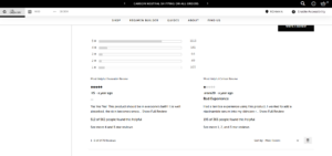
1. CTA Size
The first thing you want to ask yourself is if visitors to your site can “see” your call to action. Before you answer yes to this, know that your CTA button could be there, right underneath their noses, and visitors to your website won’t see it because of its size or other attributes.
Switch out your current CTA button for big and bold designs to test for size. It shouldn’t be so big that it becomes obnoxious or so small that it isn’t noticed. The size has to be just right for your customers, and the only way to figure out what the “perfect” size is, is to test different ones to see what customers respond to the most.
Use your current CTA button size as the control and the bigger sizes as the variations. Measure the conversion difference and use the size with the highest conversion rate.
2. CTA Phrasing
With your CTA size figured out, next up is the phrasing. The text on your CTA button is called the CTA phrase.
It is crucial because it has a psychological impact on the visitors to your page. For example, look at these two CTAs for a digital marketing company:
- “Join our mailing list”
- “Get 100 free email templates”
Both CTAs lead the visitor to the same place – an email list. But the first one is less likely to convert because visitors don’t see any value in it. The second one offers something valuable, so visitors are more likely to give their emails.
You can replicate this by testing different phrases on your CTA. Split test basic phrases that show little value, like “Buy Now,” against phrases with clear benefits, like “Save 10% Now.”
3. CTA Color
CTAs should be big, bold, and catchy. What better way to ensure that than through color?
When choosing colors, use those that stand out from the background theme of your website. Also, avoid colors that are too flashy or too dim. Bright colors like yellow may get the attention of your visitors, but they are also a bit too much for the eye. Pastel colors, on the other hand, tend to blend into the environment and go unnoticed.
You want to use a color that stands out, is catchy, but is also comfortable. Get at least two or three colors that fit this bill and test them to know which one converts the best.
4. CTA Placement
A good CTA in the wrong place is as bad as no CTA. Your call to action should be bold and easily seen, so CTA placement is crucial.
Unlike the other three CTA elements, testing for placement requires many trials. You need to test placement on every possible location on your page – top, bottom, right, left, center. You should also test placement locations by degrees to the left and right of the five major locations on your page.
It might take a while and a lot of tests, but you’ll eventually find the spot with the most visibility and the highest conversion rate.

Use Product Videos
What’s better than a picture? A video.
In today’s world, where we are busier than ever, videos have become more effective at gaining people’s attention than texts or pictures.
In the eCommerce world, videos are even more important, as 33% of people prefer to learn about products from videos. If you don’t have videos on your page, that’s a 33% potential loss in your revenue.
A product video is simply a visual representation of the product, its merits, and the type of user who needs its features. In other words, it’s a video representation of the product description.
So why use videos?
The stats tell you why: because 80% of buyers say product videos give them more confidence to purchase a product.
With product videos, you can improve your conversion rate and keep the attention of 80% of visitors to your page.
To determine which one is better at increasing conversions, you can split test the effects of a text-only product description, a video product description, and a text-and -video product description. Look out for better product engagement and increased revenue to know which of the three options is most effective.
Visible Product Reviews
According to a study done by Trustpilot in 2020, 9 out of 10 (89%) consumers around the world read reviews before buying products.
But that isn’t such a surprise, is it? Reviews are only an advanced form of word-of-mouth marketing and people rely heavily on them to make their purchase decisions.
Product reviews are a must for every eCommerce site, but they aren’t effective when they are bundled up somewhere and hidden like a bad secret.
If your customer reviews require clicking a button to access them, visitors to your site are less likely to view them and make a buying decision.
You can test for optimal product reviews. Things to test for include placement, the content of reviews, and the frequency of reviews.
Put your reviews on your website where they are easily accessible to potential customers. Even if they require a click to roll out more, ensure that part of your reviews can be seen before the “read more” button. Something else to keep in mind when considering the placement of your reviews is the fold. Ensure that your reviews begin above the fold because visitors spend 57% of their page-view time on the first page. You can add a “read more” button to entice visitors to see other reviews on the second page.
Then record how people respond to easily accessible product reviews instead of the hidden ones.
If you’re worried about negative reviews, don’t be. Buyers tend to trust reviews that have both positive and negative aspects. They consider those reviews to be more honest than positive reviews only.
Here’s an example from Deciem for The Ordinary skincare, which includes prominent and detailed product reviews:
Offer Free Shipping
Few offers incentivize a buyer to purchase a product as much as free shipping does. In fact, 80% of shoppers use eCommerce sites because of the promise of free shipping. So, if you still charge a shipping fee on your products, you’re only hurting your sales.
You stand to have a high rate of cart abandonment when you charge potential buyers a shipping fee because 49% of shoppers abandon their cart due to unexpected extra costs, like shipping fees.
But does this mean you should suffer a loss trying to boost your sales?
On the contrary. You can still charge a shipping fee for the product without making it a separate cost by adding the cost of shipping to the product’s base price.
The new price of the product would include the shipping fee, and you can mark the product as having free shipping. With this solution, you avoid the cost of shipping while also increasing revenue generation by getting more people to buy.
There are three ways to split test a free shipping offer.
- Offering free shipping on a few products only
- Eliminating shipping costs and increasing the cost of products to cover for it
- Setting a minimum order value for free shipping
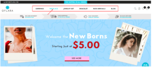
Another idea to test on this element is the placement of your free shipping offer. Where is the best place to announce a free shipping offer? Is it on the checkout page, above the navigation menu like GlowRx has, or on the product page?
Also, how bold and attention-grabbing should the free shipping notice be for optimal results?
You can find out how to maximize the free shipping offer for the best results on your eCommerce page by testing for different positions, sizes, colors, and fonts.
Product Descriptions
Product descriptions play a critical role in the buyer’s purchase decision process. Visitors to your page want to know more about your product, especially how helpful it’ll be to them. They want to know the general and unique features, the product details, the advantages and disadvantages, and a short manual on how to use the product.
Although product videos provide this information, many people are still used to reading product descriptions. So, every eCommerce site should optimize its product descriptions.
Some product descriptions are not very readable, which could negatively affect the customer’s decision to buy. If buyers cannot see the specifics they are looking for, they might go somewhere else.
So, what can be done to ensure that your product description is optimized?
You can start with an audit.
Take a look at your product page and skim through the product description. Can visitors to your page find information on that product easily?
If your answer is no, you need to try something new.
Use short paragraphs, bulleted lists, and concise copy in your product descriptions to improve its readability. In addition to that, also add a short “How to Use” section in your product description to be more helpful. Split test your old product descriptions with this well-written variation and monitor conversions.
Enhance Product Page Layout
Another eCommerce element that affects conversions strongly is the product page layout. People respond better to some product page layouts than others.
Why is the product page layout important?
A good product page layout makes visitors want to stay and look around. The longer visitors stay on your page and browse, the higher the chance that they’ll convert into paying customers.
The differences in a product page layout are usually found in the grid and product images.
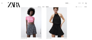
For product images, use high-quality images. Visitors respond to them better than they do low-quality photos. You can also test for image sizes. Small and low-quality images do not convert as well as larger high-quality images.
Take a look at the high-quality life-like size images on Zara‘s product page:
Now, for the grid layout of your product page, test between the two standard grids – mosaic and list. Mosaic grids keep visitors’ attention on your page longer because they can see more products above the fold, unlike lists. Here are some examples of the grid and list layout:
Grid layout

List layout
In addition to testing the grid looks, experiment with the sizes and number of products per page to get the perfect layout for your eCommerce site.
Run as many test variations using these parameters to discover the optimal design layout for your product pages.
Keep your Navigation Menu Simple
On a scale of simple to complex, how difficult is it for your website visitors to find what they’re looking for?
Navigation menus are supposed to make it easy for visitors to easily move from one page to another and from one product category to another, but some navigation menus do the opposite.
The problem with having a complex navigation menu is that visitors don’t stay to figure it out. They leave. And since 58% of shoppers would stop using an eCommerce site because of a poor shopping experience, they may not come back again.
How can you ensure you aren’t losing revenue and sales from your navigation menu? You can do this by testing your navigation menu for optimal efficiency, and it can be tested in two ways.
First, you can do this by using Clickable images.
Clickable images contain links that will lead you to the product page when you click on them. These images improve sales and revenue by making the product search seamless. Take a look at Oflara – they used clickable drop-down photos to increase their revenue by 53%.
Before adding clickable images
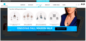
After adding clickable images
Aside from clickable images, you can try reorganizing your navigation menu to have fewer major categories and more sub-categories underneath. Big eCommerce stores with lots of goods and many product categories have utilized this method to help customers keep track of the products they offer. Take a look at Amazon‘s navigation menu.
Shorten the Checkout Process
Seven out of ten people abandon their carts at checkout.
This is a major problem for eCommerce stores as they try to engage customers enough to move past the cart stage to the actual purchase stage. It all starts with addressing the reasons why people abandon their carts.
Here are a few:
- Extra costs, mostly from shipping fees
- Requiring visitors to sign up before they make a purchase
- Limited methods of payment
- Long checkout processes
Previously, we discussed free shipping offers and how they have such a significant impact on the revenue and selling rates of businesses.
A simple checkout process, just like a free shipping offer, can impact conversions on your eCommerce site. Many check-out processes are long-winded, have more than two pages of forms to fill, and require that buyers sign up before they can pay.
A shorter checkout process does two things:
- It doesn’t give potential buyers time to change their minds about purchasing a product
- It also converts
On your eCommerce page, try out a shorter checkout process and test it against the longer checkout processes to see which one has the best results for your conversion rate. You should run this test for each of the markets you’re selling to, as shoppers in different countries have different expectations related to checkout length. While shoppers in European countries might prefer a two-step checkout, including a review page, American shoppers tend to favor one-step cart flows.
When optimizing your checkout flow, also take into account the number of fields your form includes and if any of these are not needed or excessive. For example, when selling digital goods, you might not need to collect the user’s full billing address, which could save them precious time when concluding their purchase. As a rule of thumb, whenever possible, reduce input fields on guest checkouts to the absolute minimum.
Have Multiple Payment Options
Can having multiple payment options affect your sales?
Let’s find out.
8% of customers say they abandoned their carts because only a few payment options were available.
This 8% may not seem much of a loss in the grand scheme of things, until you see this next stat: 19% of customers say they abandoned their carts because they didn’t trust the site with their credit card details.
When you put these two stats together, you’ll discover that the diversity of your payment options could be why the traffic to your eCommerce site isn’t converting to sales.
People across varied demographics gravitate towards different methods of payment. When you limit the payment options on your site, it won’t matter how much shoppers want to buy the product; they simply would not be able to pay for it.
Aside from alienating some customers, offering only a few payment options may not leave customers at ease. With the rise in credit card fraud, people feel uncomfortable putting their card details on certain websites. They would prefer to use other forms of payment like Paypal, Amazon pay, Google Pay, Apple Pay, and others.
Test multiple payment options on your checkout page to know how it affects your sales.
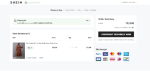
Take a look at SHEIN, a big eCommerce fashion store. They offer varied payment options to cater to everyone’s preferences.
Beyond featuring multiple payment methods in your checkouts, including local favorites, be sure to also enable auto-formatting for the card number with spaces, as this helps eliminate card validation errors caused by typos, while also making the shopper’s input a lot easier.
Conclusion
Split testing is one of the top ways to get vital insights into your website and the factors that make them perform at optimal levels. eCommerce sites should make it a point to test as many crucial elements as possible. You can start building a high converting website by split testing the ten features discussed above.
About Author

Paul is an SEO specialist and loves tweaking things to perfection in his CRO experiments with his clients. In his free time, he can be found piloting a drone, or hiking.

